Volume is the classic confirming indicator. Volume measures are often portrayed on stock charts, and volume statistics are incorporated in a number of indexes and oscillators.
1. What Is Volume?
Volume is the number of shares or contracts traded over a specified period, usually a day, but can be one trade (called tick volume) to months or years, in any trading market—stocks, bonds, futures, and options.
In markets where considerable arbitrage exists, volume statistics can sometimes be misleading. For example, arbitrage between two differently dated commodity contracts can cause volume figures in each to be distorted due to the arbitrage and not the price trend. This arbitrage problem in volume statistics is particularly troublesome in the stock market where there is not only arbitrage against index futures markets, but also arbitrage between baskets, exchange-traded funds (ETFs), and options. This arbitrage is known as “program trading,” and as of March 20, 2015, it accounted for approximately 38.6% of all traded volume on the New York Stock Exchange (NYSE: Program Trading Report). In the heavily traded stocks included in averages and widely owned by institutions, large levels of volume may thus be due simply to arbitrage trades and not the trend direction or strength. Any analyst using these volume figures for these actively traded stocks must be aware of this potential problem in analysis.
Indeed, one criticism of program trading voiced by professional traders is that it distorts the information typically provided by trading volume. As our analysis here suggests, introducing trading volume unrelated to the underlying information structure would surely weaken the ability of uninformed traders to interpret market information accurately.
(Blume, Easley, and O’Hara, 1994, p. 178)
2. How Is Volume Portrayed?
Analysts display volume on a price chart in many ways. Some analysts like to see the volume statistics separately from the price statistics. Others have developed means of integrating volume data into the price chart.
2.1. Bar/Candle
The most common portrayal of volume is a vertical bar representing the total amount of volume for that period at the bottom of the price chart. A chart showing daily price data, for example, would show the volume for each day in a vertical bar below the price bar. Figure 18.2 shows volume statistics for Apple Computer using this method. This method is simple and assumes no direct relationship between price and volume. It just displays the data.

Important levels in Figure 18.2 are noted with arrows. These represent locations where higher volume indicates potential reversals in price trend. Numbers 1, 2, and 6 occur at price lows that are not immediately penetrated and are thus potential reversal points. Numbers 3, 4, and 5 represent trend breaks that ushered in short-term trend reversals. Also note during much of October and November that volume was relatively flat while the trend was flat. Later from mid-November through December while the price was trending upward, the volume declined at first, suggesting lack of enthusiasm, but then increased later as buyers became more aggressive. The subsequent small corrections included increasing volume, which is not usually a favorable sign.
2.2. Equivolume
Many attempts have been made to integrate volume directly into a bar chart. Gartley (1935) mentions how traders before 1900 would record on a chart a vertical bar for every 100 shares traded at a certain price. For example, if 300 shares traded at a certain price, traders would record three bars at that price. A wide number of bars at a certain price showed that the majority of activity took place at that price. From this chart, traders could determine the price at which supply and demand were equalized and, thus, the support and resistance zones.
The first published service using a combination of price and volume was the Trendograph service by Edward S. Quinn (Bollinger, 2002; Gartley, 1935). Quinn produced charts using a bar for the high and low each day separated by a horizontal distance based on volume traded during the day. More recently, Richard W. Arms, Jr. (1998) designed, utilized, and reported “Equivolume” charts. These are available in some of the current charting software programs.
Arms’s method widens the vertical price bar into a rectangle and, thus, widens the horizontal axis in proportion to the volume traded during the same period. For an example of an Equivolume shape, see Figure 18.3. The Equivolume chart resembles a regular bar chart except that the bars vary in width. Thus, wide bars portray large volume, and thin rectangles portray thin volume. The horizontal axis of the entire chart adjusts accordingly, as shown in the Equivolume chart for AAPL in Figure 18.4.
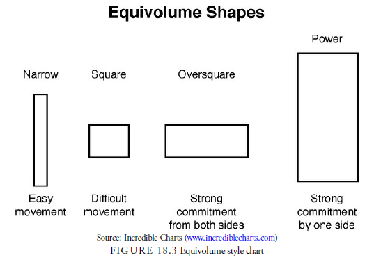

Arms first interpreted the Equivolume charts by considering the rectangular shapes displaying the price range by the height of the rectangle and the volume by the width. For example, after a strong upward trend, the formation of a box shape or flat rectangle suggested little price motion but heavy volume. This would indicate that the trend was meeting some heavy resistance. Arms also found that the standard patterns used in bar chart analysis occur in Equivolume charts, and interestingly, trend lines and channel lines appeared to work as well. One would think that a trend line was totally price- and time-related in a bar chart, but Arms demonstrated that trend lines in price-to-volume also occur.
More recently, with the introduction of picturesque candlestick charts, some services have adopted the principles of Equivolume to include open, close, shadows, colors, and indications of direction. Arms, for example, has combined the attributes of candlestick charts with Equivolume charts into what he calls candlevolume charts. Incredible Charts (www.incrediblecharts.com) displays Equivolume charts showing the open and close. These charts have the same rectangular appearance as the Equivolume charts but include other factors. Their interpretation is similar to Equivolume interpretation. The same trends, formations, and support and resistance levels as displayed in regular bar charts are visible.
2.3. Point and Figure
Point and figure charts, by their nature, do not include volume. This omission has forced point and figure analysts who believe that volume is important to find ways to integrate volume statistics into each point and figure box, usually through symbols or colors. The standard method is to sum the volume that took place while each box was in effect and portray it on the chart. From this, the analyst can quickly visualize where volume occurred in the formation. The individual analyst using the method must determine whether this information is helpful. A purist in point and figure would argue that volume is unimportant because the price action implies it.
3. Do Volume Statistics Contain Valuable Information?
Academic papers using volume to confirm technical trading rules are rare. Most academic papers on volume are concerned with bid-ask spreads and intraday trading versus option trading. The intraday spread has been of interest because it is a cost of trading called slippage that has not been well quantified. Studies in this sector arose out of the legal requirement of institutions to measure the effectiveness (“best execution”) of their traders and the brokerage firms that handled their orders. The difference between best execution and the execution received is a cost above the commission and slippage cost. Often, institutions traded through firms that did not receive the best execution but provided research and other benefits to the institution. The legal question was, should the customer of the institution pay an extra cost for execution through a firm that did not receive the best execution? Determining the best execution then became a major area of study that remains relatively unanswered today.
Intraday trading relative to option trading was of interest to those attempting to explain why option prices lagged behind stock prices.
Stock buyer-initiated volume (that which transacts at the ask) minus seller-initiated volume (that which transacts at the bid) has strong predictive ability for subsequent stock and option returns, but call or put net-buy volume has little predictive ability. (Chan, Chung, and Fong, 2002)
Finally, studies done on daily volume and subsequent price action came to the conclusion that volume statistics had valuable information.
Where we believe our results are most interesting is in delineating the important role played by volume. In our model, volume provides information in a way distinct from that provided by price…. Because the volume statistic is not normally distributed, if traders condition on volume, they can sort out the information implicit in volume from that implicit in price. We have shown that volume plays a role beyond simply being a descriptive parameter of the trading process. (Blume, Easley, and O’Hara, 1994, p. 177)
4. How Are Volume Statistics Used?
Volume indicators and signals are usually derived not from volume itself, but from a change in volume. Volume by itself may be a measure of liquidity in a security, but it is not helpful for price analysis. Volume is usually different in every security, based on factors beyond the ability for the security to rise and fall. For example, at the end of 2014, average daily volume for Walmart was around 7.4 million shares. The average daily volume for Coca-Cola at 12.4 million shares was almost twice that. The term volume used in conjunction with indicators and technical signals really refers to change in volume. We also use that convention.
How should a change in volume be interpreted? These general rules date back to the work of H. M. Gartley in 1935:
- When prices are rising:
a . Volume increasing is impressive.
b . Volume decreasing is questionable.
2. When prices are declining:
a . Volume increasing is impressive.
b . Volume decreasing is questionable.
- When a price advance halts with high volume, it is potentially a top.
- When a price decline halts with high volume, it is potentially a bottom.
In other words, price change on high volume tends to occur in the direction of the trend, and price change on low volume tends to occur on corrective price moves. Higher volume is usually necessary in an advance because it demonstrates active and aggressive interest in owning the stock. However, higher volume is not necessary in a decline; prices can decline because of a lack of interest and, thus, few potential buyers in the stock, resulting in relatively light volume.
As in all technical indicators, exceptions to the preceding rules can occur. These rules are only guides. Bulkowski, in his analysis of chart patterns, for example, found many profitable instances of patterns breaking out on low volume rather than the traditionally expected high volume. Larry Williams has reported on shortterm studies of volume accompanying advances and declines and found little or no correlation. In a study of price-volume crossover patterns, Kaufman and Chaikin (1991) demonstrated that the prevailing wisdom is not always borne out by fact. In a price-volume crossover chart, price closes within short trends are plotted on the vertical axis, and corresponding volume is plotted on the horizontal axis. Lines are drawn connecting these successive points, and when the lines cross, a crossover has occurred. Thus, the charts display the sequence of rising or falling price versus rising or falling volume. Kaufman and Chaikin found, for example, that rising volume in an advance was not necessarily positive and that declines could occur on both rising and declining volume.
Nevertheless, we look at specific examples in the indicator descriptions next. We will see that volume is a secondary indicator to price analysis and that although it is not always consistent, it can often be useful as a warning of trend change, especially on any sharp increases. As always, one must thoroughly test each assumption made about volume characteristics. The correlations between signals and price are not reliable enough to be absolute rules, and using the traditional rules too strictly can often lead to incorrect conclusions about price action.
5. Which Indexes and Oscillators Incorporate Volume?
Let us look at some specific examples of indicators that analysts use when looking at volume as a confirming indicator. These indicators are divided into two principal categories: indexes and oscillators.
5.1. Volume-Related Indexes
Technical analysts have developed a number of volume-related indexes. On-Balance-Volume is probably the most well known of these.
5.2. On-Balance-Volume (OBV)
On-Balance-Volume (OBV) is the granddaddy of all volume indexes. Joseph Granville proposed OBV in his 1976 book, A New Strategy of Daily Stock Market Timing for Maximum Profit. The daily data that is cumulated into the index is the volume for the day adjusted for the direction of the price change from the day before. Thus, it is the total daily volume added to the previous day index if the price close was higher and subtracted from the previous day index if the price close was lower than that of the previous day. This index is a cumulative sum of the volume data and is plotted on a daily price chart. Figure 18.5 shows what a plot of OBV volume looks like.
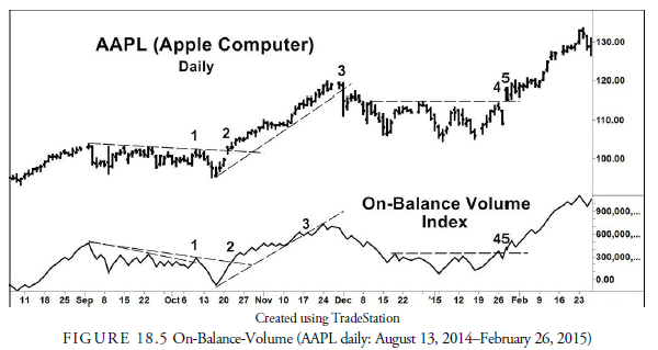
The idea behind the OBV index is simply that high volume in one direction and low volume in the opposite direction should confirm the price trend. If high volume is not confirming the price trend, then light volume in the price trend direction and heavy volume in the opposite direction suggests an impending reversal. Observing the OBV line by itself, therefore, is not helpful, but observing its trend and its action relative to price action is. For example, in a trending market, when prices reach a new high, confirmation of the price strength comes when the OBV also reaches a new high. If the OBV does not reach a new high and confirm price strength, negative divergence has occurred, warning that the price advance may soon reverse downward. A negative divergence suggests that volume is not expanding with the price rise.
How can the OBV be used in prices that are in a consolidation pattern or trading range rather than trending? When prices are in a trading range and the OBV breaks its own support or resistance, the break often indicates the direction in which the price breakout will occur. Therefore, it gives an early warning of breakout direction from a price pattern.
Let us look a little more closely at Figure 18.5. During September and early October 2014, a downward trend existed in both prices and the OBV. The OBV had a minor breakout upward at point 1, but the price did not confirm that breakout with one of its own. The suggestion was that the price was not ready to change trend direction. At point 2, however, both the OBV and price broke upward through their declining trend lines in a legitimate and confirmed breakout and initiated a month-long upward price trend. This demonstrates the importance of having confirmation from price when a signal is given by an index (or oscillator). At point 3, the OBV broke below its rising trend line signaling the volume was not keeping up with price. Nevertheless, price did not break its upward trend line to confirm this weakness until point 3 on the price chart, and it broke with a vengeance. During December and most of January, the price and OBV trend was flat. A small upward breakout occurred in the OBV at point 4 that was not confirmed by price until two days later when both the OBV and price broke upward on the same day, thus confirming each other’s action. OBV is thus valuable in assessing the legitimacy of trend breakouts, and in this example actually led price breakouts, giving the analyst warning to watch for a directional change.
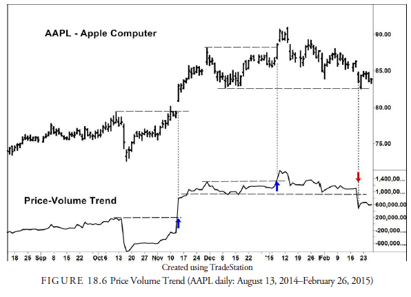
5.3. Price and Volume Trend
Another way of calculating a combination of price and volume is to determine daily the percentage price change, up or down, times the total volume for the day. This figure is then cumulated into an index called the price-volume trend. This index will be more heavily impacted when large percentage price changes occur on heavy volume. Signals are triggered in the same manner as for the OBV.
In Figure 18.6, notice that this method, using the same data as Figure 18.5, shows the price-volume trend confirming only after the upward gap breakout in November. In January, the Price-Volume Trend breakout above resistance coincides with a breakout in prices. And in February, the breakdown below support precedes a longer decline that doesn’t begin until two weeks later with an equivalent breakdown in price.
6. Williams Variable Accumulation Distribution (WVAD)
Larry Williams believes that the open and close prices are the most important price of the day. The Williams Variable Accumulation Distribution (WVAD) calculates the difference between the close and the open and relates it to the range as a percentage. For example, if a stock opened at its low price of the day and closed at its high price of the day, this percentage would be 100%. The other extreme would be if a stock opened at P1, moved higher (or lower) during trading, but returned to close at P1, then the percentage would be 0%. This percentage is then multiplied by the daily volume to estimate the amount of volume traded between the open and close.
The new volume figure is then added or subtracted from the previous day WVAD and drawn on a price chart. It can also be converted into a moving average or oscillator. Interpretation of the WVAD is identical to the other volume indexes.
6.1. Chaikin Accumulation Distribution (AD)
In 1975, financial newspapers no longer published the opening prices of stocks. Marc Chaikin, using the Williams WVAD formula as a base, created the Accumulation Distribution (AD) index that uses the high, low, and close prices each day. The basic figure determines where within the daily price range the close occurs in the formula:
Volume x ([close – low] – [high – close]) / (high – low)
Thus, if the close occurs above its midpoint for the day, the result will be a positive number, called accumulation. Conversely, a negative number occurs when a stock closes below its midpoint for the day, and distribution is said to occur. Each daily figure is then cumulated into an index similar to the OBV, and the same general rules of divergences apply.
Figure 18.7 shows a plot of the AD index using Chaikin’s formula. A negative divergence occurred in early October (point 1) that led to only a shallow correction. An upward trend line (point 2) in the AD line was broken in early December, long before the price trend line (point 2) was broken and missed the last upward splurge, and another negative divergence developed in early January that warned of a decline that subsequently continued for several months.

6.2. Williams Accumulation Distribution (WAD)
Not to be confused with the earlier Williams Variable Accumulation Distribution (WVAD) or Chaikin’s Accumulation Distribution (AD), the Williams Accumulation Distribution (WAD) also eliminates the use of the open price no longer reported in the financial newspapers. This indicator uses the concept of True Range that J. Welles Wilder developed during the same general period.
The True Range uses the previous day’s close as a benchmark and avoids the problems that arise when a price gaps between days. The calculations for the True Range high and low are based on a comparison. The True Range high, for example, is either the current day’s high or the previous day’s close, whichever is higher. The True Range low is either the current day’s low or the previous day’s close, whichever is lower.
In the WAD, accumulation occurs on days in which the close is greater than the previous day’s close; the price move on these days is calculated as the difference between the current day close and the True Range low. Distribution occurs on a day when the close is less than the previous day’s close; the price move on these days is the difference between the current day close and the True Range high, which will result in a negative number. Each price move is multiplied by the volume for the respective day, and the resulting figures are cumulated into an index, the WAD.1
- Steven B. Achelis introduced a variation of the WAD in his book Technical Analysis from A to Z(2001). This variation eliminates the multiplication by volume and is thus not a volume index but a price index. Achelis’s variation is often incorrectly identified in software programs on price indicators as the Williams Accumulation Distribution.
7. Volume-Related Oscillators
Unlike indexes, volume-related oscillators are somewhat bounded. When an oscillator approaches the upper bound, an overbought condition occurs; when it approaches the lower bound, an oversold condition occurs. Oscillators are especially useful during trading ranges.
7.1. Volume Oscillator
The volume oscillator is the simplest of all oscillators. It is merely the ratio between two moving averages of volume. Its use is to determine when volume is expanding or contracting. Expanding volume implies strength to the existing trend, and contracting volume implies weakness in the existing trend. It is, thus, useful as a confirmation indicator for trend and for giving advanced warning in a range or consolidation formation of the direction of the next breakout. For example, if within the range, the oscillator rises during small advances and declines during small declines, it suggests that the eventual breakout will be upward.
Let us look at Figure 18.8. Like volume itself, the volume oscillator should confirm the price trend. In September 2014, the price is in a flat trading range but the oscillator is rising. This is unusual in that most trading ranges have declining volume until the breakout. October also had a mixed and unusual configuration. The price broke down heavily on large volume and volume continued on the rebound. This suggests that large buying stopped the decline. The volume oscillator then fell off while the price entered another trading range, and finally, in November, began to increase again along with price. This increase in volume was a confirmation of the new trend. The same confirmation occurred in late December and early January when rising volume confirmed the generally rising trend. You can see that this oscillator has a spotty record and generally is not as satisfactory in warning us of trend changes as others previously mentioned.

7.2. Chaikin Money Flow
The Chaikin Money Flow is an oscillator that uses the (Chaikin) AD calculation for each day. It is calculated by summing the ADs over the past 21 days and dividing that sum by the total volume over the past 21 days. This produces an oscillator that rises above zero when an upward trend begins and declines below zero when the trend turns downward.
Remember that each daily Chaikin AD calculation is based only on that particular day’s high, low, and closing prices; therefore, if a gap occurs, it is not reflected in this oscillator. Another potential problem with this oscillator, as with all oscillators constructed using simple moving averages, is that simply dropping the number that occurred 21 days prior from the calculation can influence the current value of the oscillator. Remember that as an oscillator, this tool is used for confirmation, not signal generation.
7.3. Twiggs Money Flow
Colin Twiggs of www.incrediblecharts.com has adjusted the Chaikin Money Flow to account for the potential problems of gaps and the 21st-day drop-off. Twiggs eliminates the problem of gaps influencing the price strength by using Wilder’s True Range, similarly to how Williams uses it in his WAD. In addition, using Wilder’s calculation of an exponential moving average solves the problem of the drop-off figure affecting the current oscillator.
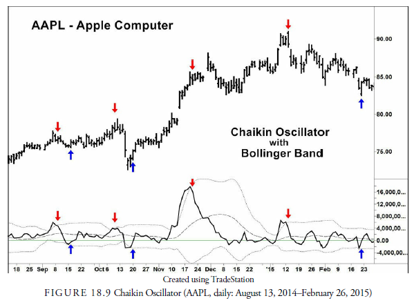
7.4. Chaikin Oscillator
Just to confuse things even more, Marc Chaikin invented the Chaikin Oscillator, as opposed to the Chaikin Money Flow. This oscillator is simply the ratio of the 3-day EMA of the AD to the 10-day EMA of the AD. Chaikin recommends that a 20-day price envelope, such as a Bollinger Band, also be used as an indication of when signals from the oscillator will be more reliable. Most signals are from divergences.
Figure 18.9 shows how well the Chaikin Oscillator signals short-term reversals within a trading range. The overbought and oversold levels in the chart are determined by a standard Bollinger Band. When the overbought (upper) band is broken from the outside, a sell signal is generated, and conversely when the oversold (lower) band is broke from the outside, a buy signal is generated. The narrowing of the bands shows a decline in volatility. Declining volatility precedes significant price moves and is, thus, a warning of change in direction if not intensity.
7.5. Money Flow Index (Oscillator)
Another method of measuring money flow into and out of a stock is the Money Flow Index (MFI). It considers “up” days and “down” days to determine the flow of money into and out of an equity. The money flow on any particular day is the day’s typical, or average, price multiplied by the daily volume. The day’s typical price is determined as the average of the high, low, and close. Therefore, money flow on Day i would be calculated as
![]()
If Day i’s average price is higher than the previous day’s average price, there is positive money flow (PMF). Conversely, if Day i’s average price is lower than the previous day’s average price, negative money flow (NMF) occurs. The analyst chooses a specific period to consider and sums all the PMF and all the NMF for that period. Dividing the sum of PMF by the sum of NMF results in the money flow ratio (MFR):
![]()
The MFI is then calculated using the following formula:
MFI = 100 – (100 / (1 + MFR))
The MFI is an oscillator with a maximum of 100 and a minimum of 0. When positive money flow is relatively high, the oscillator approaches 100; conversely, when negative money flow is relatively high, the oscillator approaches 0. A level above 80 is often considered overbought and below 20 oversold. These parameters, along with the period, are obviously adjustable.
In addition, another variation of the MFI uses a ratio between positive money flow and the total dollar volume (rather than the NMF) over the specified period to calculate the money flow ratio. We used this method of calculation in Figure 18.10. Generally, the results of this method are not significantly different from the method we described earlier. In the example, we use a Bollinger Band to determine overbought and oversold. A break into the band is a signal, buy from below and sell from above. The chart shows the signals, which were profitable except the last one that needed a protective stop.

8. Elder Force Index (EFI)
The Elder Force Index (EFI) is an easy oscillator to calculate in that it uses only closing prices and daily volume. The daily price change is calculated as the daily closing price minus the previous day’s closing price. This daily price change is then multiplied by the day’s volume. The index is simply an exponential moving average over some specified period of the daily price change multiplied by the volume.
The purpose of this index is to measure the volume strength of a trend. The higher the level of the oscillator above zero, the more powerful the trend. A negative crossover through zero would thus indicate a weakening in trend power, and a deep negative would suggest strong power to the downside.
We have plotted the EFI in Figure 18.11. Elder suggests using either a 2-day EMA for trading or a 13-day EMA for trend determination. We used 13 days. You can see how erratic the EFI can be. In theory, a trade should be made whenever the centerline is crossed. As a mechanical method, this would have been disastrous as a number of whipsaws occurred. However, if we calculate a band of one standard deviation about the index number, as plotted in Figure 18.11, buy and sell signals can be generated with some accuracy. This oscillator succumbs to the classic problems with oscillators in a trending market. Trends tend to keep the oscillator at the extreme level; thus, it gives false closing signals and misses entry signals. Obviously, the entire Elder Force system should be optimized and tested with unknown data before using it, but there does seem to be some validity to the approach.

9. Other Volume Oscillators
We have just studied the most commonly used volume oscillators. As always, a large number of variations exist, a few of which we mention here. Because these volume oscillators are variations of the more common ones we just discussed, the signals from overbought and oversold or divergences are similar.
Ease of Movement (EMV) is an oscillator developed by the volume expert Richard W. Arms. It uses a different calculation to determine daily price differences—namely, the average of the high and low for one day versus the average for the high and low of the previous day. The formula for calculating the EMV is the following:
![]()
The result is a figure that measures the effect of volume on the daily range. The EMV is usually smoothed using a moving average because it can be erratic from day to day.
Volume Rate of Change is simply a ratio or percentage change between today’s volume and the volume of some specified day in the past. For example, a ten-day rate of change would be today’s volume versus the volume ten days ago. This method has problems because the drop-off number ten days prior, for example, will influence the current day’s reading and might not have significance to recent trading. The ratio is used to identify spikes in volume (see the next section) but is not a reliable indicator by itself.
9.1. Volume Spikes
Volume spikes (not to be confused with price spikes) are most common at the beginning of a trend and at the end of a trend. The beginning of a trend often arises out of a pattern with a breakout, and the end of a trend often occurs on a speculative or panic climax. Higher-than-usual volume tends to occur with each event. By screening for volume, the trader can often find issues that are either ready to reverse or that have already reversed. The usual method of screening for a volume spike is to compare daily volume with a moving average. The trader can look for volume that is either a number of standard deviations from the average volume or a particular percentage deviation from the average. As for interpretation of the spike when it occurs, it is often difficult to determine which variety of spike has occurred until after the spike ends and you observe the subsequent price action.
Usually there is a reason for a volume spike, but the reason for the spike might be unrelated to the technical issues of price trends and behavior. Of course, heavy trading might be related to a news announcement made about the company. Or heavy trading volume in a stock can occur if the stock is a component of an index or basket that had a large institutional trade that day. Options expiring can also influence volume figures. In all spikes, any outside reason must first be investigated because it might have nothing to do with the issue’s trend and price behavior.
9.2. Volume Spike on Breakout
Breakouts are usually obvious. High volume on a gap or on a breakout from a preexisting chart pattern is usually the sign of a valid breakout. Although breakouts do not necessarily require high volume, many analysts use a spike in volume as a confirmation of the breakout and ignore those without a volume spike.
9.3. Volume Spike and Climax
A climax usually marks the end of a trend and either a subsequent reversal or consolidation. Climaxes come in many forms, however, and are not always identifiable except in retrospect. Generally, climaxes occur with one of the short-term reversal patterns outlined in Chapter 17, “Short-Term Patterns.” These typically can be price spikes or poles, one- or two-bar reversals, exhaustion gaps, key reversals, or any of the other short-term reversal patterns.
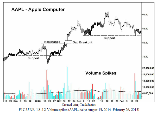
9.4. Examples of Volume Spikes
A number of volume spikes appear in Figure 18.12. The first accompanies a breakaway gap, and the second is showing that large support exists at that price level, the same level as filled the earlier gap. The third instance occurred when prices tried to break above the resistance level at $215. It ran into heavy selling and turned down. Finally, a volume spike occurred on the runaway gap in early March. The high volumes at the support and resistance levels are often important clues as to changes in direction. If price meets those levels on heavy volume and then reverses direction, those levels are extremely important and must be recorded for future use. For example, the high volume low at marker 2 provided the support that also stopped the decline at marker 3. It told of huge buying pressure at that level. Likewise, the gap in March was caused by the realization that the earlier sellers who stopped the retracement to the resistance level at $215 were gone, and the stock price was free to rise to the next level of resistance at $240.
9.5. Shock Spiral
When we looked at the Dead Cat Bounce (DCB) in Chapter 17, we saw that a substantial volume spike occurs prior to the formation. Remember that the DCB occurs after a shocking news announcement causes a sudden and dramatic shift in price direction, usually accompanied by a large gap or a price spike. An extreme spike in volume accompanies that sudden shift. Tony Plummer (2003) uses the term shock spiral to describe the entire A-B-C pattern from the shock (A) to the DCB (B) to the final decline (C). The usual shock spiral is to the downside, but Plummer advocates that it can also occur on the upside.
9.6. Volume Price Confirmation Indicator (VPCI)
In a series of two articles in Active Trader Magazine and one in the Journal of Technical Analysis, Buff Dormier (2005) introduced a method of comparing a volume-weighted price moving average with a simple price moving average to determine whether volume is confirming price action. A positive deviation in the Volume Price Confirmation Indicator (VPCI) suggested that the volume was confirming the price action, and a negative deviation suggested that the volume was contradicting price action.
9.7. Volume Dips
Sharp declines in volume are usually not meaningful. For example, the low volume in Figure 18.12 at the end of December is due to the Christmas holiday. The decline in volume generally indicates a decline in interest in the security, which is usually accompanied by a decline in volatility. For that reason, the issue should be ignored during the period of low volume, but the trader should be watching for an increase in volume and volatility. A volume dip is also typical for action just before a sudden expansion in price and volume, as in a breakout from a formation. Declines in volume can also occur before holidays, on summer days, and at other times when general activity is low.
Source: Kirkpatrick II Charles D., Dahlquist Julie R. (2015), Technical Analysis: The Complete Resource for Financial Market Technicians, FT Press; 3rd edition.
I like the helpful information you provide in your articles. I will bookmark your weblog and test again here frequently. I am moderately certain I will be informed lots of new stuff proper here! Good luck for the following!