Any economic model is a simplified statement of reality. We need to simplify in order to interpret what is going on around us. But we also need to know how much faith we can place in our model.
Let us begin with some matters about which there is broad agreement. First, few people quarrel with the idea that investors require some extra return for taking on risk. That is why common stocks have given on average a higher return than U.S. Treasury bills. Who would want to invest in risky common stocks if they offered only the same expected return as bills? We would not, and we suspect you would not either.
Second, investors do appear to be concerned principally with those risks that they cannot eliminate by diversification. If this were not so, we should find that stock prices increase whenever two companies merge to spread their risks. And we should find that investment companies which invest in the shares of other firms are more highly valued than the shares they hold. But we do not observe either phenomenon. Mergers undertaken just to spread risk do not increase stock prices, and investment companies are no more highly valued than the stocks they hold.
The capital asset pricing model captures these ideas in a simple way. That is why financial managers find it a convenient tool for coming to grips with the slippery notion of risk and why nearly three-quarters of them use it to estimate the cost of capital.[1] It is also why economists often use the capital asset pricing model to demonstrate important ideas in finance even when there are other ways to prove these ideas. But that does not mean that the capital asset pricing model is ultimate truth. We will see later that it has several unsatisfactory features, and we will look at some alternative theories. Nobody knows whether one of these alternative theories is eventually going to come out on top or whether there are other, better models of risk and return that have not yet seen the light of day.
1. Tests of the Capital Asset Pricing Model
Imagine that in 1931 ten investors gathered together in a Wall Street bar and agreed to establish investment trust funds for their children. Each investor decided to follow a different strategy. Investor 1 opted to buy the 10% of the New York Stock Exchange stocks with the lowest estimated betas; investor 2 chose the 10% with the next-lowest betas; and so on, up to investor 10, who proposed to buy the stocks with the highest betas. They also planned that at the end of each year they would reestimate the betas of all NYSE stocks and reconstitute their portfolios.[2] And so they parted with much cordiality and good wishes.
In time, the 10 investors all passed away, but their children agreed to meet in early 2018 in the same bar to compare the performance of their portfolios. Figure 8.8 shows how they had fared. Investor 1’s portfolio turned out to be much less risky than the market; its beta was only .48. However, investor 1 also realized the lowest return, 8.2% above the risk-free rate of interest. At the other extreme, the beta of investor 10’s portfolio was 1.55, about three times that of investor 1’s portfolio. But investor 10 was rewarded with the highest return, averaging 15.2% a year above the interest rate. So over this 87-year period, returns did indeed increase with beta.
As you can see from Figure 8.8, the market portfolio over the same 87-year period provided an average return of 12.1% above the interest rate[3] and (of course) had a beta of 1.0. The CAPM predicts that the risk premium should increase in proportion to beta, so that the returns of each portfolio should lie on the upward-sloping security market line in Figure 8.8. Since the market provided a risk premium of 12.1%, investor 1’s portfolio, with a beta of .48, should have provided a risk premium of 5.8% and investor 10’s portfolio, with a beta of 1.55, should have given a premium of 18.8%. You can see that, while high-beta stocks performed better than low-beta stocks, the difference was not as great as the CAPM predicts.
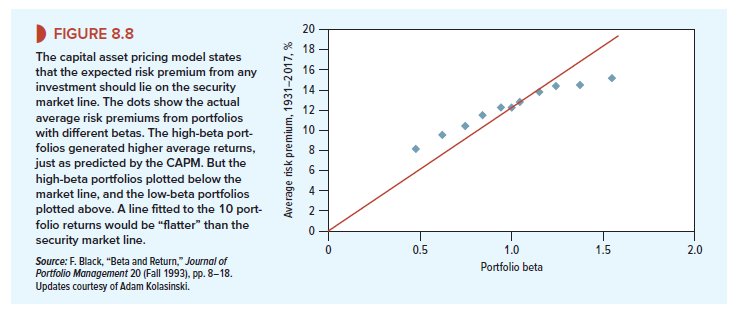
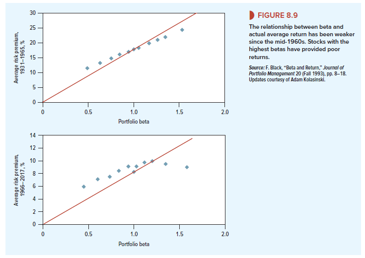
Although Figure 8.8 provides broad support for the CAPM, critics have pointed out that the slope of the line has been particularly flat in recent years. For example, Figure 8.9 shows how our 10 investors fared between 1966 and 2017. Now it is less clear who is buying the drinks: Returns are pretty much in line with the CAPM with the important exception of the two highest-risk portfolios. Investor 10, who rode the roller coaster of a high-beta portfolio, earned a return that was only marginally above that of the market. Of course, before 1967 the line was correspondingly steeper. This is also shown in Figure 8.9.
What is going on here? It is hard to say. Defenders of the capital asset pricing model emphasize that it is concerned with expected returns, whereas we can observe only actual returns. Actual stock returns reflect expectations, but they also embody lots of “noise”—the steady flow of surprises that conceal whether on average investors have received the returns they expected. This noise may make it impossible to judge whether the model holds better in one period than another.[4] Perhaps the best that we can do is to focus on the longest period for which there is reasonable data. This would take us back to Figure 8.8, which suggests that expected returns do indeed increase with beta, though less rapidly than the simple version of the CAPM predicts.[5]
The CAPM has also come under fire on a second front: Although return has not risen consistently with beta in recent years, it has been related to other measures. For example, the red line in Figure 8.10 shows the cumulative difference between the returns on small-firm stocks and large-firm stocks. If you had bought the shares with the smallest market capitalizations and sold those with the largest capitalizations, this is how your wealth would have changed. You can see that small-cap stocks did not always do well, but over the long haul, their owners have made substantially higher returns. Since the end of 1926, the average annual difference between the returns on the two groups of stocks has been 3.2%.
Now look at the green line in Figure 8.10, which shows the cumulative difference between the returns on value stocks and growth stocks. Value stocks here are defined as those with high ratios of book value to market value. Growth stocks are those with low ratios of book to market. Notice that value stocks have provided a higher long-run return than growth stocks.[6] Since 1926, the average annual difference between the returns on value and growth stocks has been 4.9%.
Figure 8.10 does not fit well with the CAPM, which predicts that beta is the only reason that expected returns differ. It seems that investors saw risks in “small-cap” stocks and value stocks that were not captured by beta.[7] Take value stocks, for example. Many of these stocks may have sold below book value because the firms were in serious trouble; if the economy slowed unexpectedly, the firms might have collapsed altogether. Therefore, investors, whose jobs could also be on the line in a recession, may have regarded these stocks as particularly risky and demanded compensation in the form of higher expected returns. If that were the case, the simple version of the CAPM cannot be the whole truth.
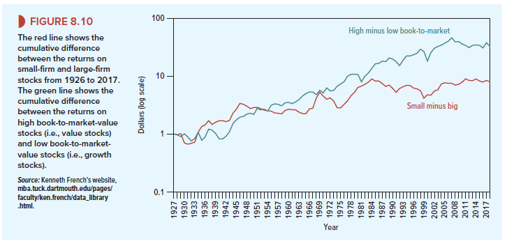
Again, it is hard to judge how seriously the CAPM is damaged by this finding. The relationship among stock returns and firm size and book-to-market ratio has been well documented. However, if you look long and hard at past returns, you are bound to find some strategy that just by chance would have worked in the past. This practice is known as “data mining” or “data snooping.” Maybe the size and book-to-market effects are simply chance results that stem from data snooping. If so, they should have vanished once they were discovered. There is some evidence that this is the case. For example, if you look again at Figure 8.10, you will see that since the mid-1980s, small-firm stocks have underperformed just about as often as they have overperformed.
There is no doubt that the evidence on the CAPM is less convincing than scholars once thought. But it will be hard to reject the CAPM beyond all reasonable doubt. Since data and statistics are unlikely to give final answers, the plausibility of the CAPM theory will have to be weighed along with the empirical “facts.”
2. Assumptions behind the Capital Asset Pricing Model
The capital asset pricing model rests on several assumptions that we did not fully spell out. For example, we assumed that investment in U.S. Treasury bills is risk-free. It is true that there is little chance of default, but bills do not guarantee a real return. There is still some uncertainty about inflation. Another assumption was that investors can borrow money at the same rate of interest at which they can lend. Generally borrowing rates are higher than lending rates. The model also assumes that all assets are marketable, but some assets, such as your human capital, cannot be bought and sold.
It turns out that many of these assumptions are not crucial, and with a little pushing and pulling, it is possible to modify the capital asset pricing model to handle them. The really important idea is that investors are content to invest their money in a limited number of benchmark portfolios. (In the basic CAPM, these benchmarks are Treasury bills and the market portfolio.)
In these modified CAPMs, expected return still depends on market risk, but the definition of market risk depends on the nature of the benchmark portfolios. In practice, none of these alternative capital asset pricing models is as widely used as the standard version.
I like this web site because so much utile stuff on here : D.