Using Weights in Stata

Stata understands four types of weighting:

aweight   Analytical weights, used in weighted least squares (WLS) regression and similar procedures.

fweight    Frequency weights, counting the number of duplicated observations. Frequency weights must be integers.

iweight    Importance weights, however you define importance.

pweight   Probability or sampling weights, proportional to the inverse of the probability that an observation is included due to sampling strategy.

Not all types of weighting have been defined for all types of analyses. We cannot, for example, use pweight with the tabulate command. Using weights effectively requires a clear understanding of what we want them to accomplish in a particular analysis.

Weights have many statistical applications, including methods of compensating for originally disproportionate or complex sampling designs — a common feature of surveys. pweight provides one way to adjust for sampling bias, using probability weights proportional to 1/(probability of selection). Analysis of survey data using probability weights is a particular strength of Stata, introduced in Chapter 4.

In some instances, weighting involves something simpler — an aggregate dataset in which the variables are statistics summarizing many individual observations. For example, dataset Nations2.dta contains United Nations human-development indicators that characterize living conditions in 194 nations.

The mean life expectancy is 68.7 years:

The mean above represents the average life expectancy for the 194 nations in the sample, rather than the average life expectancy for the 7 billion people who live in those nations. That is, it weights the life expectancy of the smallest nation (Tuvalu, a Pacific island nation with about 10,000 people) the same as the life expectancy of the largest (China, population about 1.3 billion). Using population as a frequency weight, we get a better estimate of the mean life expectancy for all 7 billion people.

Probability weights (pweight) get more attention in Chapter 4. Analytical weights (aweight) are useful in graphing (Chapter 3) and for weighted least squares (Chapters 7, 8), among other things. Importance weights (iweight) have no fixed definition, but could be applied in programs written for special purposes.

Source: Hamilton Lawrence C. (2012), Statistics with STATA: Version 12, Cengage Learning; 8th edition.

Creating Random Data and Random Samples in Stata

The pseudo-random number function runiform() lies at the heart of Stata’s ability to generate random data or to sample randomly from the data at hand. The Base Reference Manual (Functions) provides a technical description of this 32-bit pseudo-random generator. If we presently have data in memory, then a command such as the following creates a new variable named randnum, having apparently random 16-digit values over the interval [0,1).

. generate randnum = runiform()

We could also create a random dataset from scratch. To do so we first clear other data from memory (if they were valuable, save them first). Next, set the number of observations desired for the new dataset. Explicitly setting the seed number makes it possible to later reproduce the same “random” results. Finally, we generate our random variable. The following commands create a dataset with 10 observations and one variable, called randnum.

In combination with Stata’s algebraic, statistical and special functions, runiform() can simulate values sampled from a variety of theoretical distributions. If we want newvar sampled from a uniform distribution over [0,428) instead of the usual [0,1), we type

. generate newvar = 428 * runiform()

These will still be 16-digit values. Perhaps we want only integers from 1 to 428 (inclusive). The ceiling or ceil() function provides a simple way to do this:

. generate newvar = ceil(428 * runiform())

To simulate 1,000 throws of a six-sided die, type . clear

We theoretically expect 16.67% ones, 16.67% twos and so on, but in any one sample like these 1,000 “throws,” the observed percentages will vary randomly around their expected values.

To simulate 1,000 throws of a pair of six-sided dice, type

We can use _n to begin an artificial dataset as well. The following commands create a new 5,000-observation dataset with one variable named index, containing values from 1 to 5,000.

. set obs 5000
. generate
index = _n
. summarize

To generate random variables from a normal (Gaussian) distribution, use the function rnormal(). The following example creates a dataset with 2,000 observations and 2 variables: z from an N(0,1) population, and u from N(500,75).

. clear
. set obs 2000
. generate
z = rnormal()
. generate
u
= rnormal(500,75)

The actual sample means and standard deviations differ slightly from their theoretical values

If z follows a normal distribution, v = ez follows a lognormal distribution. To form a lognormal variable v based upon a standard normal distribution,

. generate v = exp(rnormal())

Taking logarithms, of course, normalizes a lognormal variable.

To simulate w values drawn randomly from an exponential distribution with mean and standard deviation p = a = 3,

. generate w = -3 * ln(runiform())

For other means and standard deviations, substitute other values for 3. x5 follows a x2 (chi-squared) distribution with five degrees of freedom:

. generate x5 = rchi2(5)

y follows a binomial distribution, given 10 trials and success probability .2:

. generate y = rbinomial(10,.2)

t45 follows a Student’s t distribution with 45 degrees of freedom:

. generate t45 = rt(45)

Type help random to see a list of other available functions for generating random variables from beta, gamma, hypergeometric, negative binomial or Poisson distributions.

The drawnorm command provides an alternative way to generate multiple normal variables, and optionally to specify the correlations between them. Using drawnorm to generate 5,000 observations of just one variable from N(0,1), type

Below, we will create three further variables. Variable x1 is from an N(0,1) population, variable x2 is from N(100,15), and x3 is from N(500,75). Furthermore, we define these variables to have the following population correlations:

The procedure for creating such data requires first defining the correlation matrix C, and then using C in the drawnorm command:

Compare the sample variables’ correlations and means with the theoretical values given earlier. Random data generated in this fashion can be viewed as samples drawn from theoretical populations. We should not expect the samples to have exactly the theoretical population parameters (in this example, an x3 mean of 500, x1-x2 correlation of 0.4, x1-x3 correlation of -.8, and so forth). Artificial uncorrelated or correlated datasets also can be created via menus and dialog boxes, under

Statistics > Other > Draw a sample from a normal distribution

or

Statistics > Other > Create a dataset with specified correlation structure

The command sample makes unobtrusive use of runiform’s random generator to obtain random samples of the data in memory. For example, to discard all but a 10% random sample of the original data, type

. sample 10

When we add an in or if qualifier, sample applies only to those observations meeting our criteria. For example,

. sample 10 if age < 26

would leave us with a 10% sample of those observations with age less than 26, plus 100% of the original observations with age > 26.

We could also select random samples of a particular size. To discard all but 90 randomly- selected observations from the dataset in memory, type

. sample 90, count

The section in Chapter 14 on Monte Carlo simulations provides further examples of random variable generation.

Source: Hamilton Lawrence C. (2012), Statistics with STATA: Version 12, Cengage Learning; 8th edition.

Writing Programs for Data Management in Stata

Data management on larger projects often involves repetitive or error-prone tasks that are best handled by writing specialized Stata programs. Advanced programming can become very technical, but we could also begin by writing simple programs that consist of nothing more than a sequence of Stata commands, typed and saved as a text file. Text files can be created using your favorite word processor or text editor, which should offer several kinds of text files among its options under File > Save As. One convenient way to create such text files is through Stata’s Do-file Editor, which is brought up by clicking Window > Do-file Editor or the icon . Alternatively, bring up the Do-file Editor by typing the command doedit, or doedit filename iffilename exists. Commands in the Review window can be highlighted and sent directly to the Do-File Editor (right-click to get this menu choice). Commands can also be copied and pasted into the Do-File Editor from other sources such as log files or the Results window.

Across several sections of this chapter we began building a global climate dataset, starting with temperature, then reshaping and merging the Multivariate El Nino/Southern Oscillation Index (MEI), and finally graphing temperature and MEI together as Figure 2.4. The commands that executed each of these steps could be assembled into a single do-file, as follows. Note the use of /// to continue the long graph twoway command onto more than one line. At its end, this do- file saves Figure 2.4 in Stata graph (.gph) and enhanced Windows metafile (.emf) file formats.

insheet using C:\data\global.csv, comma clear

label data “Global climate”

label variable year “Year”

label variable month “Month”

label variable temp “NCDC global temp anomaly vs 1901-2000, C”

generate edate = mdy(month, 15, year)

label variable edate “elapsed date”

format edate %tdmCY

sort year month

order year month edate

save C:\data\global2.dta, replace

use C:\data\MEI0.dta, clear

reshape long mei, i(year) j(month)

sort year month

label variable mei “Multivariate ENSO Index”

save C:\data\mei1.dta, replace

use C:\data\global2.dta, clear

merge 1:1 year month using c:\data\mei1.dta

sort year month

drop _merge

compress

save c:\data\global3.dta, replace graph twoway line temp edate ///

|| line mei edate, yaxis(2) lpattern(dash) ///

|| if year>1949, legend(row(2)) graph save

Graph “C:\graphs\fig02_04.gph”, replace

graph export “C:\graphs\fig02_04.emf”, as(emf) replace

This file could be written by highlighting commands in the Review window, then right-click and Send to Do-file Editor. Save the do-file with a new name, such as global.do. Once the do-file is created, we can run it by selecting File > Do and opening global.do from the menus; or just by typing a command such as

. do global

Such batch-mode programs are usually saved with a .do extension. More elaborate programs (defined by either do-files or automatic ado-files) can be stored in memory, and can call other programs in turn, creating new Stata commands and opening a world of possibilities for the adventurous.

Stata ordinarily interprets the end of a command line as the end of that command. This is reasonable onscreen, where the line can be arbitrarily long, but does not work as well when we are typing commands in a text file. Three forward slashes (///) at the end of a physical line tell Stata that the command is continued on the next physical line. The command executes only after reaching a line that does not end with ///

Another way to handle long lines in do-files is to use a #delimit ; command, which sets a semicolon as the end-of-command delimiter. In the example below we make a semicolon the delimiter, type a long command that does not end until a semicolon appears, and then finally reset the delimiter to its usual value, a carriage return ( cr )

#delimit ;

graph twoway line temp edate

|| line mei edate, yaxis(2) lpattern(dash)

|| if year>1949, legend(row(2)) ;

#delimit cr

Stata normally pauses each time the Results window becomes hill of information, and waits to proceed until we press the space bar or any other key (or click  ). Instead of pausing, we can ask Stata to continue scrolling until the output is complete. Typed in the Command window or as part of a program, the command

. set more off

calls for continuous scrolling. This is convenient if our program produces much screen output that we don’t want to see, or if it is writing to a log file that we will examine later. Typing

. set more on

returns to the usual mode of waiting for keyboard input before scrolling.

Source: Hamilton Lawrence C. (2012), Statistics with STATA: Version 12, Cengage Learning; 8th edition.

Histograms by using Stata

Histograms, displaying the distribution of measurement variables, are most easily produced with their own command histogram. For examples, we return to the data on 194 nations seen earlier in Chapter 2, containing human-development indicators gathered by the United Nations.

Figure 3.1 shows a simple histogram of adfert, the adolescent fertility rate. It was produced by the following command:

Under the Prefs > Graph Preferences menus, we have the choice of several pre-designed schemes for the default colors and shading of our graphs. Custom schemes can be defined as well. Most examples in this book employ the s2color scheme, which among other things calls for shaded margins around each graph. Experimenting with the different monochrome and color schemes helps to determine which works best for a particular purpose. A graph drawn and saved under one scheme can subsequently be retrieved and re-saved under a different one, as described later.

Options can be listed in any order following the comma in a graph command. Figure 3.1 illustrates one option: percent (instead of density, the default) is shown on the vertical axis. Once a graph is onscreen, menu choices provide the easiest way to print it, save it to disk, or copy and paste it into another program such as a word processor.

Figure 3.1 reveals the positive skew of this distribution, with a mode not far above 0 and an upper limit around 200. It is hard to describe the graph more specifically because the bars do not line up with x-axis tick marks. Figure 3.2 contains a version of the same histogram but with some optional improvements:

frequency   Frequencies are shown on the vertical (y) axis.

start(0)   The histogram’s first bar (bin) starts at 0.

width(10) The width of each bar (bin) is 10.

xlabel(0(20)200) The x axis is labeled from 0 to 200, in increments of 20.

xtick(10(20)210) The x axis has tick marks from 10 to 210, in increments of 20. ylabel(0(2)12, grid gmax)

ylabel(0(2)12, grid gmax) The y axis is labeled from 0 to 35, in increments of 5. A grid of horizontal lines is drawn, including a line at the maximum value.

title(“Adolescent fertility rate in 194 nations”) The graph has a title at top.

The command below is shown as four lines to make it easier to read. To make this four-line command work in a do-file, we could add /// to the ends of the first three lines, indicating the command continues on the next physical line.

Figure 3.2 helps us to describe the distribution more specifically. For example, we now see that in 34 nations, the adolescent fertility rates are between 10 and 20. Type help histogram to see a complete list of options and syntax for this command. There also exists a separate command, twoway histogram, that draws histograms allowing other options common to the twoway family of graphs discussed later. You can learn about it by typing help twoway histogram.

One option that histogram shares with other graph types is the ability to create multiple small graphs for each value of a specified variable, using a by(varname) option. Figure 3.3 illustrates with histograms of adfert for each of the five regions, along with a sixth (total) histogram showing the distribution for all regions.

Source: Hamilton Lawrence C. (2012), Statistics with STATA: Version 12, Cengage Learning; 8th edition.

Box Plots by using Stata

Box plots convey information about center, spread, symmetry and outliers at a glance. For example, Figure 3.4 is a simple box plot of adfert (adolescent fertility rate) obtained by typing

Figure 3.4 confirms the positive skew of this distribution, and shows five high outliers. The box in a box plot extends from approximate first to third quartiles, a distance called the interquartile range (IQR). It therefore contains roughly the middle 50% of the data. (Stata’s box plots define quartiles in the same manner as summarize, detail.) Outliers, defined as observations more than 1.5(IQR) beyond the first or third quartile, are plotted as individual points.

Figure 3.5 identifies the adfert outliers by labeling their markers with values of variable country (country names). It also specifies a non-default title for the y axis. The marker option can control the symbols and other properties denoting outliers as well. Specifying marker(1) in this example means that this option refers to the first-named y variable. There is only one y variable here, but in other cases we could have two or more, and mark their outliers in distinct ways.

One of the most common applications for box plots involves comparing the distribution of one variable over categories of a second. Figure 3.6 compares the distribution of adfert across region. The overall median is indicated by a horizontal line placed by the yline(39.3) option.

. graph box adfert, marker(1, mlabel(country)) yline(39.3) over(region)

Box plots can have a horizontal orientation instead of vertical, via the graph hbox command. Figure 3.7 illustrates using per capita carbon dioxide emissions (co2), another variable from the Nations2.dta dataset. This example also shows off several title or labeling options, which could be applied to any type of graph. The note( ) and caption( ) options place text below the graph. In this figure, “Statistics with Stata” appears in bold, and “Example of horizontal box plots” in italics. In the ytitle (y axis title, which in a horizontal box plot refers to the horizontal axis), CO2 is given its proper subscript. Bold, italic, subscript and other text attributes are controlled within graphs using Stata markup and control language (SMCL) features. Type help graph text to see other possibilities and examples.

. graph hbox co2, over(region)

note(“note: {bf:Statistics with Stata}, version 12”)

caption(“caption: United Nations Human Development Report 2011”)

title(“title: {it:Example of horizontal box plots}”)

ytitle(“ytitle: Tons of CO{subscript:2} emitted per capita”)

Individual outliers are not labeled in Figure 3.7 because they would be hard to read in the horizontal format. The three outliers in the Americas are the U.S., Canada, and Trinidad and Tobago (the leading Caribbean oil and gas producer). Australia has the highest per capita CO2 in Oceania. Four oil-exporting nations comprise the very high outliers for Asia. Looking closer at outliers, which box plots make obvious, we often find that they are interesting observations in their own right and not just a statistical complication.

Numerous options control the appearance, shading and details of boxes in a box plot; type help graph box for a list. Axis labeling, tick marks, titles, and the by(varname) or by(varname, total) options work in a similar fashion with other Stata graphing commands. For example, by(region) would have drawn individual box plots in five small window panes, instead of five box plots in one graph as over(region) did in Figures 3.6 and 3.7.

Source: Hamilton Lawrence C. (2012), Statistics with STATA: Version 12, Cengage Learning; 8th edition.

Scatterplots and Overlays by using Stata

Scatterplots belong to a broad family called twoway graphs. Stata’s basic scatterplot command has the form

. graph twoway scatter y x

where y is the vertical or y-axis variable, and x is the horizontal or x-axis one. (The initial graph twoway part of this command is optional, but kept here to emphasize a family connection that becomes important later on.) For example, again using the Nations2.dta dataset, we could plot life (life expectance) against school (mean years of schooling), with the result shown in Figure 3.8. Each point in Figure 3.8 represents one nation.

As with histograms, we can use xlabel, xtitle, ylabel and so forth to control x or y axis labels, titles etc. As with box plots, scatterplots also allow control of the shape, color, size, labeling and other attributes of markers. Figure 3.8 employs the default markers, which are solid circles. The same effect would result if we included the option msymbol(O). Other possibilities include msymbol(Th) (large hollow triangles), msymbol(d) (small diamonds), msymbol(+) (plus signs) or msymbol(i) (invisible symbols, handy for some purposes). Type help scatter for a complete list of markers and other options.

The mcolor option controls marker colors. For example, the command

. graph twoway scatter waste metro, msymbol(S) mcolor(purple)

would produce a scatterplot in which the symbols are large purple squares. Type help colorstyle for a list of available colors, which can also apply to bars, lines, text and other elements of any Stata graph.

One interesting possibility with scatterplots is to make symbol size (area) proportional to a third variable, thereby giving the data points different visual weight. For example, we might redraw the scatterplot of life against school, but make the symbol size reflect each country’s population (pop). This is done in Figure 3.9, using the [fweight=rar«fime] or frequency weight feature. Hollow circles, msymbol(Oh), provide a suitable shape.

Frequency weights are useful with some other graph types as well. Weighting can be a deceptively complex topic because weights come in several types and have different meanings in different contexts. For an overview of weighting in Stata, type help weight.

A key feature of Stata’s graph twoway family is that we can overlay two or more graphs to build more complex images. For example, to draw a scatterplot of life against school, with hollow circles as marker symbols, we would type

. graph twoway scatter life school, msymbol(Oh)

Simple regression lines (lfit) are a different twoway type. To see the line for life regressed on school, with a line of medium-thick width, type

. lfit life school, lwidth(medthick)

But often, we want to see the scatterplot and regression line together. That is accomplished by overlaying the lfit graph on top of the scatter graph using one command with || (“pipes”) to indicate the overlay. The command below is shown as two lines, but it should be typed as one physical line.

. graph twoway scatter life school, msymbol(Oh)

|| lfit life school, lwidth(medthick)

Finally, if we have certain options that should apply to the image as a whole, these can be placed in the command after a final ||. Figure 3.10 does this. The general options include not only ylabel, xlabel and xtick but also specify some details about the legend.

The legend option in Figure 3.10 specifies three things:

col(1)                  The legend should have just one column, and hence two rows.

ring(0)                The legend is placed within the plot region, instead of outside it. A legend outside the plot region crowds the data into a smaller space.

position(11)        The legend goes at the 11 o’clock position, which in this graph happens to be empty of data.

Placing a legend within the plot region but not over any actual data is a nice trick if we can manage it. By experimenting with defaults or other placements, you can see for yourself how this works. Consult legend_options under help twoway options for many more ways to control the position, contents and appearance of legends.

Figure 3.11 takes these ideas a step further in a graph with three overlays, one of them another twoway type: lfitci, meaning linear regression with confidence intervals. The lfitci graph is specified first, then two scatterplots are placed on top of that so we see their points over the gray confidence bands. If we specified lfitci last, the confidence bands would paint over some scatterplot points.

. graph twoway lfitci life school, lwidth(medthick)

|| scatter life school, msymbol(Th)

|| scatter life school if school > 8 & life < 55, msymbol(S) mlabel(country)

|| , ylabel(45(5)85) xlabel(2(2)12) xtick(1(2)13)

legend(col(1) ring(0) position(11) label(3 “Life expectancy”) order(3 2 1))

By default, lfitci shows confidence bands for the conditional mean of y, rather than for individual predicted values. Stata refers to standard errors for the conditional mean as “standard deviation of prediction” or stdp, so the default in Figure 3.11 is equivalent to typing

graph twoway lfitci life school, stdp

Standard errors for individual predicted values are termed “standard deviation of forecast” or stdf. To see the wider confidence bands for individual predictions, we could have typed instead

graph twoway lfitci life school, stdf

The other two plots in Figure 3.11 are both scatterplots, illustrating how to label (or plot with different symbols) certain selected observations. Identifying two outliers is accomplished here by drawing one ordinary scatterplot with all the data, and hollow triangles as markers:

|| scatter life school, msymbol(Th)

Then we overlay that with a second scatterplot (the third plot in this image) restricted by an if qualifier to countries for which mean schooling is greater than 8 years and life expectancy is greater than 55. Only two countries at lower right meet this criterion. They are plotted as solid squares (drawn over the triangles) and labeled with country names. Botswana and South Africa turn out to be the nations with this unusual combination of good education but poor life expectancy, which makes them stand apart from the up-to-right trend that characterizes most other nations.

|| scatter life school if school > 8 & life < 55, msymbol(S) mlabel(co«nhy)

The overall options for Figure 3.11 specify x axis labels and tick marks, and also control the legend. Again we give the legend one column, and place it at 11 o’clock within the plot region. The label for the third y variable in the legend is specified as “Life expectancy” instead of the much longer variable label that would be used by default.

legend(col(1) ring(0) position(11) label(3 “Life expectancy”)

The legend() option ends with an order(3 2 1) suboption specifying that we want the legend items to be in order 3-2-1. This is not quite as simple as it appears because to Stata’s way of thinking our three overlaid plots in Figure 3.11 actually involve four variables that could be in the legend. Given numbers by their sequence in the initial graph twoway command, these are (1) the 95% confidence interval, (2) the fitted values or linear regression predictions, (3) life expectancy for the full dataset, our first overlaid scatterplot, and (4) life expectancy for just Botswana and South Africa, our second overlaid scatterplot. By specifying order(3 2 1) we asked for the legend in Figure 3.11 which lists (3) first, (2) second and (1) last — and leaves (4) out, because it is not mentioned in the order() suboption. Thus, the order() suboption controls not only what order variables appear in the legend, but whether they appear at all.

Scatterplot matrices are not twoway plot types and cannot be overlaid with other graphs, but they involve multiple scatterplots that follow the same marker symbol conventions. Figure 3.12 shows a scatterplot matrix for five variables from Nations2.dta.

A scatterplot matrix is the visual counterpart to a correlation matrix, which can prove useful in multivariate analysis. They provide a compact display of relationships between a number of variable pairs, allowing the analyst to scan for signs of nonlinearity, outliers or clustering that might affect statistical modeling. Nonlinear relationships involving gdp (per capita Gross Domestic Product) stand out prominently in Figure 3.12, giving a warning we would not see from the correlation matrix alone.

The half option specified that Figure 3.12 should include only the lower triangular part of the matrix. The upper triangular part is symmetrical and basically redundant. msymbol(o) called for small circles as markers, just as we might with a scatterplot. Control of the axes is more complicated, because there are as many axes as variables; type help graph matrix for details.

When the variables of interest include one dependent or effect variable, and several independent or cause variables, it helps to list the dependent variable last in the graph matrix command’s variable list. That results in a neat row of dependent-versus-independent variable (y vs. x) graphs across the bottom row of the matrix. The last-named or bottom-row variable in Figure 3.12, life (life expectancy), is analyzed as a dependent variable in Chapters 7 and 8.

Source: Hamilton Lawrence C. (2012), Statistics with STATA: Version 12, Cengage Learning; 8th edition.

Line Plots and Connected-Line Plots by using Stata

Mechanically, connected-line plots (graph twoway connect) are just scatterplots in which the points are connected by line segments. Line plots (graph twoway line) show the line segments without markers for the scatterplot points. Both belong to Stata’s versatile graph twoway family, which can be overlaid in any combinations. The scatterplot options that control axis labeling and markers work much the same with connected-line and line plots as well. Further options control width, pattern, color and other characteristics of the lines themselves.

Connected-line and line plots tend to have different uses than scatterplots. For example, they serve well to graph changes in a variable over time. To illustrate, we return to dataset Arctic9.dta, which contains 33 years of Arctic sea ice and temperature observations.

A line plot of area against year depicts the reduction in September sea ice area over these years, and makes an abrupt drop in 2007 particularly apparent (Figure 3.13).


Figure 3.14 offers a more elaborate time plot, adding a second line for sea ice extent (the area covered by at least 15% ice). We label the x axis from 1980 to 2010 in 5-year increments (xlabel(1980(5)2010) but suppress the x-axis title because “Year” is obvious, and unnecessarily wastes data space. The y axis extends down to zero, a possible state of some interest to Arctic observers. Y axis labels go from 0 to 8 in increments of 1, with grid lines including the minimum (0) and maximum (8) labeled values: ylabel(0(1)8, grid gmin gmax).

. graph twoway line area extent year, xlabel(1980(5)2010) xtitle(“”)

lwidth(medium medthick) lpattern(solid dash)

legend(row(2) ring(0) position(9)

label(1 “Area”) label(2 “Extent”) order(2 1))

ylabel (0 (1) 8, grid gmin gmax) ytitle ( “Million km{superscript: 2} “)

title(“Arctic sea ice, September 1979’=char(150)’2011”)

The first-named y variable in the Figure 3.14 command (area) is graphed with a line of medium width and solid pattern. The second y variable (extent) is graphed with a heavier line of medium-thick (medthick) width and dashed pattern. legend() options simplify the labels in the legend, and place extent first corresponding to its higher position in the graph.

Ice area and extent are measured in millions of square kilometers. The ytitle(“Million km{superscript:2}”) option displays this as “Million km2 ”. Type help graph text for more about controlling text attributes in graphs. Figure 3.7 gave some other examples.

Another typographical trick in Figure 3.14 is more subtle: the years 1979-2011 in the title are separated by an n-dash (-) rather than a hyphen (-). The n-dash is a standard character that does not appear on your keyboard, but is identified by the ASCII code 150. The title option for Figure 3.14 inserted ASCII character 150 between 1979 and 2011 by writing 1979’=char(150)’2011. Note the use of left and right single quotes.

Figure 3.15 employs the n-dash along with two other ASCII characters in a time plot where the two y variables have different scales and are graphed together using overlays. For this example we overlay a line plot of area vs. year with a connected-line plot (connect, which combines the features of scatter with line) of Arctic temperature vs. year. The graph shows September sea ice declining as annual Arctic air temperatures rise; the two variables influence each other, and both reflect larger changes originating outside of the Arctic.

. graph twoway line area year, ylabel(0(1)6) yline(0)

ytitle(“Ice area, million km’=char(178)'”)

|| connect tempN year, yaxis(2) ylabel(-1(1)2, axis(2)) msymbol(+)

ytitle(“Arctic temperature anomaly, ‘=char(186)’C”, axis(2))

|| , xlabel(1980(5)2010) xtitle(“”)

legend(row(2) ring(0) position(6)

label(1 “Ice area”) label(2 “Temperature”) order(1 2))

title(“Arctic September sea ice and annual temperature,

1979’=char(150)’2011″, size(medium))

In Figure 3.15, Arctic temperature anomaly is assigned to yaxis(2), which is the right-hand y axis. Temperature values are marked as plus signs (msymbol(+)). A legend inside the data region at 6 o’clock position identifies the two variables. Instead of using {superscripts} to write km2 on the left-handy axis (as was done earlier in Figure 3.14), Figure 3.15 uses ASCII character 178 — which also is a superscript 2 but looks slightly better. On the right-hand y axis, ASCII character 186 provides the degree symbol for °C.

How do we know that character 150 is an n-dash, character 186 a degree symbol, and so forth? Figure 3.16 gives a table of ASCII codes, drawn by a convenient utility named asciiplot. This is not part of Stata but written in Stata’s programming language by geographical statistician Nicholas Cox. Type findit asciiplot for instructions on how to download and install this program, which makes the table in Figure 3.16 available whenever you type asciiplot.

Figure 3.15 illustrated the simplest connect style, in which data points are connected by straight line segments. Other connect choices are listed below. The default straight lines correspond to connect(direct) or connect(l). For more details, see help connectstyle.

Source: Hamilton Lawrence C. (2012), Statistics with STATA: Version 12, Cengage Learning; 8th edition.

Other Twoway Plot Types by using Stata

In addition to basic line plots and scatterplots, the graph twoway command can draw a wide variety of other types. This section illustrates several more; type help graph twoway for a complete list.

Earlier, in Figures 3.10 and 3.11, we used graph twoway lfit (linear fit) to draw a simple regression line. A similar command, graph twoway qfit, draws a quadratic or second-order polynomial regression curve. Figure 3.17 illustrates using another variable from the Arctic9.dta dataset, sea ice volume. Volume is measured in cubic kilometers, so ASCII character 179 here provides the superscript for km3. Writing {superscripts} would also have worked.

The quadratic curve together with a horizontal line drawn at y = 0 (yline(0)) emphasize that mean September ice volume has been falling toward the floor. A linear model would not capture its accelerating trajectory, but in some respects the quadratic mode is unrealistic too. The curve in Figure 3.17 shows a slight but counterfactual slight rise in the early years, and if extrapolated to future years it would predict ice volumes below zero. In Chapter 8 we return to these data and consider a more plausible curve.

Figure 3.18 takes a different look at the same volume time series, this time using a range-area plot, graph twoway rarea, to show 95% uncertainty limits of plus or minus 1.35 thousand km3 (Schweiger et al. 2011). The range-area or rarea command looks for two y variables — in this example, volumehi and volumelo — that define the upper and lower bounds of an area to be shaded. A line plot of volume itself is drawn with a thick line (lwidth(thick)) and overlaid on top of the rarea plot so it can be seen over the shading.

The graph command drawing Figure 3.18 also specifies colors for both the rarea and line plots. color(gs13) assigns the rarea bands a gray scale color of13, closer to white (gs16) than to black (gs0). The line plot overlaid on these bands is colored green. Controlling the colors (instead of going with their defaults) does little for an image published in black and white, but has obvious value for other media. Type help colorstyle to see a list of colors available for the elements of Stata graphics.

Figure 3.19 overlays two other graph twoway types to make a different image from the same Arctic ice volume information. In this image the volume estimates themselves are drawn by graph twoway bar, while the uncertainty bands appear as range spikes (rspike) instead of the range area (rarea) we saw in Figure 3.18. The bars have a medium gray color (color(gs10)). Note that Figure 3.18 overlays the volume line on top of the uncertainty range area, whereas Figure 3.19 overlays the uncertainty range spikes on top of the volume bars. The order in both cases is required for visibility. You can experiment with similar commands to see how that works.

graph twoway bar should not be confused with graph bar, a different command introduced in the next section. twoway bar is basically a y-versus-x plot that assumes two measurement variables, and shares features with other twoway types such as y and x axis labeling and the possibility of overlays.

Stata offers more than 40 different graph twoway types, too many to catalog here. Later chapters demonstrate several others; type help graph twoway for the complete list, with links to the syntax of individual commands.

Source: Hamilton Lawrence C. (2012), Statistics with STATA: Version 12, Cengage Learning; 8th edition.

Bar Charts and Pie Charts by using Stata

The graph bar command, unlike graph twoway bar, works well to display relationships involving one or more categorical variables. Such graphs prove particularly useful with survey data, as will be shown in Chapter 4. This section serves just to introduce the command, with an example using variables from the cross-national dataset Nations_2.dta.

. use C:\data\Nations2.dta, clear

. describe region gdp pop

Variable gdp, per capita Gross Domestic Product, has values ranging from 279.8 to 74,906 dollars per person. Five-digit numbers often look unwieldy as axis labels, so we start by generating a new variable, gdp1000, expressing Gross Domestic Product in thousands of dollars. Figure 3.20 depicts the mean and median of gdp1000 over values of region, using graph bar.

Figure 3.20 includes labels giving the height of each bar, displayed in numerical format(%3.1f) — which means a fixed format with three digits, one of them right of the decimal. graph bar can display not only means or medians but also other statistics including various percentiles, minimum, maximum or count. It also could show these statistics for more than one variable, if they have similar scales.

The legend in Figure 3.20 is placed within the data region at 11 o’clock: ring(0) position(11). It has two columns to parallel the side-by-side arrangement of bars. symxsize(*.5) causes the horizontal (x) dimension of the symbols in the legend to appear at half their default size, which saves space and also makes the symbols more similar to the widths of the bars themselves.

The graph bar example above specifies a blue color for bar 1 and orange for bar 2. Blue and orange may not show on this page, but even converted to black and white the blue and orange bars look quite different. As Nicholas Cox has pointed out, blue and orange form a noteworthy pair because they appear visually distinct to readers with most types of color vision deficiencies, unlike (for example) red and green. Analysts might take this consideration into account when designing graphs where distinguishing between colors is critical.

Bar charts can provide clear visualizations of relationships involving many categories and two or more variables. Pie charts, on the other hand, rarely clarify the analysis but are popular for some public presentations. Figure 3.21 illustrates Stata’s graph pie command, showing the breakdown of world population by region. The variable pop ranges from just under 10,000 to 1.32 billion (1.32e+09, meaning 1.32*109 = 1,320,000,000). To make our pie chart readable it helps to create a new variable, popmil or population in millions.

The pie(2, explode) option “explodes” the second pie slice (Americas) for emphasis. plabel(_all sum, format(%4.0f) requests labels for all of the pie slices, giving the sum ofpopmil (that is, the total population in millions) for each region. The pie labels are have format(%4.0f), meaning a fixed numerical format with four digits, none right of the decimal.

Type help graph pie to see other pie chart options, including methods for differently-organized data. One interesting variation uses the by( ) option to create an image containing multiple small pie charts that can be visually compared.

Source: Hamilton Lawrence C. (2012), Statistics with STATA: Version 12, Cengage Learning; 8th edition.

Symmetry and Quantile Plots by using Stata

Box plots, bar charts and histograms summarize measurement variable distributions, hiding individual data points to clarify overall patterns. Symmetry and quantile plots, on the other hand, include points for every observation. They take more effort to read than summary graphs, because they convey more detailed information.

A histogram of the ratio of females to males in the labor forces of 177 countries, from Nations2.dta, appears in Figure 3.22. A superimposed normal (Gaussian) curve indicates that femlab has a heavier-than-normal left tail (countries with relatively few females in the labor force), and a lighter-than-normal right tail — the definition of negative skew.

Figure 3.23 depicts this distribution as a symmetry plot. It plots the distance of the ith observation above the median (vertical) against the distance of the ith observation below the median. All points would lie on the diagonal line if this distribution were symmetrical. Instead, we see that distances below the median grow steadily larger than corresponding distances above the median, a symptom of negative skew.

Quantiles are values below which a certain fraction of the data lie. For example, a .3 quantile is that value higher than 30% of the data (similar to the 30th percentile). If we sort n observations in ascending order, the ith value forms the (i-.5)/n quantile. Quantile plots automatically calculate what fraction of the observations lie below each data value, and display the results graphically as in Figure 3.24. Quantile plots provide a reference for someone who does not have the original data at hand. From well-labeled quantile plots, we can estimate order statistics such as median (.5 quantile) or deciles (.1, .2, .3 quantiles and so forth). We could also read a quantile plot to estimate the fraction of observations falling below a given value.

Quantile-normal plots, also called normal probability plots, compare quantiles of a variable’s distribution with quantiles of a theoretical normal distribution having the same mean and standard deviation. They allow visual inspection for departures from normality in every part of a distribution, which can help guide decisions regarding normality assumptions and efforts to find a normalizing transformation. Figure 3.25, a quantile-normal plot offemlab, confirms the negative skew noticed earlier. The grid option calls for a set of lines marking the .05, .10, .25 (first quartile), .50 (median), .75 (third quartile), .90, and .95 quantiles of both distributions. The .05, .50, and .95 quantile values are displayed along the top and right-hand axes.

Quantile-quantile plots (not shown) resemble quantile-normal plots, but compare quantiles (ordered data points) of two empirical distributions instead of comparing one empirical distribution with a theoretical normal distribution. Regression with Graphics (Hamilton 1992a) includes an introduction to reading these and other quantile-based plots. Chambers et al. (1983) provide more details. Related Stata commands include pnorm (standard normal probability plot), pchi (chi-squared probability plot) and qchi (quantile-chi-squared plot). Type help quantile for details on this graphical family.

Source: Hamilton Lawrence C. (2012), Statistics with STATA: Version 12, Cengage Learning; 8th edition.

Adding Text to Graphs by using Stata

Titles, captions and notes can be added to make graphs more self-explanatory. The default versions of titles and subtitles appear above the data region; notes (which might document the data source, for instance) and captions appear below. See Figure 3.7 for an example using title, caption and note. These defaults can be overridden, of course; type help title options for more information about placement of titles, or help textbox options for details concerning their content, including font size and color.

It also is possible to add text boxes at specified locations within the data region. For example, we might wish to annotate the plot of a time series, such as the historical ice-out dates on Lake Winnepesaukee, as done in Figure 3.26.

The basic graph in Figure 3.26 is a twoway line plot of Winnepesaukee ice-out day against years from 1887 through 2012. Overlaid on this is a second twoway plot showing a smooth lowess regression curve, drawn with a medium-thick line (lwidth(medthick)) to stand out. Lowess regression, explained in Chapter 8, provides a flexible approach to data smoothing that has several advantages over the better-known moving-average methods. The lowess curve in Figure 3.26 reveals multi-decade trends that underlie the jagged year-to-year variations.

Decadal trends on this lake broadly follow patterns of New Hampshire and global temperature over the same years (Hamilton et al. 2010a). Ice-out dates generally declined during a warming period of the late 19th and early 20th century. Slight cooling in mid-century, from the 1940s to the early 1970s, resulted in later ice-out dates. Globally, this period marks a time when sunlight reaching the surface was measurably dimmed by industrial pollution (Wild et al. 2007). During the warming from the mid-1970s on, Winnepesaukee ice-out dates more rapidly declined. The earliest recorded ice-out dates occurred in 2010 and 2012.

Three text boxes within the data region in Figure 3.26 note these climate episodes. They each contain two lines of text, broken within the text() options by separate sets of double quotes. The text() options specify y and x coordinates for the boxes; it often takes some experimenting to place them exactly where you want. The first box,

text(87 1905 “Early 20th century” “warming”)

is centered at y = 87 and x = 1905, with default attributes. The second box, at y = 130 and x = 1950, is shown surrounded by a visible border with small margin from the text. Border and background colors are specified as a medium gray, gs11.

text(130 1950 “Mid-century cooling” “(global dimming)”, box margin(small) bcolor(gs11))

The third box contains left-justified text.

text(125 1998 “Modern rapid” “warming”, justification(left))

See help textbox options and help colorstyle for more on controlling how text boxes look.

Source: Hamilton Lawrence C. (2012), Statistics with STATA: Version 12, Cengage Learning; 8th edition.

Graphing with Do-Files by using Stata

Complicated graphics like Figure 3.26 require graph commands that are many physical lines long (although Stata views the whole command as one logical line). Do-files, introduced in Chapter 2, help in writing such multi-line commands. They also make it easy to save the command for future re-use, in case we later want to modify the graph or draw it again.

The following commands, typed into Stata’s Do-file Editor and saved with the file name fig03_26.do, become a new do-file for drawing Figure 3.26.

use C:\data\lakesunwin.dta, clear graph twoway line winout year ///

|| lowess winout year, lwidth(medthick) ///

|| if year>=1887 , xlabel(1890(10)2010) legend(off) xtitle(“”) ///

ytitle(“Ice Out day of year”) ///

text(87 1905 “Early 20th century” “warming”) ///

text(130 1950 “Mid-century cooling” “(global dimming)”, ///

box margin(small) bcolor(gs11)) ///

text(125 1998 “Modern rapid” “warming”, ///

justification(left))

graph save Graph C:\graphs\fig03_26.gph, replace

graph export C:\graphs\fig03_26.png, as(png) replace

graph export C:\graphs\fig03_26.eps, as(eps) replace

Ending lines with /// in this do-file tells Stata that the command continues on the next physical line. The command executes only after it reaches a line that does not end with ///. An alternative way to write multiline commands is to give a #delimit ; command, which would set the end-of- line delimiter to a semicolon instead of the default Enter or carriage return (#delimit cr), as illustrated in Chapter 2.

The graph save Graph command saves the image (by default, temporarily named “Graph” as seen in the Graph window) in Stata’s .gph format. We can always specify our own temporary name for a graph, by adding to the graph command an option such as name(newgraph) or name(fig03_26). Such temporary names for graphs become important when we have several graphs currently displayed, and want to save or print a particular one. Giving a temporary name to the graph as we create it does not save that graph to disk The temporary and saved-file names need not be the same. Type help name option for more discussion.

Our do-file’s graph export commands create second and third versions of the same image in different formats. Portable Network Graphics (.png) files are bitmapped images and have a fixed resolution, but they are very compatible and easily shared through Web pages, Powerpoint presentations or other applications. Encapsulated PostScript (.eps) is a high-quality vector format often preferred for publication. Type help graph export to learn about other options for this command.

Once the graph-drawing and graph-saving commands are saved as fig03_26.do, simply typing the command

. do fig03_26

causes this do-file to execute, redrawing the graph and saving it in three formats, writing over earlier versions of those files if they exist.

Source: Hamilton Lawrence C. (2012), Statistics with STATA: Version 12, Cengage Learning; 8th edition.

Retrieving and Combining Graphs by using Stata

Any graph saved in Stata’s “live” .gph format can subsequently be retrieved into memory by the graph use command. For example, we could retrieve Figure 3.26 by typing

. graph use fig03_26.gph

Once the graph is in memory, it is displayed onscreen and can be printed or saved again with a different name or format. From a graph saved earlier in .gph format, we could subsequently save versions in other formats such as Encapsulated PostScript (.eps), Portable Network Graphics (.png) or Enhanced Windows metafile (.emf). It is also possible to change the color scheme, either through menus or directly in the graph use command. fig03_26gph was saved in Stata’s s2color scheme, but we could see how it looks in s2monochrome (which substitutes dashed lines for different colors) by typing

. graph use fig03_45.gph, scheme(s2mono)

Graphs saved on disk can also be combined by the graph combine command. This provides a way to bring multiple plots into the same image.

The do-file below (saved as fig03_27.do, then run by typing do fig03_27) combines Figures 3.17, 3.18 and 3.19 from this chapter. The /// indicates a command continued on the next physical line, as described earlier. The final combined image is saved as Figure 3.27.

The rows(2) option specified that Figure 3.27 should be arranged with the sub-graphs in two rows. Equivalently, we could have specified col(2). altshrink calls for alternate scaling of the text within each small image. Note that we can request an overall title (or note, caption, ytitle, xtitle and so forth — not shown) for the combined image. However, we cannot substantially change contents of the sub-graphs themselves.

Source: Hamilton Lawrence C. (2012), Statistics with STATA: Version 12, Cengage Learning; 8th edition.

Graph Editor in Stata

The Graph Editor allows us to alter the appearance of a graph currently in memory, whether just drawn or previously saved and retrieved by graph use. It is easier to learn about this useful feature by experimenting yourself, rather than reading from a book. As an example to get started, however, we can show how to make a few changes in Figure 3.18. A first step is to retrieve this graph into memory.

. graph use C:\graphs\fig03_18.gph

Then, in the Graph window, select File > Start Graph Editor, or click the Graph Editor icon . The view will change to include a Tools Toolbar on the left margin and an Object Browser on the right, as seen in Figure 3.28. The Tools Toolbar contains a pointer tool for selecting parts of the graph, and other tools to add text, add lines, add markers, and edit the graph grid. The Object Browser presents a hierarchical list of graph contents. Some items are marked with a + sign, and clicking on this + will expand the list to show lower objects within it. We can select objects in the graph by clicking the pointer on their image, or by clicking names in the Object Browser (often easier in complex graphs).

“Plot1” in this image refers to the twoway rarea plot forming the gray error bands. Click on the gray band (or plot1 under plotregion1 at right) to select them. Plot1 is now highlighted both in the Object Browser, and in the graph itself. Selecting an object opens a Contextual Toolbar just above the graph, which gives information about the properties of that object. In this instance we see that plot1 is a range-area or rarea plot, with color Gray 13, intensity 80% and outline width Medium. If we click More… on the Contextual Toolbar we would see further options to control the properties of the selected object.


Changing the plottype from Rarea (range area) to Reap (range capped), color from Gray 13 to Gray 3 (darker), and outline width from Medium to Medium thick gives the graph a new look (Figure 3.30).

Plot2 in this image refers to the twoway line plot that was overlaid to form the main line in Figure 3.18. If we select plot2 in the Graph Editor, then change its plottype from Line to Scatter, and its color to Gray 5, we get something like Figure 3.29. This final image also includes an arrow with the text “2010 significantly lower,” added using the T (text) and line tools from the left-margin toolbar.

In general, the Graph Editor revises graph features in ways that could have been controlled by the original graph command. We cannot do things such as move an individual data point in the plot, although we can add or move new markers at any position. On the other hand, it is easy to change the properties of markers, lines, axis labels or titles. We can also hide objects, making them invisible. Any changes made in the Graph Editor become permanent when we save the graph.

Source: Hamilton Lawrence C. (2012), Statistics with STATA: Version 12, Cengage Learning; 8th edition.

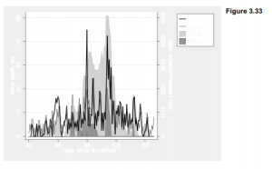
Creative Graphing by using Stata

Edward Tufte, in his elegant and influential books about graphing data (1990, 1997, 2001, 2006), calls for more effort at designing clear, information-packed graphics. Presenting a rich collection of impressively good or humorously awful examples, Tufte shows how successful graphics allow viewers to draw their own comparisons and examine details of relationships between variables. Stata users form a natural audience for these suggestions. Stata provides flexible tools for visualizing patterns in complex data, allowing basic plots to be enhanced or rearranged creatively in new images.

One of Tufte’s themes is the value of small multiples, sets of thumbnail-sized graphics that add dimensions for comparison. A graph command with by( ) option can draw these nicely. Figure 3.32 illustrates with time plots of winter snow depth at two locations: a town in New Hampshire’s White Mountains, and the city of Boston, 225 kilometers to its south (dataset whitemtl.dta). Snow depth was measured daily at both locations; these data cover nine consecutive winters, 1997-98 through 2005-2006. Variable dayseason counts days since November 1 each winter season. mtdepth and bosdepth are snow depths in centimeters at the White Mountains location and in Boston, respectively. Variable season identifies the winter seasons, 1997-98 through 2005-06. The following command specifies a twoway area graph of mtdepth and bosdepth against dayseason, using lighter and darker gray (gs11 and gs5) for colors, in a 3*3 layout by season, and with a one-column legend positioned at 3 o’clock. symxsize(*.3) saves space by making the legend’s symbols only 30% as wide as their default.

Figure 3.32 visualizes daily conditions through nine New England winters, showing how snow depth varies at two different places and on two different time scales. 2000-01 and 2003-04 stand out as heavy snow seasons in the mountains, with several significant storms in Boston. 1998-99 was much lighter in the mountains, with periods of no snow on the ground.

The data behind Figure 3.32 were assembled for research on how weather and climate affect attendance at ski areas (Hamilton et al. 2003, 2007). As New England’s winter climate warmed in recent decades, low-snow winters became more common. That warming is troublesome from environmental and other perspectives, including that of winter recreation. Ski areas can feel not only the effects of local snow conditions, but also a “backyard effect” of snow conditions in distant cities such as Boston, where many skiers live. The next graph, Figure 3.33, focuses on the single season of 1999-2000 (dataset whitemt2.dta). It begins with the same snow-depth shadow mountains that formed the top right plot in Figure 3.32.

Figure 3.33 overlays these shadow mountains (the twoway area plot) with a line plot showing the number of skier and snowboarder visits each day, at one ski area in the White Mountains close to where the snow-depth measurements were made. Both the observed visits (visits) and the number of visits predicted by a time series model (model) are graphed. The model, described
in Hamilton et al. (2007), predicts daily attendance as a function of weekly cyclical factors together with weather and snow conditions, both in the mountains and in Boston. The graph command creating Figure 3.33 assigns the left-hand y axis to snow depth in centimeters (mtdepth and bosdepth), and the right-hand y axis to observed and modeled number of visitors (visits and model).

Note that by carefully setting the yscale(range( )) and ylabel( ) options for each of the two overlaid plots in Figure 3.33, we managed to align their scales so that the same horizontal grid lines work for both. This is not practical to do with all data, but can definitely improve the readability of graphs involving differently-scaled y variables.

. graph twoway area mtdepth bosdepth dayseason, yaxis(1)

ytitle(“Snow depth, cm”, axis(1)) bcolor(gs12 gs6)

ylabel(0(10)60, axis(1))

|| line model visits dayseason, yaxis(2)

lwidth(medthin medthick)

ylabel(0(1)3, axis(2)) lcolor(gs1 gs0)

|| if dayseason>29 & dayseason<160,

r2(“Daily skier/snowboarder visits”) xlabel(30(30)150)

xtitle(“Days since November 1”)

legend(rows(4) position(2) order(4 3 1 2) label(1 “White Mt”)

label(2 “Boston”) label(3 “model”) label(4 “attend”)

symxsize(*.3))

yscale(range(0,51) axis(1)) ylabel(0(10)50, axis(1) grid)

yscale(range(0,5100) axis(2)) ylabel(0(1000)5000, axis(2))

The two highest spikes in ski-area visits were school holiday periods that happened to coincide with snow in Boston. The original study tested and confirmed the significance of this backyard effect. Graphically, it would be a simple step (not shown) from Figure 3.33 to a new set of small-multiples plots like Figure 3.32, visualizing the ski business together with the snow.

Population pyramids, widely used by demographers to represent the age-sex structure of populations, are not among Stata’s plot types. They can, however, be constructed from horizontal bar charts, through creative use of graph hbar. There are several ways to do so. Figure 3.34 illustrates one approach, with a pyramid for the Greenland-born, predominantly Inuit, population of Greenland in 2006 (Hamilton and Rasmussen 2010). The number of females at each age is indicated by a bar to the right of center, and the number of males that same age by a bar to the left. The 90 one-year age groups seen here are too many to label individually, so they are marked off instead by gray bands every 20 years (0-19 years, 20-39 years, etc.). The graph indicates, for example, that in 2006 the Greenland-born population included almost 600 40-year-old males but fewer than 500 40-year-old females, reflecting sex differences in net outmigration. The central bulge in this pyramid marks a baby boom of adults now ages 35-49 (born in the 1950s and 60s), followed by much smaller cohorts of younger adults. We also see an echo boom of children, born in the 1980s and 90s to adults from the first baby boom. Ages 10-14 comprise the most numerous cohort among children.

There are several tricks behind Figure 3.34. The raw data (greenpopl.dta) contain counts of the number of males andfemales at each age. In order to graph males on the left, we generate a new variable equal to the negative of the number of males,

. gen negmales = -males

A basic unlabeled pyramid could then be drawn by a command such as

. graph hbar (sum) negmales females if year==2006,

over(age, descending gap(0) label(nolabel))

To place gray bands in the background, marking off 20-year groups, we define fake variables maleGRAYandfemGRAYjust to fill in the graph to plus or minus 700:

. gen maleGRAY = -(700-males) if (age>=20 & age<40)

| (age>=60 & age<80)

. gen femGRAY = 700-females if (age>=20 & age<40)

| (age>=60 & age<80)

Figure 3.34 now can be drawn by stacking negmales, females, maleGRAY and femGRAY in a horizontal bar chart, with text to label the gray bands. We also apply labels such as “600” for -600 on the y axis so that the counts for males do not appear negative.

. graph hbar (sum) negmales females malGRAY femGRAY if year==2006,

over(age, descending gap(0) label(nolabel))

ylabel(-600 “600” -400 “400” -200 “200” 0 200 400 600)

ytick(-700(100)700, grid) legend(off) stack

ytitle(“Greenland-born males (left) and females (right)”)

bar(1, color(emidblue)) bar(2, color(maroon)) bar(3, color(gs14))

bar(4, color(gs14)) text(550 97 “2006”, size(large)) text(-550 11 “Age 0 to 19”)

text(-550 33 “Age 20 to 39”)

text(-550 53 “Age 40 to 59”)

text(-550 76 “Age 60 to 79”)

text(-550 95 “Age 80+”)

Figure 3.35 takes this idea a step further by showing similar age pyramids for 1977, 1986, 1996 and 2006. In this sequence we can follow the rise of the large cohort born following improvements in Greenlanders’ health and living standards in the 1950s and 60s. This baby boom shows up as teenagers in the 1977 pyramid. As the boom generation enters adulthood by the 1986 pyramid, we see the echo boom of their children. By 2006, this echo boom is waning

Although Figure 3.35 (constructed using separate images and graph combine) follows a small- multiples idea similar to Figure 3.32, these pyramids can be displayed in a more interesting way. For a live presentations I drew a set of 30 annual pyramids, 1977 to 2006, using a do-file. These 30 Stata graphs (in .emf format) were then pasted onto one PowerPoint slide each, with
automatic transitions at 1-second intervals, producing a 30-second animation of Greenland’s demographic change. Another animation showed how the population of non-Greenlanders living in Greenland had changed over the same years, an interconnected but quite different demographic tale (Hamilton and Rasmussen 2010).

Figure 3.36 is less dynamic, but combines five simple plots with text to form an image having some properties ofboth an illustration and a table. The resulting Stata graphic depicts population changes 1990-2000 among different ethnic groups living in rural counties of the U.S. South (based on U.S. Census data assembled by Voss et al. 2005). The left side of Figure 3.36 is a twoway area graph. To achieve the ramped effect showing population change, the variables graphed for each ethnic group (popwbho, popwbh etc.) actually represent sums calculated as that group’s population plus all the other populations that are graphically “below” it (dataset southmigl.dta). Important additional information, not evident from the area plot itself, is conveyed by two lines of labeling for each group in the legend. For example, readers can see from the legend that the Hispanic population of the rural South grew by 61% over this decade, from roughly 800,000 to 1.3 million people, and make their own visual or numerical comparisons with other populations.

The right-hand part of Figure 3.36 consists of four pie charts showing the percentage of population growth due to net in-migration. Each pie chart was drawn separately using dataset southmig2.dta. For example, the bottom pie chart shows that 12% of the white population growth reflects net migration. Variables graphed are net migration (netmig_w, the total number of in-migrants minus out-migrants) and the remainder of population growth due to natural increase (nonmig_w, number of births minus deaths).

. graph pie nonmig_w netmig_w,

legend(off) pie(1, color(dkorange)) pie(2, color(gs13))

title(“White 12%      “, position(2))


Each individual pie chart was saved with a file name such as pie white.gph. After drawing and saving four such pie charts, they were brought together using graph combine.

. graph combine ple_other.gph

pie_hisp.gph pie_black.gph pie_white.gph,

imargin(tiny) rows(4)

title(“% growth due to migration”) fxsize(40)

An fxsize(40) option forces this four-pie-chart image to use only 40% of the width available. Consequently, when they are combined with the left-hand area plot to make Figure 3.36, the pie charts take up less than half of the total width.

These examples illustrate some of the potential for designing new graphics in Stata, by combining standard elements in fresh ways.

Source: Hamilton Lawrence C. (2012), Statistics with STATA: Version 12, Cengage Learning; 8th edition.

Declare Survey Data in Stata

Since 2001, the Granite State Poll at the University of New Hampshire has conducted statewide telephone surveys several times each year. Each survey contacts a new sample of about 500 people, asking a variety of opinion questions along with respondent background characteristics. The poll’s political findings attain national importance every four years during New

Hampshire’s presidential primary campaigns. Dataset Granite_2011_6.dta contains questions from a Granite State Poll of 516 people, conducted in June 2011.

As with any survey, the sampling design and response patterns may result in sample data that differs from the target population. For example, Census data tell us that less than 52% of the state’s adult population is female, but women make up almost 55% of this sample.

To compensate for minor bias in sampling, survey researches routinely calculate probability weights. Some weights are calculated from comparisons between sample and population characteristics, such as gender in the example above. Others are based on features of the sampling design. For the Granite State Poll, researchers define a variable named censuswt that combines adjustments for household size, number of telephone lines, gender and region within the state. censuswt values in the June 2011 poll have a mean of 1 but range from .16 (observations given low weights to compensate for over-representation) to 2.19 (high weights to compensate for under-representation).

A svyset command declares the survey structure of the data, with probability weights given by censuswt. Saving the data then saves this information, although survey weights will be used in any particular analysis only if we specifically ask for them. Otherwise the data are unchanged.

Once data have been svyset, commands with the prefix svy: will perform calculations using the survey weight information. After weighting the gender balance is closer to what we expect in the population.

Many Stata commands from simple tables to statistical models permit the svy: prefix. For example, we could perform a weighted logistic regression (Chapter 9) of personal opinions about climate change, variable warmop2, on respondent education and political party through a command such as

. svy: logit warmop2 educ party

Type help survey for a list of analytical possibilities. The svyset command also can declare more information than just the probability weights used in the example above. svyset options allow for complex designs including stratified and multistage cluster sampling, finite population corrections, alternative methods of variance estimation, and poststratification. Type help svyset to see the syntax and a complete list of options. The Survey Data Reference Manual gives more examples and technical details.

Source: Hamilton Lawrence C. (2012), Statistics with STATA: Version 12, Cengage Learning; 8th edition.

Design Weights of Survey Data in Stata

The previous section took weight definitions for granted, and indeed many data users begin with a completed survey in which weights have already been calculated by someone else. This and the following sections present examples showing how such calculations are done.

Survey researchers apply probability weights to adjust for biases in their sampling methods. The biases could arise from intentional features of the sampling design, or from accidental properties of the data-collection process. Either way, initial sampling yields data not well representing the population of interest. Probability weighting attempts to compensate for departures from simple random sampling, and give us a more realistic picture of sampling variability and population characteristics.

For the Granite State Poll, interviewers call a random sample of New Hampshire household telephone numbers. In theory, these random phone numbers could yield a representative sample of households. For voting research and many other purposes, however, pollsters want to generalize not about the population of households, but about the population of adults (or voters) living in those households. Some households contain only one adult, whereas others have more. Among respondents to the June 2011 poll, about 29% said that they lived in a one-adult household. Responses in this example are limited to one, two, or three or more adults, as a practical compromise for weighting purposes. Only 503 of the original 516 respondents gave an answer regarding the number of adults; we will return to the other 13 later.

Although 29% of our sample lived in one-adult households, it would be a mistake to guess that a similar percentage of New Hampshire adults do so. To select a resident randomly, once a household has been called, the telephone interviewers ask to speak to the adult in the household who had the most recent birthday, or would call back later if that individual was not present. People from households with one adult therefore were at least three times more likely to enter our sample, compared with those from households with three or more. The table above suggest that our phone calls reached households with at least (1*148)+(2*273)+(3×82) = 940 adults. Among this sample of pseudo-people, those living in one-adult households make up only 148/940 or 16%, much less than the 29% in our table.

Survey weights provide a way to adjust for such known sampling biases, and achieve more realistic results. In this example that could matter not only for describing household size, but for other things such as voting behavior that might be correlated with household size. Single-adult households probably include a larger proportion of elderly people living alone. Two-adult households will include many young families. Multi-adult households will often be older families with adult children, or else young adults with roommates.

Probability weights are proportional to the inverse of the probability of selection. For our example, the conditional probability of selecting a particular person from a one-adult household (given that we phoned there) equals one. The probability of selecting a person from a two- person household equals 1/2, and from a three-person household 1/3. If we used the inverse of these probabilities, 1, 2 and 3, as weights then our sample would contain 940 pseudo-people — giving us the correct proportions, but leading to incorrect totals and other confusion. To maintain the true sample size, we can multiply these inverse probabilities by the ratio of real people to pseudo-people, 503/940. This step creates a new variable named adultwt, which contains the probability weights to adjust for a known sampling bias, while preserving the original sample size. The weights are .535 (one-adult household), 1.070 (two adults) or 1.605 (three or more); missing values get a neutral weight of 1. The ratio of these weights remains 1:2:3.

The weighted proportions (such as 16% from one-person households, instead of 29% as in the raw data) give a more realistic picture.

Source: Hamilton Lawrence C. (2012), Statistics with STATA: Version 12, Cengage Learning; 8th edition.

Poststratification Weights of Survey Data in Stata

The previous section gave an example of weights based on the sampling design, which was known before data collection began. A second type of weights might be defined after we have collected the data, and see that despite our best efforts, it appears unrepresentative in some respect. For instance, the sample might have a gender or age distribution noticeably different from those of our target population, making other results suspect. Poststratification refers to probability weights calculated so that the proportions of particular groups or strata in our sample more closely resemble the population.

The Granite State Poll sample is 54.65% female. But according to the 2010 Census, the adult population of New Hampshire is only 51.6% female. If we guessed from the survey that the state’s population was something close to 54.65% female, we would be off the mark. Moreover, we could easily draw mistaken conclusions about other things correlated with gender, such as voting. This apparent response bias could undermine our ability to draw inferences about a larger population.

There are many ways to approach poststratification. (For an alternative to the by-hand approach shown below, Stata’s svyset command offers a poststrata option, illustrated in the Survey Reference Manual; type help svyset for the basic syntax.) If we know the true population percentages of key variables, as we do regarding gender, then weights to adjust for response bias can be calculated from population percentage divided by sample percentage. Sex is coded 0 for males, who make up 48.4% of the adult population of New Hampshire but only 45.35% of this sample. It is coded 1 for females, who are 51.6% of the population and 54.65% of the sample. There are no missing values of sex in these data.

We calculate weights slightly above one for males: 48.4/45.35 = 1.067. For females the weights are slightly below one: 51.6/54.65 = .944.

If we svyset the data using sexwt as the probability weight, svy: tab produces a weighted table showing exactly the right proportions of men (48.4%) and women (51.6%). After calculating poststratification weights, it is good to check on whether they perform as intended.

More elaborate poststratification weights could follow a similar approach. For example, suppose that for a different study we wish to approximate a population age-race-sex distribution.

  1. Obtain a table of age-race-sex percentages from Census or other data on the population of interest, such as adults living in a particular state. If we employ five groups for age (18-29, 30-39, etc.) and two for race (white, nonwhite), this results in 20 numbers such as the percentage of that state’s adult population consisting of white males 18-29, the percentage of white females 18-29, and so forth.
  2. Obtain a similar table of age-race-sex percentages from the sample, for example by creating and tabulating a new variable named ARS denoting age-race-sex combinations:

. egen ARS = group(agegroup race sex), lname(ars)

. tab ARS

  1. Define a new set of weights, using generate … if commands. For example, suppose we know that 8.6% of the adult population in the study area consists of white males age 18-29, and 8.2% are white females in this age group. In our unweighted sample, however, we see only 2.6% white males 18-29, and 5.1% white females — so the young adults, particularly young males, are under-represented. We could create a new age-race-sex weight variable named ARSwt equal to 1 (a neutral weight) if we do not know a respondent’s age-race-sex combination, and otherwise equal to the population percentage divided by corresponding sample percentage for their age-race-sex group. The first few commands could be

. generate ARSwt = 1 if ARS >= .

. label variable ARSwt “Age-race-sex weights”

. replace ARSwt = 8.6/2.6 if ARS == 1 . replace ARSwt = 8.2/5.1 if ARS == 2

Poststratification adjustments work best in connection with carefully-designed surveys, and should not be misunderstood as a cure for haphazard sampling. Such adjustments have been applied most extensively in areas such as voter opinion polls and social science surveys, where great effort goes into securing the most representative samples to begin with. These also are areas where independent evidence such as vote outcomes or replications by other researchers provides reality tests for how well the adjustments succeed.

A single dataset might include weight variables calculated from more than one source, such as design weights and poststratification weights. To combine these into one overall weight variable, we multiply and then make an adjustment so that the final sum of weights equals the sample size. A quietly prefix before summarize tells Stata to calculate summary statistics but do not show us the results, to save time or space. The quietly prefix works similarly with other commands as well.

. generate finalwt = adultwt*ARSwt

. replace finalwt = 1 if finalwt > = .

. quietly summarize finalwt

. replace finalwt = finalwt*(r(N)/r(sum))

Any number of weight variables can exist in the same dataset, and svyset used repeatedly to select among them as needed for particular analysis. The weights affect analysis only when we apply them through svy: or other explicitly weighted commands. For the remainder of this chapter, we return to the Granite State Poll weighted by censuswt, a variable calculated by the UNH Survey Center to combine design weighting (for number of adults, and number of phone lines) with poststratification (for gender and region within New Hampshire).

Source: Hamilton Lawrence C. (2012), Statistics with STATA: Version 12, Cengage Learning; 8th edition.

Survey-Weighted Tables and Graphs by using Stata

The June 2011 Granite State Poll included six questions related to global warming or climate change. Several questions were factual, but one (warmop) asked what you personally believe.

Which of the following three statements do you personally believe?

Climate change is happening now, caused mainly by human activities.

Climate change is happening now, but caused mainly by natural forces.

Climate change is NOT happening now.

Interviewers rotated the order of response choices to avoid possible bias. About 55% agree that climate change is happening, now, caused mainly by human activities. Others think the changes have mainly natural causes (35%). Few believe that climate change is not happening now (3%).

The svy: tab command applies weights according to the specification declared earlier by svyset. ci requests confidence intervals for the weighted percentages, shown as lower and upper bounds (lb and ub). Based on this sample, we are 95% confident that between 50.11% and 59.58% of New Hampshire adults believe that human activities are changing the climate.

Stata’s native graph types are not ideal for viewing categorical-variable distributions such as those in the table above. Fortunately, a user-written program named catplot, introduced in a Stata Journal article (Cox 2004b), does this job quite well. You can obtain the ado-files for catplot easily from the Web by typing

. findit catplot

and following the links to install them on your computer. (The findit command works for hundreds of other user-written programs as well.) Once it is installed, typing help catplot will show the command’s syntax and options. Figure 4.1 contains a simple catplot bar chart of warmop. Although catplot does not accept pweights, specifying [aweights = censuswt] in this command will have the same visual effect so that bar heights correspond to the svy: tab percentages.

. catplot bar warmop [aweight = censuswt], percent

Bar charts with value labels often are easier to read in a horizontal-bar (hbar) format, particularly when we have many bars. Figure 4.2 shows a horizontal version including a title and better axis label, suitable for a report or presentation on the survey results. We also label the bars so that weighted percentages can be read directly from the graph; these are the same numbers found by svy: tab above.

How do climate change beliefs relate to other variables in the survey, such as respondent education (educ)? We could answer such questions through a two-way tabulation, . svy: tab warmop educ, col percent

In the example above we asked for column percentages, because the column variable (educ) forms the independent variable for this analysis. About 69% of those with postgraduate degrees, 55% of college graduates, and 42% with some college or technical school personally believe that climate change is happening now, due mainly to human activities. The design-weighted F test for this table confirms that the relationship between climate belief and education is statistically significant (p = .0102).

Figure 4.3 shows a catplot of warmop responses by education, giving the same weighted percentages. The percent(educ) option calls for percentages within categories of educ. We also place the title( ) as a sub-option within by( ) in order to get a single title for the whole graph. You can experiment to see what happens without these options.

Source: Hamilton Lawrence C. (2012), Statistics with STATA: Version 12, Cengage Learning; 8th edition.

Bar Charts for Multiple Comparisons by using Stata

The catplot bar charts in Figure 4.3 depict a relationship between two categorical variables, each with four categories. If we have more than two variables, or more than a few categories, however, the catplot approach becomes cluttered. A cleaner alternative for making multiple comparisons of categorical variables employs Stata’s horizontal bar chart command hbar.

Figure 3.13 in the previous chapter tracked changes in the late-summer area of Arctic sea ice, over the years 1979-2011. The dramatic decline has attracted much scientific attention, and been widely noted in popular news media as well. Our Granite State Poll included a carefully worded question (warmice) testing whether people know about this. As with warmop, the order of response choices was rotated to avoid bias. A large majority (71%) know that ice area declined.

Which of the following three statements do you think is more accurate?

Over the past few years, the ice on the Arctic Ocean in late summer …

Covers less area than it did 30 years ago.

Declined but then recovered to about the same area it had 30 years ago.

Covers more area than it did 30 years ago.


. svy: tab warmice, percent ci

The warmice question allows four response choices, including “don’t know” or no answer. For some purposes, however, it proves useful to create a new dichotomous variable that just indicates whether they answered this question correctly. Variable warmiceQ equals 1 for respondents who said that ice area declined, and 0 for everyone else. About 71% answered correctly that late-summer sea ice covers less area than it did 30 years ago.

The mean of a {0,1} variable like warmiceQ simply equals the proportion of 1’s. Such {0,1} dummy variables have many uses in statistical modeling. For graphical purposes we might temporarily re-scale warmiceQ to have values of 0 or 100 instead. The mean of a {0,100} variable equals the percentage of 100s, or the percentage of correct answers on Arctic ice in this example. By applying graph hbar to a {0,100} dichotomy, we can visually compare many different percentages. The bar chart in Figure 4.4 gives the weighted percent of correct answers among college graduates and others (variable college).

Note that in Stata’s horizontal bar charts (graph hbar; also in graph hbox and some other turned-sideways graphics) the horizontal axis is called the y axis, contrary to usual convention. Thus ytitle(“Weighted percent”) specifies a title that goes along the bottom. Stata does not recognize an x axis in these charts, although l1title( ) could specify a title that would go along the left-hand side.

Figure 4.4 compared only two numbers, 76% among college graduates and 64% among others. No one needs to draw a graph to make such a simple comparison. This bar-chart approach readily extends to more complicated comparisons, however. Previous surveys have found pervasive partisan divisions across many questions involving climate change. Might those exist even for this factual question about Arctic sea ice? A three-variable bar chart in Figure 4.5 gives the percent of correct answers broken down by college education and respondent’s political identification (variable party).

. graph hbar (mean) warmiceQ100 [aw = censuswt],

over(college) over(party)

blabel(bar, format(%3.0f)) ytitle(“Weighted percent”)

title(“Arctic ice declined, by college and political party”

, size(medium))

Within each party group we see a college-education effect, and within each level of education we see a partisan difference as well.

Figure 4.5 cannot tell us whether the differences are statistically significant. Answering that question requires statistical modeling tools introduced in Chapter 9. As a preview, however, the following weighted logit regression model confirms that both college and party have statistically significant effects, positive in the case of college (0 = non-college, 1 = college grad) and negative in the case of party (1 = Democrat, 2 = Independent, 3 = Republican). Party is a stronger predictor than college.

Chapter 9 will return to this example, applying a statistical method (multinomial logit) that can model the predictors of each separate answer to the ice-area question.

Source: Hamilton Lawrence C. (2012), Statistics with STATA: Version 12, Cengage Learning; 8th edition.