Summary Statistics for Measurement Variables by using Stata

Dataset electricity.dta contains information on electricity consumption in U.S. states, from the California Energy Commission (2012).

To find the mean and standard deviation of per capita electricity use (elcap), type

This table also gives the number of nonmissing observations and the variable’s minimum and maximum values. If we had simply typed summarize with no variable list, we would obtain means and standard deviations for every numeric variable in the dataset.

To see more detailed summary statistics, type . summarize elcap, detail

 . summarize elcap, detail

Percentiles: Notably the first quartile (25th percentile = 10,359), median (50th percentile = 13,388), and third quartile (75th percentile = 16,117). Because many samples do not divide evenly into quarters or other standard fractions, these percentiles are approximations.

Four smallest and four largest values, where outliers might show up.

Sum of weights: the summarize command permits frequency weights or fweight. For explanations see help weight.

Variance: Standard deviation squared (more properly, standard deviation equals the square root of variance).

Skewness: The direction and degree of asymmetry. A perfectly symmetrical distribution has skewness = 0. Positive skew (heavier right tail) results in skewness > 0; negative skew (heavier left tail) results in skewness < 0.

Kurtosis: Tail weight. A normal (Gaussian) distribution is symmetrical with kurtosis = 3. If a symmetrical distribution has heavier-than-normal tails (is sharply peaked), then kurtosis > 3. Kurtosis < 3 indicates lighter-than-normal tails.

The tabstat command provides a more flexible alternative to summarize . We can specify just which summary statistics we want to see. For example,

With a by(varname) option, tabstat constructs a table containing summary statistics for each value of varname. The following example gives means, minimum and maximum for per capita electricity use, separately for each of four U.S. census regions. Electricity use is relatively low in the Northeast, and much higher in the Midwest and South.

. tabstat elcap, stats(mean min max) by(reglon4)

In addition to mean, min or max, other statistics available for the stats( ) option of tabstat include the same set listed earlier for collapse or graph bar (such as count, sum, max, min, variance, sd, and pi through p99 for percentiles). Further tabstat options give control over the table layout and labeling. Type help tabstat to see a complete list.

The statistics produced by summarize or tabstat describe the sample at hand. For some purposes, although probably not with U.S. states data, we might want to construct confidence intervals suggesting inferences about a larger population. As an illustration, obtaining a 99% confidence interval for the mean of elcap:

Accepting for the moment these 51 states (with the District of Columbia) as a sample, we could be 99% confident that the population mean lies somewhere in the interval from 11,766 to 14,870 kWh per person. More precisely, over many random samples, intervals constructed in this manner should contain the true population mean about 95% of the time. The level(99) option specified a 99% confidence interval. If we omit this option, ci defaults to a 95% confidence interval.

Other options allow ci to calculate exact confidence intervals for variables that follow binomial or Poisson distributions. A related command, cii, calculates normal, binomial or Poisson confidence intervals directly from summary statistics, such as we might encounter in a published article. It does not require the raw data. Type help ci for details about both of these useful commands.

Source: Hamilton Lawrence C. (2012), Statistics with STATA: Version 12, Cengage Learning; 8th edition.

Exploratory Data Analysis by using Stata

Statistician John Tukey assembled a toolkit of old and new methods for exploratory data analysis (EDA), which involves analyzing data in an exploratory and skeptical way without making unneeded assumptions (see Tukey 1977; also Hoaglin, Mosteller and Tukey 1983, 1985). Box plots, introduced in Chapter 3, are one the most popular EDA methods. Another is the stem-and-leaf display, a graphical arrangement of ordered data values in which initial digits form the stems and following digits for each observation make up the leaves.

In this display the lowest per capita electricity value, 6,721 (California), appears as a 721 leaf on the 6*** stem. The highest, 27,457 (Wyoming), appears as a 457 leaf on the 27*** stem. stem automatically chooses values for the stems, but can override this with a lines( ) option. Type help stem for information about this option and others.

Letter-value displays (lv) use order statistics to dissect a distribution.

M denotes the median, and F the “fourths” (quartiles, using a different approximation than the quartile approximation used by summarize, detail and tabsum). E , D , C , . . . denote cutoff points such that roughly 1/8, 1/16, 1/32, . . . of the distribution remains outside in the tails. The second column of numbers gives the depth or distance from the nearest extreme, for each letter value. Within the center box, the middle column gives midsummaries, which are averages of the two letter values. If midsummaries drift away from the median, as they do for elcap, this tells us that the distribution becomes progressively more skewed as we move farther out into the tails. The spreads are differences between pairs of letter values. For instance, the spread between Fs equals the approximate interquartile range. Finally, pseudosigmas in the right-hand column estimate what the standard deviation should be if these letter values described a Gaussian
population. The F pseudosigma, sometimes called a pseudo standard deviation (PSD), provides a simple and outlier-resistant check for approximate normality in symmetrical distributions:

  1. Comparing mean with median diagnoses overall skew:

mean > median                      positive skew

mean = median                      symmetry

mean < median                      negative skew

  1. If the mean and median are similar, indicating symmetry, then a comparison between standard deviation and PSD helps to evaluate tail normality:

standard deviation > PSD heavier-than-normal tails

standard deviation = PSD normal tails

standard deviation < PSD lighter-than-normal tails

Let F1 and F3 denote 1st and 3rd fourths (approximate 25th and 75th percentiles).

Then the interquartile range, IQR, equals F3 – F1 , and PSD = IQR / 1.349.

lv also identifies mild and severe outliers, if any exist (there is only one mild outlier in the elcap distribution). We call an x value a “mild outlier” when it lies outside the inner fence, but not outside the outer fence:

F1 – 3IQR < x < F1 – 1.5IQR       or F3 + 1.5IQR < x < F3 + 3IQR

The value of x is a “severe outlier” if it lies outside the outer fence:

x < F1 – 3IQR or x > F3 + 3IQR

lv gives these cutoffs and the number of outliers of each type. Severe outliers, values beyond the outer fences, occur sparsely (about two per million) in normal populations. Monte Carlo simulations suggest that the presence of any severe outliers in samples of n = 15 to about 20,000 should be sufficient evidence to reject a normality hypothesis at α= .05 (Hamilton 1992b). Severe outliers create problems for many statistical techniques.

summarize, stem and lv all confirm that lived has a positively skewed sample distribution, not resembling a theoretical normal curve. The next section introduces more formal normality tests, and transformations that can reduce a variable’s skew.

Source: Hamilton Lawrence C. (2012), Statistics with STATA: Version 12, Cengage Learning; 8th edition.

Normality Tests and Transformations by using Stata

Many statistical procedures work best when applied to variables that follow normal distributions. The preceding section described exploratory methods to check for approximate normality, extending the graphical tools (histograms, box plots, symmetry plots and quantile-normal plots) presented in Chapter 3. A skewness-kurtosis test, making use of the skewness and kurtosis statistics shown by summarize, detail, can more formally evaluate the null hypothesis that the sample at hand came from a normally-distributed population.

sktest here rejects normality: elcap appears significantly nonnormal in skewness (p = .0223), although not in kurtosis (p = .0723), and in both statistics considered jointly (p = .0236).

Other normality tests include Shapiro-Wilk W (swilk) and Shapiro-Francia W’ (sfrancia) methods (type help sktest). A Stata module to perform Doornik-Hansen omnibus tests for univariate/multivariate normality is available online (type findit omninorm).

Nonlinear transformations such as square roots and logarithms are often employed to change distributions’ shapes, with the aim of making skewed distributions more symmetrical and perhaps more nearly normal. Transformations might also help linearize relationships between variables (Chapters 7 and 8). Table 5.1 shows a progression called the ladder of powers (Tukey 1977) that provides guidance for choosing transformations to change distributional shape. The variable lived exhibits mild positive skew, so its square root might be more symmetrical. We could create a new variable equal to the square root of elcap by typing

. generate srelcap = elcap ^.5

Instead of elcap ^.5, we could equally well have written sqrt(elcap).

Logarithms are another transformation that can reduce positive skew. To generate a new variable equal to the natural (base e) logarithm of elcap, type

. generate logelcap = ln(elcap)

In the ladder of powers and related transformation schemes such as Box-Cox, logarithms take the place of a “0” power. Their effect on distribution shape is intermediate between .5 (square root) and -.5 (reciprocal root) transformations.

We take negatives of the result after raising to a power less than zero, to preserve the original order — the highest value of old becomes transformed into the highest value of new, and so forth. When old itself contains negative or zero values, it is necessary to add a constant before
transformation. For example, if arrests measures the number of times a person has been arrested (0 for many people), then a suitable log transformation could be

. generate logarrest = ln(arrests + 1)

The ladder command combines the ladder of powers with sktest for normality. It tries each power on the ladder, and reports whether the result is significantly nonnormal. This can be illustrated using the positively skewed variable elcap, per capita electricity consumption, from electricity.dta.

Square root, log, inverse square root and inverse transformations all yield distributions that are not significantly different from normal. In this respect they offer improvements compared with the raw data or identity transformation, with is significantly nonnormal (p = .024). It appears that logarithms offer the best choice for a normalizing transformation. Figure 5.1, produced by the gladder command, visually supports this conclusion by comparing histograms of each transformation to normal curves.

Figure 5.2 shows a corresponding set of quantile–normal plots for these ladder of powers transformations, obtained by thequantile ladder command qladder. (Type help ladder for information about ladder, gladder and qladder.) To make the tiny plots more readable in the example below, we scale the labels and marker symbols up by 25% with the scale(1.25) option. The axis labels (which would be unreadable and crowded) are suppressed by the options ylabel(none) xlabel(none)

An alternative technique called Box-Cox transformation offers finer gradations between transformations and automates the choice among them (easier for the analyst, but not always a good thing). The command bcskewO finds a value of X (lambda) for the transformations

such that y(λ) has approximately zero skewness. Applying this to elcap, we obtain the transformed variable belcap:

That is, belcap = (elcap 145 – 1)/(.145) is the transformation that comes closest to symmetry, as defined by the skewness statistic. The Box-Cox parameter X = .145 is not far from our ladder- of-powers choice, logarithms (which take the place of the 0 power). The confidence interval for X includes 0 (logarithm) but not 1 (identity or no change):

-.827 < λ < .878

Chapter 8 describes a Box-Cox approach to regression modeling.

Source: Hamilton Lawrence C. (2012), Statistics with STATA: Version 12, Cengage Learning; 8th edition.

Frequency Tables and Two-Way Cross-Tabulations by using Stata

The summary statistics, graphs and transformations described above apply mainly to measurement variables. Categorical variables require different approaches, often starting with simple one- or two-way tables. For examples using such tables we return to the Granite State Poll data, Granite2011_6.dta. One question (trackus) asked whether people think the U.S. is headed in the right direction, or is on the wrong track. Although this question appears vague and strangely worded it has a long tradition among pollsters, having been used successfully on hundreds of surveys as a barometer of public mood. A majority on this New Hampshire poll expressed pessimism:

tabulate can produce frequency distributions for variables that have thousands of values. To construct a manageable frequency distribution table for a variable with many values, however, you might first want to group those values by applying generate with its recode or autocode options (see Chapter 2 or help generate).

tabulate followed by two variable names creates a two-way cross-tabulation. For example, here is a cross-tabulation of trackus by educ (respondent’s level of education):

The first-named variable forms the rows, and the second forms columns in the resulting table. We see that 71 of the 107 respondents with high-school education or less believe the U.S. is on the wrong track.

Are trackus opinions related to education? To find out we can run a %2 (chi-squared) test and examine row percentages, because educ, which defines the rows, is our independent variable here. The row option asks for row percentages; nof means no frequencies should be shown.

. tabulate educ trackus, row nof chi2

Sixty-nine percent of respondents with technical school or some college believe the U.S. is on the wrong track. Those with postgraduate degrees appear more optimistic; only 48% hold this view. Based on this sample, we can reject the null hypothesis that educ and trackus are unrelated in the New Hampshire population (/2 = 12.75, p = .005).

tabulate has a number of options that are useful with two-way tables. These include alternative tests (Fisher’s exact test; likelihood-ratio %2 ) and measures of association (Goodman and Kruskal’s y (gamma), Kendall’s Tb (tau-b) and Cramer’s V). The option missing requests that missing values be included among the rows or columns of the table. tabulate can also save frequencies and variables names as matrices. Type help tabulate for list of options with details.

Occasionally we might need to re-analyze a published table, without access to the original raw data. A special command, tabi (immediate tabulation), accomplishes this. Type the cell frequencies on the command line, with table rows separated by “ \ ”. For illustration, here is how tabi could reproduce the previous cross-tabulation directly from the four cell frequencies without need for any dataset:

Unlike tabulate, tabi does not require or refer to any data in memory. By adding the replace option, however, we can ask tabi to replace whatever data are in memory with the new cross­tabulation. Statistical options (chi2, exact, nofreq and so forth) work the same for tabi as they do with tabulate; see help tabulate twoway.

None of the examples in this section so far involve weighting. As described in Chapter 4, survey researchers often do apply weights, carefully calculated to make sample results more representative of a target population. The variable censuswt provides such weights for the Granite State Poll. Earlier, we used a svyset command to declare these as probability weights.

. syvset [pw = censuswt]

Commands with the svy: prefix will apply the svyset weights automatically; for other commands the weights are ignored. Here are weighted versions of the one and two-way tables above.

In the weighted table we see an even greater difference in pessimism between respondents with technical school or some college (75.5% wrong track) and postgraduate education (46.6% wrong track). Design-based F tests provide the survey counterpart to an unweighted table’s chi- squared test. This F test also agrees that the educ/trackus relationship is statistically significant (p = .0005).

Source: Hamilton Lawrence C. (2012), Statistics with STATA: Version 12, Cengage Learning; 8th edition.

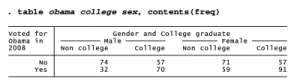
Multiple Tables and Multi-Way Cross-Tabulations by using Stata

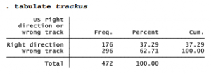
With surveys and other large datasets, we sometimes need frequency distributions of many different variables. Instead of asking for each table separately, for example by typing tabulate tparty, then tabulate obama, and finally tabulate trackus, we could simply use another specialized command, tabl:

. tabl tparty obama trackus

Or, to produce one-way frequency tables for each variable from tparty through trackus in this dataset (the maximum is 30 variables at one time), type

. tabl tparty-obama

Similarly, tab2 creates multiple two-way tables. For example, the following command cross- tabulates every two-way combination of the listed variables:

. tab2 tparty obama trackus

tabl and tab2 offer the same options as tabulate.

To form multi-way contingency tables, it is possible to use tabulate with a by prefix. For example, here is a simple two-way cross-tabulation of whether the survey respondents voted for Obama in 2008, by whether or not they graduated from college.

One way to make a three-way cross-tabulation of the obama/college relationship by gender is to use sort and the by: prefix. This produces two-way tables with the same layout as above, but separately for males and females.

. sort sex

. by sex: tab obama college, col nof chi

The obama/college relationship is significant and has the same direction in both sub-tables, but appears somewhat stronger among men (where college makes a 25-point difference, 30.19 to 55.12%) than women (a 16-point difference, 45.38 to 61.79%).

This approach can be extended to tabulations of greater complexity. To get a four-way cross­tabulation of obama by college, with separate sub-tables for married and unmarried men and women, we could type the commands (results not shown):

. sort sex married

. by sex married: tab obama college, col nof chi

Such multi-way tables divide the data into increasingly small subsamples, where variations become more erratic.

An alternative way to produce multi-way tables, if we do not need percentages or statistical tests, is through Stata’s general table-making command, table. This versatile command has many options, only a few of which are illustrated here. To construct a two-way table of obama by college, with frequencies in each cell, type

If we specify a third categorical variable, it forms the supercolumns of a three-way table:

More complicated tables require the by( ) option, which allows up to four supperrow variables. table thus can produce up to seven-way tables: one row, one column, one supercolumn, and up to four superrows. Here is a four-way example:

The table examples above all place frequencies in the cells, but table permits statistical summaries as well. Here is a four-way table, obama x college x sex xmarried, in which each cell contains the mean age for that combination of characteristics. For example, we see that the 34 non-college, unmarried men who did not vote for Obama have a mean age of 46.6 years.

The contents( ) option of table specifies what statistics the table’s cells contain. The choices include not just frequency or mean, but also standard deviation, minimum, maximum, median, range, percentiles and other summaries. Type help table for a full list. The next section illustrates some other possibilities for summary statistics within tables.

Source: Hamilton Lawrence C. (2012), Statistics with STATA: Version 12, Cengage Learning; 8th edition.

Tables of Means, Medians and Other Summary Statistics by using Stata

Summary Statistics tabulate produces tables of means and standard deviations within categories of the tabulated variable. For the remaining examples in this chapter, we return to the data on electricity consumption in U.S. states. tabulate gives us one way to view summary statistics of per capita electricity consumption (elcap) for each of the 9 U.S. census divisions (region9): . tabulate region9, summ(elcap)

We could also use tabulate to form a two-way table of means, as in this contrived example using the 9 census divisions and 4 census regions: . tabulate region9 region4, summ(elcap) mean

The means option above called for a table containing only means. Otherwise we get a bulkier table with means, standard deviations and frequencies within each cell.

The more flexible table command can build up to seven-way tables containing means, standard deviations, sums, medians or other statistics. For illustration, here is a one-way table showing mean and standard deviation of per capita electricity use and also the median and interquartile range of population, within each census division.

. table region9, contents (mean elcap sd elcap median pop iqr pop)

Mean per capita electricity use varies by a factor of two, from the low of 8,417 kWh in New England to a high of 17,948 kWh in the West South Central division (which includes the oil- producing states of Texas, Louisiana and Oklahoma). The greatest variation, on the other hand, occurs among the Mountain states, where the standard deviation (5,723 kWh) is ten times that of New England (533 kWh).

The contents) ) option with table specifies what statistics, for what variables, each cell should contain. The possible statistics also include minimum, maximum, sum, percentiles and several types of standard error. See help table for the list.

Source: Hamilton Lawrence C. (2012), Statistics with STATA: Version 12, Cengage Learning; 8th edition.

Using Frequency Weights with Stata

summarize, tabulate, table and related commands can be used with frequency weights that indicate the number of replicated observations. For example, here are the mean and other statistics for per capita electricity use across all U.S. states.

This mean, 13,318 kWh, tells us the average electricity across the 51 states (including District of Columbia) — counting each state as one unit. Wyoming has the smallest population (564 thousand) and the highest per capita electricity consumption (27,457 kWh). California has the largest population (37 million) and the lowest per capita electricity consumption (6,721 kWh). Each has equal weight in this 51-state mean. To see the per capita mean for the U.S. as a whole, however, we need to weight by population.

The population-weighted mean (12,114 kWh) is lower than the mean of the 51 states (13,318 kWh) because more people live in relatively low-consuming states such as California and New York than in high-consuming states such as Wyoming and Kentucky (Figure 5.3).

The population-weighted mean, unlike the unweighted mean, can be interpreted as a mean for the 309 million people in the U.S. Note, however, that we could not make similar statements for the weighted standard deviation, minimum or maximum. Apart from the mean, most individual- level statistics cannot be calculated simply by weighting data that already are aggregated. Thus, we need to use weights with caution. They might make sense in the context of one particular analysis, but seldom do for the dataset as a whole, when many different kinds of analyses are needed.

Frequency weights operate in a similar way with both tabulate and table. The following table command calculates population-weighted means for each census division. Now that we take its much larger population into account, we see that the Pacific division has lower mean electricity consumption than New England.

The row option called for a final row summarizing the table as a whole. The overall mean in this table (12,112.7 kWh) is the same as that found earlier by summarize.

Source: Hamilton Lawrence C. (2012), Statistics with STATA: Version 12, Cengage Learning; 8th edition.

One-Sample Tests by using Stata

One-sample t tests have two seemingly different applications:

  1. Testing whether a sample mean y differs significantly from an hypothesized value p0 .
  2. Testing whether the means of yj and y2 , two variables measured over the same set of observations, differ significantly from each other. This is equivalent to testing whether the mean of a difference score variable created by subtracting y1 from y2 equals zero.

We use essentially the same formulas for either application, although the second starts with information on two variables instead of one.

The data in writing.dta were collected to evaluate a college writing course based on word processing (Nash and Schwartz 1987). Measures such as the number of sentences completed in timed writing were collected both before and after students took the course. The researchers wanted to know whether the post-course measures showed improvement.

Suppose that we knew that students in previous years were able to complete an average of 10 sentences. Before examining whether the students in writing.dta improved during the course, we might want to learn whether at the start of the course they were essentially like earlier students — in other words, whether their pre-test (preS) mean differs significantly from the mean of previous students (10). To see a one-sample t test of H0:p = 10, type

The notation Pr(T < t) means “probability of a t-distribution value less than the observed t, if H0 were true”— that is, the one-tail test probability. The two-tail probability of a greater absolute t appears as Pr(|T| > |t|) = 0.4084 . Because this probability is high, we have no reason to reject H0:p = 10. Note that ttest automatically provides a 95% confidence interval for the mean, and this confidence interval includes the null-hypothesis value 10. We could see a different confidence interval, such as 90%, by adding a level(90) option to this command.

A nonparametric counterpart, the sign test, employs the binomial distribution to test hypotheses about single medians. For example, we could test whether the median of preS equals 10. signtest gives us no reason to reject that null hypothesis either.

Like ttest, signtest includes right-tail, left-tail, and two-tail probabilities. Unlike the symmetrical t distributions used by ttest, however, the binomial distributions used by signtest have different left- and right-tail probabilities. In this example, only the two-tail probability matters because we were testing whether the writing.dta students “differ” from the null- hypothesis median of 10.

Next, we can test for improvement during the course by testing the null hypothesis that the mean number of sentences completed before and after the course (that is, the means ofpreS and postS) are equal. The ttest command accomplishes this as well, finding a significant improvement.

Because we expect “improvement,” not just “difference” between the preS and postS means, a one-tail test is appropriate. The displayed right-tail probability rounds off to zero. Students’ mean sentence completion does significantly improve. Based on this sample, we are 95% confident that it improves by between 12.7 and 18.4 sentences.

t tests ordinarily assume that variables are normally distributed around their group means. This assumption usually is not critical because the tests are moderately robust. When nonnormality involves severe outliers, however, or occurs in small samples, we might be safer turning to medians instead of means and employing a nonparametric test that does not assume normality. The Wilcoxon signed-rank test, for example, assumes only that the distributions are symmetrical and continuous. Applying a signed-rank test to these data yields essentially the same conclusion as ttest: that students’ sentence completion significantly improved. Because both tests agree on this conclusion, we can state it with more assurance.

Source: Hamilton Lawrence C. (2012), Statistics with STATA: Version 12, Cengage Learning; 8th edition.

Two-Sample Tests by using Stata

The remainder of this chapter draws examples from a survey of college undergraduates by Ward and Ault (1990).

About 19% of these students belong to a fraternity or sorority. On campus, these organizations and their members are commonly referred to as “Greeks” not with any reference to nationality, but because most of the organizations have names composed of Greek letters.

Another variable, drink, measures how often and heavily a student drinks alcohol, on a 33-point scale. Campus rumors might lead one to suspect that fraternity/sorority members tend to differ from other students in their drinking behavior. Box plots comparing the median drink values of members and nonmembers, and a bar chart comparing their means, both appear consistent with such rumors. Figure 6.1 combines these two separate plot types in one image, after using ylabel(0(5)25) to set a common y-axis scale for comparability.

The ttest command, applied earlier to one-sample and paired-difference tests, can perform two- sample tests as well. In this application its general syntax is ttest measurement, by(categorical). For example,

As the output notes, this t test rests on an equal-variances assumption. But the fraternity and sorority members’ sample standard deviation appears somewhat lower — they are more alike than nonmembers in their reported drinking behavior. To perform a similar test without assuming equal variances, add the option unequal:

Adjusting for unequal variances does not alter our basic conclusion that Greeks (fraternity/sorority members) and non-Greeks are significantly different. We can further check this conclusion by trying a nonparametric Mann-Whitney U test, also known as a Wilcoxon rank-sum test. Assuming that the rank distributions have similar shape, the rank-sum test indicates that we can reject the null hypothesis of equal population medians.

. ranksum drink, by(greek)

Source: Hamilton Lawrence C. (2012), Statistics with STATA: Version 12, Cengage Learning; 8th edition.

One-Way Analysis of Variance (ANOVA) by using Stata

Analysis of variance (ANOVA) provides another way, more general than t tests, to test for differences among means. The simplest case, one-way ANOVA, tests whether the means of y differ across categories of x. One-way ANOVA can be performed by a oneway command with the general form oneway measurement categorical. For example,

The tabulate option produces a table of means and standard deviations in addition to the analysis of variance table itself. One-way ANOVA with a dichotomous x variable is equivalent to a two-sample t test, and its F statistic equals the corresponding t statistic squared. oneway offers more options and processes faster, but it lacks an unequal option for relaxing the equal- variances assumption.

oneway does, however, formally test the equal-variances assumption using Bartlett’s /2. A low Bartlett’s probability implies that an equal-variance assumption is implausible, in which case we should not trust the ANOVA F test results. In the oneway drink belong example above, Bartlett’s p = .028 casts doubt on the ANOVA’s validity.

One-way ANOVA’s real value lies not in two-sample comparisons, but in comparisons of three or more means. For example, we could test whether mean drinking behavior varies by year in college. The term “freshman” refers to first-year students, not necessarily male.

We can reject the hypothesis of equal means (p = .0018), but not the hypothesis of equal variances (p = .917). The latter is good news regarding the ANOVA’s validity.

The horizontal box plots (graph hbox) in Figure 6.2 support this conclusion, showing similar variation within each category. For this image the box plots are combined with a dot chart (graph dot (mean)) depicting means within each category. The combined image shows that differences among medians (top) and differences among means (bottom) follow similar patterns. Dot charts serve much the same purpose as bar charts: visually comparing statistical summaries of one or more measurement variables. The organization and options for dot charts and bar charts are broadly similar, including the choices of statistical summaries. Type help graph dot for details.

. graph hbox drink, over(year) ylabel(0(5)35) saving(fig06_02a)

. graph dot (mean) drink, over(year) ylabel(0(5)35, grid) marker(1, msymbol(Sh)) saving(fig06_02b)

. graph combine fig06_02a.gph fig06_02b.gph, row(2) iscale(1.05)


The scheffe option (Scheffe multiple-comparison test) with our oneway command produced a table showing the differences between each pair of means. The freshman mean equals 18.975 and the sophomore mean equals 21.16923, so the sophomore-freshman difference is 21.16923 – 18.975 = 2.19423, not statistically distinguishable from zero (p = .429). Of the six contrasts in this table, only the senior-sophomore difference, 16.6508 – 21.1692 = -4.5184, is significant (p = .002). Thus, our overall conclusion that these four groups’ means are not the same arises mainly from the contrast between seniors (the lightest drinkers) and sophomores (the heaviest).

oneway offers three multiple-comparison options: scheffe, bonferroni and sidak (see Base Reference Manual for definitions). The Scheffe test remains valid under a wider variety of conditions, although it is sometimes less sensitive.

The Kruskal-Wallis test (kwallis), a ^-sample generalization of the two-sample rank-sum test, provides a nonparametric alternative to one-way ANOVA. It tests the null hypothesis of equal population medians.

. kwallis drink, by(year)

These kwallis results (p = .0023) agree with our oneway findings of significant differences in drink by year in college. Kruskal-Wallis is generally safer than ANOVA if we have reason to doubt ANOVA’s equal-variances or normality assumptions, or if we suspect problems caused by outliers. kwallis, like ranksum, makes the weaker assumption of similar-shaped rank distributions within each group. In principle, ranksum and kwallis should produce similar results when applied to two-sample comparisons, but in practice this is true only if the data contain no ties. ranksum incorporates an exact method for dealing with ties, which makes it preferable for two-sample problems.

Source: Hamilton Lawrence C. (2012), Statistics with STATA: Version 12, Cengage Learning; 8th edition.

Two- and N-Way Analysis of Variance by using Stata

One-way ANOVA examines how the means of measurement variable y vary across categories of one other variable x. N-way ANOVA generalizes this approach to deal with two or more categorical x variables. For example, we might consider how drinking behavior varies not only by fraternity or sorority membership, but also by gender. We start by examining a two-way table of means:

It appears that in this sample, males drink more than females and fraternity/sorority members drink more than nonmembers. The Greek/non-Greek difference appears similar among males and females. anova, Stata’s N-way ANOVA command, can test for significant differences among these means attributable to belonging to a fraternity or sorority, gender, or the interaction of Greek membership and gender (written greek#gender).

. anova drink greek gender greek#gender

In this example of two-way factorial ANOVA, the output shows significant main effects for greek (p = .0000) and gender (p = .0008), but their interaction contributes little to the model (p = .7448). Because this interaction cannot be distinguished from zero, we might prefer to fit a simpler model without the interaction term.

To include any interaction term with anova, specify the variable names joined by # (or ## for a factorial interaction). Unless the number of observations with each combination of x values is the same (a condition called balanced data), it can be hard to interpret the main effects in a model that also includes interactions. This does not mean that the main effects in such models are unimportant, however. Regression analysis might help to make sense of complicated ANOVA results, as seen in the following section.

Source: Hamilton Lawrence C. (2012), Statistics with STATA: Version 12, Cengage Learning; 8th edition.

Factor Variables and Analysis of Covariance (ANCOVA) by using Stata

anova and many other Stata estimation commands allow independent variables specified in factor variable notation. The prefix i. written before the name of an independent variable tells Stata to include indicator (binary) variables for levels of a categorical variable, as if each category comprised its own dichotomous predictor. Categorical variables marked by the i. prefix must have non-negative integer values, from 0 to 32,740. anova by default views all independent variables as categorical, so typing

. anova drink greek year greek#year

invokes the same model as typing

. anova drink i.greek i.year i.greek#i.year

As often the case with ANOVA, we could get a more direct view of the underlying model by re-expressing the analysis as regression. Stata does this easily: simply type regress with no arguments immediately after anova.

Note that sums of squares, F test, R2 and other details are identical for these equivalent anova and regress analyses. The regress table gives more detail, however. We see that each value of year is treated as its own predictor. First-year college students form the omitted category in this table, so the coefficients on years 2, 3 and 4 express contrasts with these first-year students. Second-year non-Greek students drink somewhat more (+1.14), whereas fourth-year non-Greek students drink considerably less (-3.04) compared with first-year students. These year coefficients correspond to coefficients on dummy variables coded 1 for that particular year and 1 for any other. The greek coefficient corresponds to the coefficient on a dummy variable coded 1 for Greek and 0 for non-Greek students.

Analysis of covariance (ANCOVA) extends A-way ANOVA to encompass a mix of categorical and continuous x variables. The c. prefix identifies an independent variable as continuous, in which case its values are treated as measurements rather than separate, unordered categories. We might have treated year as continuous: . anova drink i.greek c.year i.greek#c.year

This version with year as continuous variable (c.year) instead of a categoricatl variable (i.year) results in a simpler model with more degrees of freedom, but the adjusted R2 shows the continuous version does not fit as well (.1864 versus .2034 ). The categorical version found that drinking is higher (+1.14) in year 2 compared with year 1, slightly higher (+.36) in year 3 compared with year 1, but much lower (-3.04) in year 4 compared with year 1. The continuous version just smoothed the up-and-down details into an average decrease of -1.10 per year.

Treating year as a continuous or categorical variable can be the analyst’s call, based on substantive or statistical reasoning. Other variables such as student grade point average (gpa) are unambiguously continuous, however. When we include gpa among the independent variables, we find that it, too, is related to drinking behavior. This model omits the interaction effects, which have not proven to be significant. Because categorical variables are the default for anova, the i. prefixes can be omitted with greek and gender.

From this analysis we know that a significant relationship exists between drink and gpa when we control for greek and gender. Beyond their F tests for statistical significance, however, ANOVA or ANCOVA tables do not provide much descriptive information about how variables are related. Regression does a better job at this.

Source: Hamilton Lawrence C. (2012), Statistics with STATA: Version 12, Cengage Learning; 8th edition.

Predicted Values and Error-Bar Charts by using Stata

After anova , the followup command predict calculates predicted values, residuals or standard errors and diagnostic statistics. One use for such statistics is in drawing graphical representations of the model results, such as an error-bar chart. For a simple illustration, we return to the one­way ANOVA of drink by year: . anova drink year

To calculate predicted means from the recent anova, type a command with form predict newvarl, where “newvarl” can be any name you want to give these means. predict newvar2, stdp creates a second new variable containing standard errors of the predicted means.

. predict drinkmean

. predict SEdrink, stdp

Using new variables drinkmean and SEdrink, we calculate approximate 95% confidence intervals as the means plus or minus 2 standard errors. The error-bar chart in Figure 6.3 consists of a range plot with capped spikes (rcap) for the error bars, overlaid by a connected-line plot (connect) for the means.

Drawing Figure 6.3 in this fashion provided an introduction to the predict command, which has broad applications in statistical modeling. An alternative way to draw error-bar charts makes use of two other commands, margins and marginsplot. The margins command calculates marginal means or predictive margins after a modeling command. marginsplot displays these
graphically. In the example below, margins year obtainsmean values of drink for each year. Then marginsplot simply graphs these means with their confidence intervals. Figure 6.4 is a plain version, but we could apply many of the standard twoway options to marginsplot if desired.

For a two-way factorial ANOVA, error-bar charts help us to visualize main and interaction effects. For this example we use the aggressive-behavior scale aggress as our dependent variable, in a factorial ANOVA with gender, year and the interaction term gender#year as predictors. In light of the nonlinear year effects seen in Figure 6.3/6.4, for this analysis we accept the default treatment of year as a categorical rather than a continuous variable. F tests show that gender, year and gender#year all have significant effects.

We use predict to calculate a new variable holding the predicted means, and predict, stdp to calculate standard errors. Approximate high and low confidence limits equal the means plus or
minus two standard errors. To represent the gender#year interaction, the graph command for Figure 6.5 employs a by(gender) option that draws separate plots for males and females. Some other options illustrate control of secondary details such as marker symbols (large Diamonds), suppressed legend and suppressed note. We also draw small-margin boxes with white background around the “Mean ±2SE” text, which is carefully placed so it does not interfere with the data in either sub-plot,

A basic but similar error-bar chart could have been created quickly using margins and marginsplot. The command margins gender#year calculates predicted values or means of drink for every combination of gender and year. marginsplot, by(gender) then plots these means with their confidence intervals separately by gender (Figure 6.6).

. margins gender#year . marginsplot, by(gender)

Substantively, Figure 6.5 or 6.6 add details about the gender and interaction effects seen by anova. Female means on the aggressive-behavior scale fluctuate at comparatively low levels during the four years of college. Male means are higher throughout, with a second-year peak that resembles the pattern seen earlier for drinking (Figures 6.2 and 6.3). Thus, the relationship between aggress and year is different for males and females. Error-bar charts visually complement the anova or regress tables they are based on. While the tables confirm which effects are significant and give numerical details, the charts help to picture what these effects mean.

Source: Hamilton Lawrence C. (2012), Statistics with STATA: Version 12, Cengage Learning; 8th edition.

Simple Regression by using Stata

File Nations2.dta contains U.N. human-development indicators for 194 countries: . use C:\data\Nations2.dta, clear

Life expectancies (life) exhibit much place-to-place variation. For example, Figure 7.1 shows that they tend to be lower in Africa than elsewhere.

To what extent can variations in life expectancy be explained by average education, per capita wealth and other development indicators? We might begin to study education effects by conducting a simple regression of life expectancy on mean years of schooling. Basic syntax for Stata’s regression command is regressy x, where y is the predicted or dependent variable, and x the predictor or independent variable.

As might be expected, life expectancies tend to be higher in countries with higher levels of schooling. A causal interpretation is premature at this point, but the regression table conveys information about the linear statistical relationship between life and school. At upper right it gives an overall F test, based on the sums of squares at the upper left. This F test evaluates the null hypothesis that coefficients on all x variables in the model (here there is only one x variable, school) equal zero. The F statistic, 206.34 with 1 and 186 degrees of freedom, leads easily to rejection of this null hypothesis (p = .0000 to four decimal places, meaning p < .00005). Prob > F means “the probability of a greater F statistic” if we drew many random samples from a population in which the null hypothesis is true.

At upper right, we also see the coefficient of determination, R2 = .5259. Schooling explains about 53% of the variance in life expectancies. Adjusted R2, R2a = .5234, takes into account the complexity of the model relative to the complexity of the data.

The lower half of the regression table gives the fitted model itself. We find coefficients (slope and y-intercept) in the first column. The coefficient on school is 2.45184, and the y-intercept (listed as the coefficient on _cons) is 50.35941. Thus our regression equation is approximately predicted life = 50.36 + 2.45school

For every additional year of mean schooling, predicted life expectancy rises 2.45 years. This equation predicts a life expectancy of 50.36 years for a country where the mean schooling is zero — although the lowest value in the data is 1.15 years of schooling (Mozambique).

The second column lists estimated standard errors of the coefficients. These are used to calculate t tests (columns 3-4) and confidence intervals (columns 5-6) for each regression coefficient. The t statistics (coefficients divided by their standard errors) test null hypotheses that the corresponding population coefficients equal zero. At the a = .05 or .001 significance levels, we could reject this null hypothesis regarding both the coefficient on school and the y-intercept; both probabilities show as “.000” (meaningp < .0005). Stata’s modeling procedures ordinarily show 95% confidence intervals, but we can request other levels by specifying the level( ) option. For example, to see 99% confidence intervals instead, type
. regress life school, level(99)

After fitting a regression model, we could re-display the results just by typing regress, without arguments. Typing regress, level(90) would repeat the results but show 90% confidence intervals this time. Because the Nations2.dta dataset used in these examples does not represent a random sample from some larger population of nations, hypothesis tests and confidence intervals lack their literal meanings.

Mean years of schooling among these nations range from 1.15 to 12.7. What mean life expectancies does our model predict for nations with, for example, 2 or 12 years of schooling? The margins command offers a quick way to view predicted means along with their confidence intervals, and z tests (which often are not interesting) for whether those means differ from zero. A “vertical squish” vsquish option reduces the number of blank lines between rows in the table.

At school = 2, predicted mean life expectancy equals 55.26 years, with a confidence interval from 53.19 to 57.34. At school = 12, predicted mean life expectancy is 79.78 years with an interval from 77.97 to 81.59. We could obtain predicted means of life expecting for school values at 1-year intervals from 2 through 12, and graph the results, by typing two commands:

. margins, at(school = (2(1)12)) vsquish

. marginsplot

In regression tables, the term _cons stands for the regression constant, usually set at one (so the coefficient on _cons equals the y intercept). Stata automatically includes a constant unless we tell it not to. A nocons option would cause Stata to suppress the constant, performing regression through the origin:

. regress y x, nocons

For some applications you might wish to specify your own constant. If the right-hand side variables include a user-supplied constant (named c, for example), employ the hascons option instead of nocons:

. regress y c x, hascons

Using nocons in this situation would result in a misleading F test and R2. Consult the Base Reference Manual or help regress for more about hascons.

Regression with one predictor amounts to finding a straight line that best fits the scatter of data, with “best fit” defined by the ordinary least squares (OLS) criterion. An easy way to graph this line is to draw a scatterplot (twoway scatter) overlaid with the a linear fit (lfit) plot. The command below would draw a basic version (not shown),

Figure 7.2 displays a nicer version, suppressing the unneeded legend, and inserting the regression equation as text. The variable names life and school illustrate how to italicize text in Stata graphs.

Source: Hamilton Lawrence C. (2012), Statistics with STATA: Version 12, Cengage Learning; 8th edition.

Correlation in Linear Regression by using Stata

Ordinary least-squares (OLS) regression finds the best-fitting straight line. A Pearson product- moment correlation coefficient describes how well the best-fitting line fits. correlate obtains correlations for listed variables.

. correlate gdp school adfert chldmort life

correlate reports correlations based only on those observations that have non-missing values on all of the listed variables. From the table above we learn that only 178 of the 194 nations in Nations2.dta have complete information on all five of these variables. Those 178 correspond to the subset of observations that would be used in fitting models such as a multiple regression analysis that involves all of these variables.

Analysts not employing regression or other multi-variable techniques, however, might prefer to find correlations based on all of the observations available for each variable pair. The command pwcorr (pairwise correlation) accomplishes this. It can also furnish f-test probabilities for the null hypotheses that each individual correlation equals zero. In this example, the star(.05) option requests stars (*) marking correlations individually significant at the a = .05 level.

It is worth recalling, however, that if we drew many random samples from a population in which all variables really had zero correlations, about 5% of the sample correlations would nonetheless test “statistically significant” at the .05 level. Inexperienced analysts who review many individual hypothesis tests such as those in a pwcorr matrix, to identify the handful that are significant at the .05 level, run a much higher than .05 risk of making a Type I error. This problem is called the multiple-comparison fallacy. pwcorr offers two methods, Bonferroni and Sidak, for adjusting significance levels to take multiple comparisons into account. Of these, the Sidak method is more accurate. Significance-test probabilities are adjusted for the number of comparisons made.

. pwcorr gdp school adfert chldmort life, sidak sig star(.05)

The adjustments have minor effects with the moderate to strong correlations above, but could become critical with weaker correlations or more variables. In general, the more variables we correlate, the more the adjusted probabilities will exceed their unadjusted counterparts. See the Base Reference Manual’s discussion of oneway for the formulas involved.

Because Pearson correlations measure how well an OLS regression line fits, such correlations share the assumptions and weaknesses of OLS. Like OLS, correlations should generally not be interpreted without a look at the corresponding scatterplots. Scatterplot matrices provide a quick way to do this, using the same organization as a correlation matrix. Figure 3.12 in Chapter 3 shows a scatterplot matrix corresponding to the pwcorr commands above. By default, graph matrix applies pairwise deletion like pwcorr, so each small scatterplot shows all observations with nonmissing values on that particular pair of variables.

To obtain a scatterplot matrix corresponding to a correlate matrix or multiple regression, from which all observations having missing values are omitted, we qualify the command. One way to exclude observations with missing values on any of the listed variables employs the “not missing” (!missing) function (Figure 7.3):

. graph matrix gdp school adfert chldmort life

if lmissing(gdp,school,adfert,chldmort,life), half msymbol(+)

Figure 7.3 reveals what the correlation matrix does not: relationships involving per capita GDP are distinctly nonlinear. Consequently the correlation coefficients, or linear regression, provide poor descriptions of these relationships, and their significance tests are invalid.

Adding the covariance option after correlate produces a matrix of variances and covariances instead of correlations.

. correlate w x y z, covariance

Typing the following after a regression analysis displays the matrix of correlations between estimated coefficients, sometimes used to diagnose multicollinearity.

. estat vce, correlation

The following command will display the estimated coefficients’ variance-covariance matrix, from which standard errors are derived.

. estat vce

In addition to Pearson correlations, Stata can also calculate several rank-based correlations. These can be employed to measure associations between ordinal variables, or as an outlier- resistant alternative to Pearson correlation for measurement variables. To obtain the Spearman rank correlation between life and school, equivalent to the Pearson correlation if these variables were transformed into ranks, type

. spearman life school

Number of obs =  188

Spearman’s rho =   0.7145

lest of Ho:     life and school are independent

Prob > |t| =   0.0000

Kendall’s Ta (tau-a) and Tb (tau-b) rank correlations can be found easily for these data, although with larger datasets their calculation becomes slow:

For comparison, here is the Pearson correlation with its unadjusted p-value:

In this example, both spearman (.71) and pwcorr (.73) yield higher correlations than ktau (.51). All three agree that null hypotheses of no association can be rejected.

Source: Hamilton Lawrence C. (2012), Statistics with STATA: Version 12, Cengage Learning; 8th edition.

Multiple Regression by using Stata

Simple regression and correlation establish that a country’s life expectancy is related to the mean years of schooling: school by itself explains about 52% of the variance of life. But might that relationship be spurious, occurring just because both schooling and life expectancy reflect a country’s economic wealth? Does schooling matter once we control for regional variations? Are there additional factors besides schooling that can explain substantially more than 52% of the variance in life expectancy? Multiple regression addresses these sorts of questions.

We can incorporate other possible predictors of life simply by listing these variables in the regress command. For example, the following command would regress life expectancy on per capital GDP, adolescent fertility rate and child mortality.

. regress life school gdp adfert chldmort

Results from the above command are not shown because they would be misleading. We already know from Figure 7.3 that gdp exhibits distinctly nonlinear relationships with life and other variables in these data. We should work instead with a transformed version of gdp that exhibits
more linear relationships. Logarithms are an obvious and popular choice for transformation. After generating a new variable equal to the base-10 log of gdp, Figure 7.4 confirms that its relationships with other variables appear closer to linear, although some nonlinearity remains.

In Chapter 8 we will explore a different approach to transformation called Box-Cox regression. For the moment, let’s consider loggdp to be good enough, and proceed with the regression example. Regressing life expectancy on schooling, log of GDP, adolescent fertility and child mortality rate yields a model that explains 88% of the variance in life.

The multiple regression equation,

predicted life = 62.25 – .23school + 4.05loggdp – .00adfert – .l5chldmort

tells a much different story than the earlier simple regression,

predicted life       = 50.36 + 2.45school

Once we control for three other variables, the coefficient on school becomes negative, and so much weaker (-.23 versus +2.45) that it no longer is statistically distinguishable from zero (t = -1.50, p = .135). Adolescent fertility has a coefficient only one-twentieth of one standard error from zero, which of course is not significant either (t = -.05,p = .961). loggdp and chldmort on the other hand show substantial, statistically significant effects. Life expectancy tends to be higher in wealthier countries with lower childhood mortality.

The coefficient on chldmort tells us that predicted life expectancy declines by .15 years with each 1-point rise in child mortality, if other predictors remain the same. The coefficient on loggdp indicates that, other things being equal, life expectancy rises by 4.05 years with each power-of-10 increase in per capita GDP. Per capita GDP varies in these data by more than two orders of magnitude, from S279.8/person (Democratic Republic of the Congo) to S74,906/person (Qatar).

The four predictors together explain about 88% of the variance in life expectancy (R2a = .8786). Adjusted R2a is the preferred summary statistic in multiple regression because unlike unadjusted R2 (R2 = .8813), R2a imposes a penalty for making models overly complex. R2 will always go up when we add more predictors, but R2a may not.

The near-zero effect of adfert and the weak, nonsignificant effect of school suggest that our four-predictor model is unnecessarily complex. Including irrelevant predictors in a model tends to inflate standard errors for other predictors, resulting in less precise estimates of their effects. A more parsimonious and efficient reduced model can be obtained by dropping nonsignificant predictors one at a time. First setting aside adfert,

and then leaving out school, . regress life loggdp chldmort

We end up with a reduced model having only two predictors, smaller standard errors, and virtually the same adjusted R2a (.8784 with two predictors, or .8786 with four). The coefficient on loggdp ends up slightly lower, while that on chldmort remains almost unchanged.

predicted life = 62.29 + 3.51loggdp -.15chldmort

We could calculate predicted values for any combination of loggdp and chldmort by substituting those values into the regression equation. The margins command obtains predicted means (also called adjusted means) of the dependent variable at specified values of one or more independent variables. For example, to see the predicted mean life expectancy, adjusted for loggdp, at chldmort values of 2, 100 and 200: . margins, at(chldmort = (2 100 200)) vsquish

This margins table tells us that the predicted mean life expectancy, at chldmort = 2 across all observed values of loggdp, is 75.23. Similarly, the predicted mean life expectancy at chldmort = 200 is 46.37. If we include the atmeans option, loggpd would be set to its mean — giving an equivalent result in this instance. The output would then be labeled “adjusted predictions” instead of “predictive margins.”

We could also ask for predicted means for specified values of both chldmort and loggdp. The following commands request means at six combinations of values: chldmort at 2, 100 or 200, and loggdp at 2.5 or 4.5.

The follow-up command marginsplot graphs margins results, in Figure 7.5.

To obtain standardized regression coefficients (beta weights) with any regression, add the beta option. Standardized coefficients are what we would see in a regression where all the variables have been transformed into standard scores, which have means equal to 0 and standard deviations equal to 1.

The standardized regression equation is

predicted life* = .197loggdp* -.778chldmort*

where life*, loggdp* and chldmort* denote these variables in standard-score form. For example, we could interpret the standardized coefficient on chldmort as follows:

b2* = -.778: Predicted life expectancy declines by .778 standard deviations, with each one-standard-deviation increase in the child mortality rate— if loggdp does not change.

The F and t tests, R2, and other aspects of the regression remain the same.

Source: Hamilton Lawrence C. (2012), Statistics with STATA: Version 12, Cengage Learning; 8th edition.

Hypothesis Tests with Linear Regression by using Stata

Two types ofhypothesis tests appear in regress output tables. As with other common hypothesis tests, they begin from the assumption that observations in the sample at hand were drawn randomly and independently from an infinitely large population.

  1. Overall F test: The F statistic at the upper right in the regression table evaluates the null hypothesis that in the population, coefficients on all the model’s x variables equal zero.
  2. Individual t tests: The third and fourth columns of the regression table contain t tests for each individual regression coefficient. These evaluate the null hypotheses that in the population, the coefficient on each particular x variable equals zero.

The t test probabilities are two-sided. For one-sided tests, divide these p-values in half.

In addition to these standard F and t tests, Stata can perform F tests of user-specified hypotheses. The test command refers back to the most recently fitted model such as anova or regress. Returning to our four-predictor regression example, suppose we with to test the null hypothesis that both adfert and chldmort (considered jointly) have zero effect.

While the individual null hypotheses point in opposite directions (effect of chldmort significant, adfert not), the joint hypothesis that coefficients on chldmort and adfert both equal zero can reasonably be rejected (p < .00005). Such tests on subsets of coefficients are useful when we have several conceptually related predictors or when individual coefficient estimates appear unreliable due to multicollinearity.

test could duplicate the overall F test:

test also could duplicate the individual-coefficient tests. Regarding the coefficient on school, for example, the F statistic obtained by test equals the square of the t statistic in the regression table, 2.25 = (-1.50)2, and yields exactly the same p-value:

Applications of test more useful in advanced work (although not meaningful for the life- expectancy example at hand) include the following.

  1. Test whether a coefficient equals a specified constant. For example, to test the null hypothesis that the coefficient on school equals 1 (H 0 😛1 = 1), instead of testing the usual null hypothesis that it equals 0 (H 0 😛1 = 0), type

. test school = 1

  1. Test whether two coefficients are equal. For example, the following command evaluates the null hypothesis H 0 😛2 = P3

. test loggdp = adfert

  1. Finally, test understands some algebraic expressions. We could request something like the following, which would test H 0 😛2 = (P3 + P4) / 100

. test school = (loggdp + adfert)/100

Consult help test for more information and examples.

Source: Hamilton Lawrence C. (2012), Statistics with STATA: Version 12, Cengage Learning; 8th edition.

Dummy Variables in Linear Regression by using Stata

Categorical variables can become predictors in a regression when they are expressed as one or more {0,1} dichotomies called dummy variables. For example, we have already seen large regional differences in life expectancies (Figure 7.1). The categorical variable region takes values from 1 (Africa) to 5 (Oceania) which can be re-expressed as a set of five {0,1} dummy variables. The tabulate command offers an automatic way to do this, generating one dummy variable for each category of the tabulated variable when we include a gen (generate) option. In the example below the resulting dummy variables are named regl through reg5. regl equals 1 for African nations and 0 for others; reg2 equals 1 for the Americas and 0 for others; and so forth.

Regressing life on one dummy variable, regl (Africa), is equivalent to performing a two-sample t test of whether mean life is the same across categories of regl. Is the mean life expectancy significantly different, comparing Africa with other parts of the world?

The t test confirms that the 16.72-year difference between means for Africa (56.49) and other regions (73.21) is statistically significant (t = 15.17, p = .000). We get exactly the same result from the dummy variable regression (t = -15.17, p = .000), where the coefficient regl (b1 = -16.72) likewise indicates that mean life expectancy is 16.72 years lower in Africa than in other regions (b0 = 73.21).

Figure 7.6 graphs this dummy variable regression. All the data points line up along two vertical bands at regl = 1 (Africa) and regl = 0 (elsewhere). To spread the points out visually this graph example employs a jitter(5) option, which adds a small amount of spherical random noise to the location of each point, so they do not all plot on top of each other. jitter() does not affect the regression line, which simply connects the mean of life when regl = 0 (73.21) with
the mean of life when regl = 1 (56.49). Both of these means or predicted values are plotted as solid squares. The difference between the two means equals the regression slope, -16.72 years. Note that the 0 and 1 values of regl are re-labeled in the xlabel() option of this graph command.

The five world regions have been re-expressed as five dummy variables, but it is not possible to include all five in one regression because of multicollinearity: the values of any four of these dummy variables perfectly determine the fifth. Consequently, we can represent all the information of a k-category categorical variable through k-1 dummy variables. For example, we earlier saw that per capita gross domestic product (in log form, loggpd) and child mortality rate (chldmort) together explain about 88% of the variance in life expectancy. Including four dummy variables for regions 1-4 raises this only to about 89% (R2a = .8872).

None of the regional dummy variables have significant effects, when we include them all and control for loggdp and chldmort. The nonsignificant coefficients suggests that a simpler model might fit just as well, and give a clearer picture of those effects that really do matter. The first step toward a reduced model involves dropping reg3, the weakest of these predictors. The result below fits just as well (R2a = .8873) and yields more precise estimates (lower standard errors) of other region effects. The coefficient on regl now appears significant.

Next, dropping reg4 and finally reg2 results in a reduced model that still explains 89% of the variance in life expectancy (R2a = .8879) but with just three predictors.

From this purely statistical investigation we might conclude that the differences in life expectancy among other regions of the world are largely accounted for by variations in wealth and child mortality, but in Africa there are circumstances at work (such as wars) that further depress life expectancy.

Source: Hamilton Lawrence C. (2012), Statistics with STATA: Version 12, Cengage Learning; 8th edition.

Interaction Effects in Linear Regression by using Stata

The previous section described what are called “intercept dummy variables,” because their coefficients amount to shifts in a regression equation’s y intercept, comparing the 0 and 1 groups. Another use for dummy variables is to form interaction terms called “slope dummy variables” by multiplying a dummy times a measurement variable. In this section we stay with the Nations2.dta data, but consider some different variables: per capita carbon dioxide emissions (co2), percent of the population living in urban areas (urban), and the dummy variable reg4 defined as 1 for European countries and 0 for all others. We start out by labeling the values of reg4, and calculating a log version of co2 because of that variable’s severe positive skew.

We form an interaction term or slope dummy variable named urb_reg4 by multiplying the dummy variable reg4 times the measurement variable urban. The resulting variable urb_reg4 equals urban for countries in Europe, and zero for all other countries.

. generate urb_reg4 = urban * reg4

. label variable urb_reg4 “interaction urban*reg4 (Europe)”

Regressing logco2 on urban, reg4 and the interaction term urb_reg4 gives a model that tests whether either the y-intercept or the slope relating logco2 to urban might be different for Europe compared with other regions.

The interaction effect is statistically significant (p = .043), suggesting that the relationship between percent urban and log CO2 emissions is different for Europe than for the rest of the world. The main effect of urban is positive (.0217), meaning that logco2 tends to be higher in countries with more urbanized population. But the interaction coefficient is negative, meaning that this upward slope is less steep for Europe. We could write the model above as two separate equations:

The post-regression command predict newvar generates a new variable holding predicted values from the recent regression. Graphing the predicted values for this example visualizes our interaction effect (Figure 7.7). The line in the left-hand (reg4 = 0) panel has a slope of .0217 and y-intercept -.4682. The line in the right panel (reg4 = 1) has a less-steep slope (.0084) and a higher y-intercept (.826). No European countries exhibit the low-urbanization, low-CO2 profile seen in other parts of the world; and even European nations with middling urbanization have relatively high CO2 emissions.

. predict co2hat

. graph twoway scatter logco2 urban, msymbol(Oh)

|| connect co2hat urban, msymbol(+)

|| , by(reg4)

The i.varname and c.varname notation for indicator and continuous variables, introduced in Chapter 6, provides an alternative way to include interactions. The symbol # specifies an interaction between two variables, and ## a factorial interaction which automatically includes all the lower-level interactions involving those variables. reg4 is an indicator variable and urban is continuous, so the same model estimated above could be obtained by the command

. regress logco2 c.urban i.reg4 c.urban#i.reg4

or equivalently with a factor interaction,

margins understands # or ## interactions. Percent urban ranges from about 10 to 100 percent in these data, so we could graph the interaction as follows. First calculate the predicted means of logco2 at several combinations of urban (10, 40, 70 or 100) and reg4 (0 or 1).

Next, use marginsplot to graph these means. Note the use of twoway-type options to label details of the graph. Figure 7.8 visualizes the same model as Figure 7.7, but in a different style that shows confidence intervals for the predicted means instead of data points. The option in the following marginsplot command specifies l2 (letter “el” 2), a second left-hand axis title.

. marginsplot, l2(“Log{subscript:10}(CO{subscript:2} per capita)”) xlabel(10(30)100)

Interaction effects could also involve two measurement variables. A trick called centering helps to reduce multicollinearity problems with such interactions, and makes their main effects easier to interpret. Centering involves subtracting their respective means from both variables before defining an interaction term as their product. Centered variables have means approximately equal to zero, and are negative for below-average values. The commands below calculate centered versions of urban and loggdp, named urbanO and loggdpO. The interaction term urb_gdp is then defined as the product of urbanO times loggdpO.

More precise centering could be performed using means returned by summarize:

. summarize urban

. generate urbanOO = urban – r(mean)

We might also set aside all observations with missing values on any variables in the regression, before obtaining a mean for centering.

Regressing logco2 on the centered main effects loggdpO and urbanO, along with the interaction term urb_gdp, we find that the interaction effect is negative and statistically significant.

The same regression could have been conducted, and the continuous-by-continuous variable interaction effect graphed, with the following three commands (results not shown).

. regress logco2 c.loggdpO c.urbanO c.loggdp0#c.urbanO

. margins, at(loggdpO = (-1.3 1.1) urbanO = ( -45 45))

. marginsplot

Main effects in a regression of this sort, where the interacting variables have been centered, can be interpreted as the effect of each variable when the other is at its mean. Thus, predicted logco2 rises by 1.12 with each 1-unit increase in loggdp, when urban is at its mean. Similarly, predicted logco2 rises by only a small amount, .0025, with each 1-unit increase in urban when loggdp is at its mean. The coefficient on interaction term urb_gdp, however, tells us that with each 1-unit increase in urbanization, the effect of loggdp on logco2 becomes weaker, decreasing by -.008. That is, CO2 emissions increase as wealth increases, but do so less steeply in more urbanized countries.

Source: Hamilton Lawrence C. (2012), Statistics with STATA: Version 12, Cengage Learning; 8th edition.

Robust Estimates of Variance in Linear Regression by using Stata

The standard errors and hypothesis tests that accompany ordinary regression (such as regress or anova) assume that errors follow independent and identical distributions. If this assumption is untrue, those standard errors probably will understate the true sample-to-sample variation, and yield unrealistically narrow confidence intervals or too-low test probabilities. To cope with a common problem called heteroskedasticity, regress and some other model fitting commands have an option that estimates standard errors without relying on the strong and sometimes implausible assumptions of independent, identically distributed errors. This option uses an approach derived independently by Huber, White and others that is sometimes referred to as a sandwich estimator of variance. Type help vce option, or see vce_option in the Stata Reference Manual, for technical details.

The previous section ended with a regression of logco2 on three predictors: loggdpO, urbanO and their product urb_gdp. To repeat this same regression but with robust standard errors, we just add the vce(robust) option: . regress logco2 loggdpO urbanO urb_gdp, vce(robust)

Descriptive aspects of the regression — the coefficients and R2 — are identical with or without robust standard errors. On the other hand the robust standard errors themselves, along with confidence intervals, t and F tests, differ from their non-robust counterparts seen earlier. The differences here are slight, however. The basic results for this example do not depend on assuming errors that are independent and identically distributed across values of predictors.

The rationale underlying these robust standard-error estimates is explained in the User’s Guide. Briefly, we give up on the classical goal of estimating true population parameters (P’s) for a model such as

Instead, we pursue the less ambitious goal of simply estimating the sample-to-sample variation that our b coefficients might have, if we drew many random samples and applied OLS repeatedly to calculate b values for a model such as

We do not assume that these b estimates will converge on some “true” population parameter. Confidence intervals formed using the robust standard errors therefore lack the classical interpretation of having a certain probability (across repeated sampling) of containing the true value of p. Rather, the robust confidence intervals have a certain probability (across repeated sampling) of containing b, defined as the value upon which sample b estimates converge. Thus, we pay for relaxing the identically-distributed-errors assumption by settling for a less impressive conclusion.

Another robust-variance option, vce(cluster clustervar), allows us to relax the independent- errors assumption in a limited way, when errors are correlated within subgroups or clusters of the data. For example, in the cross-national data we have seen substantial differences in variation by region. Adding the option vce(cluster region) obtains robust standard errors across clusters defined by region.

Again, the regression coefficients and R2 are identical to those in the earlier models, but the standard errors, confidence intervals and hypothesis tests have changed. The clustered standard errors are substantially larger than those in the earlier models, resulting in smaller t statistics and higher probabilities. Using vce(robust) earlier brought much less change, indicating no particular problem with assuming that errors are independent and identically distributed with respect to predictors in the model. Using vce(cluster region), however, brought larger changes indicating that, as we suspected, errors are not independent and identically distributed with respect to region. Consequently, the vce(cluster region) estimates are more plausible, and should be reported in place of the default estimates if we were writing up these results as research.

Source: Hamilton Lawrence C. (2012), Statistics with STATA: Version 12, Cengage Learning; 8th edition.