Correlation and Regression with SPSS – Problem 8.4: Internal Consistency Reliability With Cronbach’s Alpha

A very common measure of reliability in the research literature is Cronbach’s alpha. It usually is used to assess the internal consistency reliability of several items or scores that the researcher wants to add together to get a summary or summated scale score. Alpha is based on a correlation matrix and is interpreted similarly to other measures of reliability; alpha should be positive and usually greater than .70 in order to provide good support for internal consistency reliability.

Remember that in Chapter 7 we computed Cohen’s kappa to assess interobserver reliability for nominal data. In Chapter 9, we compute test-retest or parallel forms reliability.

  • What is the internal consistency reliability for the four items in the pleasure with math scale?

To compute Cronbach’s alpha:

  • Select Analyze Scale  Reliability Analysis…
  • Move item02 pleasure, item06 reversed, item10 reversed, and item14 pleasure to the right into the Items Be sure you use the reversed versions of items 6 and 10.
  • Check to be sure that the Model is (See Fig. 8.8.)
  • Type “Cronbach’s Alpha for Pleasure with Math” in the Scale label

  • Click on Statistics to get the Reliability Analysis: Statistics window (See Fig. 8.9).
  • Under Inter Item check
  • Click on Continue and

Compare your output to Output 8.4.

Output 8.4: Cronbach’s Alpha for the Pleasure Scale

RELIABILITY

/VARIABLES=item02 item06r item10r item14

/SCALE(“Cronbach’s Alpha for Pleasure with Math”) ALL

/MODEL=ALPHA /STATISTICS=CORR.

Reliability

Interpretation of Output 8.4

The Reliability Statistics table provides the Cronbach’s Alpha (.69) and an alpha based on standardizing the items (.70). Unless the items have very different means and SDs, you would use the unstandardized alpha (.69). This alpha is marginal in terms of acceptability as a measure of reliability because it is (slightly) less than .70. However, alpha is highly dependent on the number of items in the proposed summated scale so .69 is probably acceptable to most researchers for a four item scale.

The Inter-Item Correlation Matrix is read similarly to the correlation matrix in Output 8.3. Remember that each correlation (r) is given twice, both above and below the diagonal (1.000). Use only one. Note that the six correlations are all positive and range from .20 to .50.

Source: Morgan George A, Leech Nancy L., Gloeckner Gene W., Barrett Karen C.

(2012), IBM SPSS for Introductory Statistics: Use and Interpretation, Routledge; 5th edition; download Datasets and Materials.

Correlation and Regression with SPSS – Problem 8.5: Bivariate or Simple Linear Regression

As stated earlier, the Pearson correlation is the best choice for a statistic when you are interested in the association of two variables that have normal or scale level measurement for the two variables. Correlations do not indicate prediction of one variable from another; however, there are times when researchers wish to make such predictions. To do this, one needs to use bivariate regression (which is also called simple regression or simple linear regression). Assumptions and conditions for simple regression are similar to those for Pearson correlations; the variables should be approximately normally distributed and should have a linear relationship.

  • Can we predict math achievement from grades in high school?

To answer this question, a bivariate regression is the best choice. Follow these commands:

  • Analyze  Regression Linear..
  • Highlight math achievement. Click the arrow to move it into the Dependent
  • Highlight grades in high school and click on the arrow to move it into the Independent(s) The window should look like Figure 8.10.
  • Click on

Fig. 8.10. Linear regression.

  • Compare your output with Output 8.5

Output 8.5: Bivariate regression

REGRESSION

/MISSING LISTWISE

/STATISTICS COEFF OUTS R ANOVA

/CRITERIA=PIN(.05) POUT(.10)

/NOORIGIN

/DEPENDENT mathach

/METHOD=ENTER grades.

Regression

Interpretation of Output 8.5

In the fourth table, labeled Coefficients, the Unstandardized regression Coefficient in bivariate regression is simply the slope of the “best fit” regression line for the scatterplot showing the association between two variables. The Standardized regression Coefficient is equal to the correlation between those same two variables. (In Problem 8.6, multiple regression, we will see that when there is more than one predictor, the relation between correlation and regression becomes more complex, and there is more than one standardized regression coefficient.) The primary distinction between bivariate regression and bivariate correlation (e.g., Pearson) is that, in regression, one wants to predict one variable from another variable, whereas in correlation you simply want to know how those variables are related.

The Unstandardized Coefficients give you a formula that you can use to predict the y scores (dependent variable) from the x scores (independent variable). Thus, if one did not have access to the real y score, this formula would tell one the best way of estimating an individual’s y score based on that individual’s x score. For example, if we want to predict math achievement for a similar group knowing only grades in h.s., we could use the regression equation to estimate an individual’s achievement score; predicted math achievement = .40 + 2.14 x (the person’s grades score). Thus, if a student has mostly Bs (i.e., a code of 6) for their grades, their predicted math achievement score would be 13.24; math achievement = .40 + 2.14 x 6.

One should be cautious in doing this, however; we know that grades in h.s. only explains 24% of the variance in math achievement, so this would not yield a very accurate prediction. A better use of simple regression is to test a directional hypothesis: Grades in h.s. predict math achievement. If one really thinks that this is the direction of the relationship (and not that math achievement leads to grades in h.s.), then regression is more appropriate than correlation.

An Example of How to Write About Output 8.5

Results

Simple regression was conducted to investigate how well grades in high school predict math achievement scores. The results were statistically significant, F(1, 73) = 24.87, p < .001. The identified equation to understand this relationship was math achievement = .40 + 2.14 x (grades in high school). The adjusted R2 value was .244. This indicates that 24% of the variance in math achievement was explained by the grades in high school. According to Cohen (1988), this is a large effect.

Source: Morgan George A, Leech Nancy L., Gloeckner Gene W., Barrett Karen C.

(2012), IBM SPSS for Introductory Statistics: Use and Interpretation, Routledge; 5th edition; download Datasets and Materials.

Correlation and Regression with SPSS – Problem 8.6: Multiple Regression

The purpose of multiple regression is similar to bivariate regression, but with more predictor variables. Multiple regression attempts to predict a normal (i.e., scale) dependent variable from a combination of several normally distributed and/or dichotomous independent/predictor variables. In this problem, we will see if math achievement can be predicted well from a combination of several of our other variables, gender, grades in high school, and mother’s and father’s education. There are many different methods provided to analyze data with multiple regression. We will use one where we assume that all four of the predictor variables are important and that we want to see what is the highest possible multiple correlation of these variables with the dependent variable. For this purpose, we will use the method the program calls Enter (usually called simultaneous regression), which tells the computer to consider all the variables at the
same time. Our IBM SPSS for Intermediate Statistics book (Leech, Barrett, & Morgan, 4th ed., in press) provides more examples and discussion of multiple regression assumptions, methods, and interpretation.

Assumptions and Conditions of Multiple Regression

There are many assumptions to consider, but we will only focus on the major ones that are easily tested. These include the following: the relationship between each of the predictor variables and the dependent variable is linear, the errors are normally distributed, and the variance of the residuals (difference between actual and predicted scores) is constant. A condition that can be problematic is multicollinearity; it occurs when there are high intercorrelations among some set of the predictor variables. In other words, multicollinearity happens when two or more predictors are measuring overlapping or similar information.

  • How well can you predict math achievement from a combination of four variables: grades in high school, father’s and mother’s education, and gender?

In this problem, the computer will enter or consider all the variables at the same time. We will ask which of these four predictors contribute significantly to the multiple correlation/regression when all are used together to predict math achievement.

Let’s compute the regression for these variables. To do this, follow these steps:

  • Click on the following: Analyze Regression Linear.... The Linear Regression window (Fig. 8.11) should appear.
  • Select math achievement and click it over to the Dependent box (dependent variable).
  • Next select the variables grades in h.s., father’s education, mother’s education, and gender and click them over to the Independent(s) box (independent variables).
  • Under Method, be sure that Enter is selected.
  • Click on Statistics at the top right corner of Fig 8.11 to get Fig. 8.12.
  • Click on Estimates (under Regression coefficients), click on Model fit, and Descriptives.

(See Fig. 8.12.)

  • Click on Continue.
  • Click on OK.

Compare your output and syntax to Output 8.6.

Output 8.6: Multiple Regression

REGRESSION

/DESCRIPTIVES MEAN STDDEV CORR SIG N

/MISSING LISTWISE

/STATISTICS COEFF OUTS R ANOVA

/CRITERIA=PIN(.05) POUT(.10)

/NOORIGIN

/DEPENDENT mathach

/METHOD=ENTER grades faed maed gender.

Regression

Interpretation of Output 8.6

This output begins with the usual Descriptive Statistics for all five variables in the first table. Note that the N is 73 because two participants are missing a score on one or more variables. Multiple regression uses only the participants who have complete data (listwise exclusion) for all the variables. The next table is a Correlation matrix. The first column shows the correlations of the other variables with math achievement. Note that all of the independent/predictor variables are significantly correlated with math achievement. Also notice that two of the predictor/ independent variables are highly correlated with each other; mother’s and father’s education are correlated .68, which is not desirable. It might have been better to use only mother’s (or father’s) education or a combined parents’ education.

The Model Summary table shows that the multiple correlation coefficient (R), using all the predictors simultaneously, is .62 and the Adjusted R2 is .34, meaning that 34% of the variance in math achievement can be predicted from the combination of father’s education, mother’s education, grades in h.s., and gender. Note that the adjusted R2 is lower than the unadjusted R2 (.38). This is, in part, related to the number of variables in the equation. As you will see from the coefficients table, only grades in h.s. and gender are significant, but the other variables add a little to the prediction of math achievement. Because several independent variables were used, a reduction of the number of variables might help us find an equation that explains more of the variance in the dependent variable, once the correction is made. It is helpful to use the concept of parsimony with multiple regression and use the smallest number of predictors needed. The ANOVA table shows that F = 10.40 and is statistically significant. This indicates that the predictors significantly combine together to predict math achievement.

One of the most important tables is the Coefficients table. It shows the standardized beta coefficients, which are interpreted much like correlation coefficients. The t value and the Sig. opposite each independent variable indicates whether that variable is significantly contributing to the equation for predicting math achievement. Thus, grades and gender, in this example, are the only variables that are significantly adding to the prediction when the other three variables are already considered. It is important to note that all the variables are being considered together when these values are computed. Therefore, if you delete one of the predictors, even if it is not significant, it can affect the levels of significance for other predictors. For example, if we deleted father’s education, it is quite possible that mother’s education would be a significant predictor. The fact that both father’s education and mother’s education are correlated with math achievement and with each other makes this possibility more likely.

How to Write About Output 8.6

Results

Simultaneous multiple regression was conducted to investigate the best predictors of math achievement test scores. The means, standard deviations, and intercorrelations can be found in Table 8.2a. The combination of variables to predict math achievement from grades in high school, father’s education, mother’s education, and gender was statistically significant, F(4, 68) = 10.40, p < .001. The beta coefficients are presented in Table 8.2b. Note that high grades and male gender significantly predict math achievement when all four variables are included. The adjusted R2 value was .343. This indicates that 34% of the variance in math achievement was explained by the model. According to Cohen (1988), this is a large effect.

Source: Morgan George A, Leech Nancy L., Gloeckner Gene W., Barrett Karen C.

(2012), IBM SPSS for Introductory Statistics: Use and Interpretation, Routledge; 5th edition; download Datasets and Materials.

Comparing Two Groups with SPSS – Problem 9.1: One-Sample t Test

Sometimes you want to compare the mean of a sample with a hypothesized population mean to see if your sample is significantly different. For example, the scholastic aptitude test was originally standardized so that the mean was 500 and the standard deviation was 100. In our modified HSB data set, we made up mock scholastic aptitude test – math (SAT Math) scores for each student. You may remember from Chapter 3 that the mean SAT Math score for our sample was 490.53. Is this significantly different from 500?

  • Is the mean SAT Math score in the modified HSB data set significantly different from the presumed population mean of 500?

Assumptions of the One-Sample t Test:

  1. The dependent variable is normally distributed within the population.
  2. The data are independent (scores of one participant are not dependent on scores of the others; participants are independent of one another).

To compute the one-sample t test, use the following commands:

  • Analyze   Compare Means  One-Sample T Test…
  • Move scholastic aptitude test – math to the Test Variable(s)
  • Type 500 in the Test Value box (the test value is the score that you want to compare to your sample mean).
  • Your window should look like Fig. 9.1
  • Click OK.

Source: Morgan George A, Leech Nancy L., Gloeckner Gene W., Barrett Karen C.

(2012), IBM SPSS for Introductory Statistics: Use and Interpretation, Routledge; 5th edition; download Datasets and Materials.

Comparing Two Groups with SPSS – Problem 9.2: Independent Samples t Test

When investigating the difference between two unrelated or independent groups (in this case males and females) on an approximately normal dependent variable, it is appropriate to choose an independent samples t test if the following assumptions are not markedly violated.

Assumptions of the Independent Samples t Test:

  1. The variances of the dependent variable in the two populations are equal.
  2. The dependent variable is normally distributed within each population.
  3. The data are independent (scores of one participant are not related systematically to scores of the others).

SPSS will automatically test Assumption 1 with the Levene’s test for equal variances. Assumption 2 could be tested, as we did in Chapter 4, Problem 4.3, with the Explore command, to see whether the dependent variables are at least approximately normally distributed for each gender. Because the t test is quite robust to violations of this assumption, especially if the data for both groups are skewed in the same direction, we won’t test it here. Assumption 3 probably is met because the genders are not matched or related pairs and there is no reason to believe that one person’s score might have influenced another person’s. This assumption is best addressed during design and data collection. In addition to ensuring that the data meet these assumptions, the researcher should try to ensure that groups or samples are of similar size, as the assumption of homogeneity of variance is most important and more likely to be violated if samples differ markedly in size.

  • Do male and female students differ significantly in regard to their average math achievement scores, grades in high school, and visualization test scores?

One feature of this program is that it can do several t tests in a single output if they have the same independent or grouping variable (e.g., gender). In this problem, we computed three separate t tests, one each for math achievement, grades in high school, and visualization test scores; in each males are compared to females.

With more than one dependent variable, one could have chosen to use MANOVA (see Fig. 6.1), especially if these variables were conceptually related and correlated with each other. MANOVA would enable us to see how a linear combination of these three variables was different for boys than for girls. We will not demonstrate MANOVA in this book, but see Leech et al. (in press) IBM SPSS for Intermediate Statistics (4th ed.) for how to compute and interpret MANOVA.

For the t tests, follow these commands:

  • Click on Analyze Compare means  Independent Samples T Test…
  • Move math achievement, grades in h.s., and visualization test to the Test (dependent) Variable(s) box and move gender to the Grouping (independent) Variable: box (see Fig. 9.2).

  • Next click on Define Groups in Fig. 9.2 to get Fig. 9.3.
  • Type 0 (for males) in the Group 1 box and 1 (for females) in the Group 2 box (see Fig. 9.3). This will enable us to compare males and females on each of the three dependent variables.

  • Click on Continue then on OK. Compare your output to Output 9.2.

Output 9.2: Independent Samples t Test

T-TEST GROUPS=gender(0 1) /MISSING=ANALYSIS

/VARIABLES=mathach grades visual

/CRITERIA=CIN(.95) .


Interpretation of Output 9.2

The first table, Group Statistics, shows descriptive statistics for the two groups (males and females) separately. Note that the means within each of the three pairs look somewhat different. This might be due to chance, so we will check the t tests in the next table.

The second table, Independent Samples Test, provides two statistical tests. The left two columns of numbers are the Levene’s test for the assumption that the variances of the two groups are equal. This is not the t test; it only assesses an assumption! If this F test is not significant (as in the case of math achievement and grades in high school), the assumption is not violated, and one uses the Equal variances assumed line for the t test and related statistics. However, if Levene’s F is statistically significant (Sig. < .05), as is true for visualization, then variances are significantly different and the assumption of equal variances is violated. In that case, the Equal variances not assumed line is used, and the t, df, and Sig. are adjusted by the program. The appropriate lines to use are circled in the output.

Thus, for visualization, the appropriate t = 2.39, degrees of freedom (df) = 57.15, and p = .020. This t is statistically significant so, based on examining the means, we can say that boys have higher visualization scores than girls. We used visualization to provide an example where the assumption of equal variances was violated (Levene’s test was significant). Note that for grades in high school, the t is not statistically significant (p = .369) so we conclude that there is no evidence of a systematic difference between boys and girls on grades. On the other hand, for math achievement variances are not significantly different (p = .466) so the assumption is not violated. However, the t is statistically significant because p = .009. Thus, males have higher means.

The 95% Confidence Interval of the Difference is shown in the two right-hand columns of the Output. The confidence interval tells us that if we repeated the study 100 times, 95 of the times the true (population) difference would fall within the confidence interval, which for math achievement is between 1.05 points and 6.97 points. Note that if the Upper and Lower bounds have the same sign (either + and + or – and -), we know that the difference is statistically significant because this means that the null finding of zero difference lies outside of the confidence interval. On the other hand, if zero lies between the upper and lower limits, there could be no difference, as is the case for grades in h.s. The lower limit of the confidence interval on math achievement tells us that the difference between males and females could be as small as 1.05 points out of 25, which is the maximum possible score.

Effect size measures for t tests are not provided in the printout but can be estimated relatively easily. See Chapter 6 for the formula and interpretation of d. For math achievement, the difference between the means (4.01) would be divided by about 6.4, an estimate of the pooled (weighted average) standard deviation. Thus, d would be approximately .60, which is, according to Cohen (1988), a medium to large sized “effect.” Because you need means and standard deviations to compute the effect size, you should include a table with means and standard deviations in your results section for a full interpretation of t tests.

How to Write About Output 9.2.

Results

Table 9.2 shows that males were significantly different from females on math achievement (p = .009). Inspection of the two group means indicates that the average math achievement score for female students (M = 10.75) is significantly lower than the score (M = 14.76) for males. The difference between the means is 4.01 points on a 25-point test. The effect size d is approximately .6, which is a typical size for effects in the behavioral sciences. Males did not differ significantly from females on grades in high school (p = .369), but males did score higher on the visualization test (p = .020). The effect size, d, is again approximately .6.

Table 9.2

Comparison of Male and Female High School Students on a Math Achievement Test, Grades, and a Visualization Test (n = 34 males and 41 females)

Source: Morgan George A, Leech Nancy L., Gloeckner Gene W., Barrett Karen C.

(2012), IBM SPSS for Introductory Statistics: Use and Interpretation, Routledge; 5th edition; download Datasets and Materials.

Comparing Two Groups with SPSS – Problem 9.3: The Nonparametric Mann-Whitney U Test

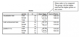
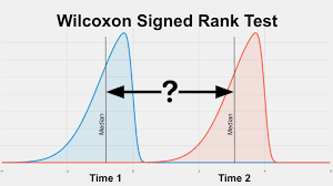
What should you do if the t test assumptions are markedly violated (e.g., what if the dependent variable data are grossly skewed, otherwise non-normally distributed, or are ordinal)? One answer is to run the appropriate nonparametric statistic, which in this case is called the Mann-Whitney (M-W) U test. The M-W is used with a between-groups design with two levels of the independent variable.

9.3 Do boys and girls differ significantly on visualization, math achievement, and grades?

For this problem, we will assume that the scores for the three dependent variables were ordinal level data or that other assumptions of the t test were violated but that the assumptions of the Mann-Whitney test were met.

Assumptions of the Mann-Whitney test:

  1. It is assumed there is an underlying continuity from low to high in the dependent variable, before ranking, even if the actual data are discrete numbers such as 1, 2, 3, 4, 5, on a Likert rating.
  2. The data are independent (scores of one participant are not dependent on scores of the others).
  • Click on Analyze Nonparametric Tests Legacy Dialogs  2 Independent Samples…
  • Move visualization test, math achievement, and grades in h.s. to the Test (dependent) Variable List:
  • Next, click on gender and move it over to the Grouping (independent) Variable:
  • Click on Define Groups and enter 0 and 1 for groups because males are 0 and females are 1.
  • Ensure that Mann-Whitney U is checked. Your window should look like Fig. 9.4.

  • Click on OK

Compare your syntax and output to Output 9.3 to check your work.

Output 9.3: Nonparametric Test: Mann-Whitney U

NPAR TESTS

/M-W= visual mathach grades BY gender(0 1) /MISSING ANALYSIS.

NPar Tests

Mann-Whitney Test                                       

Interpretation of Output 9.3

The Ranks table shows the mean or average ranks for males and females on each of the three dependent variables. The 75 students are ranked from 75 (highest) to 1 (lowest) so that, in contrast to the typical ranking procedure, a high mean rank indicates the group scored higher.

The second table provides the Mann-Whitney U, z score, and the Sig. (significance) level or p value. Asymptotic (“Asymp.”) significance refers to the fact that the significance levels are not exact. Note that the mean ranks of the genders differ significantly on visualization test and math achievement but not on grades in high school, as was the case for the similar t tests in Problem 9.2. The Mann-Whitney test is only slightly less powerful than the t test, so it is a good alternative if the assumptions of the t test are violated, as was actually the case with visualization test. Note that you would not report both t tests and Mann-Whitney tests for the same variables because they provide very similar information.

Although an effect size measure is not provided in the output, it is easy to compute an r from the z provided in the Test Statistics table, using the conversion formula, r = z/ ,— . For these N

three comparisons, the r effect sizes are -.24 (i.e., 2.05/8.66), -.30, and -.09 for visualization test, math achievement, and grades in h.s., respectively. You can see from Table 6.5 that these are small to medium/typical, medium, and small/minimal, respectively. These r effect sizes are somewhat smaller than for the corresponding t tests in Output 9.2.

How to Write About Output 9.3

Results

Because the dependent variables were ordinal and the variances were unequal, Mann-Whitney U tests were performed to compare the genders. The 34 male students have significantly higher mean ranks (43.65) than the 41 females (33.32) on the visualization test, U = 505, p = .04, r = -.24, which, according to Cohen (1988), is a small to medium effect size. Likewise, there was a significant difference in the mean ranks of males (45.10) and females (32.11) on math achievement, U = 455.5, p = .01, r = -.30, which is considered a medium effect size. However, male and female students did not differ on grades in high school. Mean ranks were 35.78 and 39.84, respectively, U = 621.5, p = .41, r = .09.

Source: Morgan George A, Leech Nancy L., Gloeckner Gene W., Barrett Karen C.

(2012), IBM SPSS for Introductory Statistics: Use and Interpretation, Routledge; 5th edition; download Datasets and Materials.

Comparing Two Groups with SPSS – Problem 9.4: Paired Samples t Test

In this problem, you will compare the average scores of each HSB student’s father’s and mother’s scores on the same measure, namely, their educational level. Because father’s and mother’s education are not independent of each other, the paired t test is the appropriate test to perform.

The paired samples t test is also used when the two scores are repeated measures, such as the visualization test score and the visualization retest score (see Problem 9.5). Other examples would be in a longitudinal study or in a single group quasi-experimental study in which the same assessment is used as the pretest, before the intervention, and as the posttest, after the intervention.

Assumptions and Conditions for Use of the Paired Samples t test:

  1. The independent variable is dichotomous and its levels (or groups) are paired, or matched, in some way (e.g., husband-wife, pre-post, etc.).
  2. The dependent variable is normally distributed in the two conditions.

The first assumption depends on the design; the second can be assessed by examining the skewness of the two variables.

  • Do students’ fathers or mothers have more education?

We will determine if the fathers of these students have more education than their mothers. Remember that the fathers and mothers are paired; that is, each child has a pair of parents whose educations are given in the data set. (Note that you can do more than one paired t test at a time, so we could have compared the visualization test and retest scores in the same run as we compared father’s and mother’s education, but we decided to do them separately.)

  • Select Analyze Compare Means  Paired Samples T Test
  • Move both of the variables, father’s education and mother’s education, to the Paired Variables: box (see Fig. 9.5).
  • Click on OK.

Output 9.4: Paired Samples t Tests

T-TEST PAIRS= faed WITH maed (PAIRED)

/CRITERIA=CI(.9500)

/MISSING=ANALYSIS.

T-Test


Interpretation of Output 9.4

The first table shows the descriptive statistics used to compare mother’s and father’s education levels. The second table, Paired Samples Correlations, provides correlations between the two paired scores. The correlation (r = .68) between mother’s and father’s education indicates that highly educated men tend to marry highly educated women and vice versa. It doesn’t tell you whether men or women have more education. That is what t in the third table tells you.

The last table shows the Paired Samples t Test. The Sig. for the comparison of the average education level of the students’ mothers and fathers was p = .019. Thus, the difference in educational level is statistically significant, and we can tell from the means in the first table that fathers have more education; however, the effect size is small (d = .28) and is computed by dividing the mean of the paired differences (.59) by the standard deviation (2.1) of the paired differences. Also, we can tell from the confidence interval that the difference in the means could be as small as .10 or as large as 1.08 points on the 2 to 10 scale.

It is important that you understand that the correlation in the second table provides you with different information than the paired t. If not, read this interpretation again.

How to Write About Output 9.4

Results

A paired or correlated samples t test indicated that the students’ fathers had on average significantly more education than their mothers, t (72) = 2.40, p = .019, d = .28. The difference, although statistically significant, is small using Cohen’s (1988) guidelines.

Source: Morgan George A, Leech Nancy L., Gloeckner Gene W., Barrett Karen C.

(2012), IBM SPSS for Introductory Statistics: Use and Interpretation, Routledge; 5th edition; download Datasets and Materials.

Comparing Two Groups with SPSS – Problem 9.5: Using the Paired t Test to Check Reliability

In addition to comparing the means for two paired or matched samples, the paired t can be used in connection with checking reliability, especially test-retest or parallel (equivalent) forms reliability. These reliability measures are usually done using a correlation coefficient, so we could have demonstrated test-retest reliability for the visualization test scores in the last chapter. However, the paired t test program may be a better way to go because it produces and displays not only the reliability correlation but also the comparison of the test and retest means. Thus we can see not only whether the test scores were strongly associated (relatively high test scores have high retests and low tests have low retests) but also whether, on the average, scores on the retest were the same (versus higher or lower) as the test scores. Thus, two alternate forms of a test may provide reliable data for the same construct (high positive correlation), but one form may be easier, such that people generally perform at a higher level on it than on the other form. Or, retesting may lead to higher scores, perhaps due to a practice effect. The paired t program enables one to determine this, providing more information about the tests.

  • What is the test-retest reliability of the visualization test scores? Do average visualization retest scores differ from average initial visualization scores?

To compute reliability and mean differences with the paired t test program:

  • Select Analyze Compare Means  Paired Samples T Test…
  • Click on Reset.
  • Click on both visualization test and visualization retest and move them to the Paired Variables: box (see Fig 9.4 if you need help).
  • Click on

Compare your output to Output 9.5.

Output 9.5: Test-Retest Reliability for Visualization Scores

T-TEST PAIRS = visual WITH visual2 (PAIRED)

/CRITERIA = CI(.9500)

/MISSING = ANALYSIS.

Interpretation of Output 9.5

The first table, Paired Samples Statistics, shows the Mean for the visualization test (5.24) and the visualization retest (4.55). These means will be compared in the third table. In addition, the Ns, SDs, and standard errors are shown.

The second table shows the Paired Samples Correlations, which will be used to assess the test- retest reliability of the visualization scores. Note that r = .89, which is a high positive correlation and seems to provide good support for test-retest reliability. This correlation indicates that students who scored high on the test were very likely to score high on the retest, and students who scored low were very likely to score poorly on the retest. More specifically, it indicates that the visualization test is systematically measuring primarily the same thing both times it is taken.

The Paired Samples Test table shows that the means of the test and the retest are significantly different (p = .002). Although the correlation is very high, a significant t test is usually not desirable when the two assessments are supposed to be measuring the same thing. It indicates that, although the same students tended to score high (or low) on the test and the retest, the group average was lower on the retest. For some reason, the retest seemed to be harder. Perhaps the retest was actually an alternate form or version of the test that was supposed to be equivalent but turned out to be more difficult.

Source: Morgan George A, Leech Nancy L., Gloeckner Gene W., Barrett Karen C.

(2012), IBM SPSS for Introductory Statistics: Use and Interpretation, Routledge; 5th edition; download Datasets and Materials.

Comparing Two Groups with SPSS – Problem 9.6: Nonparametric Wilcoxon Test for Two Related

Let’s assume that education levels and visualization test scores are not normally distributed and/or other assumptions of the paired t test are violated. In fact, mother’s education was quite skewed (see Chapter 4). Let’s run the Wilcoxon signed-ranks nonparametric test to see if fathers have significantly higher educational levels than the mothers and to see if the visualization test is significantly different from the visualization retest. The assumptions of the Wilcoxon tests are similar to those for the Mann-Whitney test.

  • (a) Are mother’s and father’s education levels significantly different? (b) Are the visualization and visualization retest scores different?
  • To answer these questions, select Analyze Nonparametric Tests Legacy Dialogs  2 Related Samples…
  • Highlight father’s education and mother’s education and move them into the Test Pairs: Then, highlight visualization test and visualization retest and move them into the box.
  • Ensure that Wilcoxon is checked in the Test Type dialog box. (See Fig. 9.6.)
  • Click on

Compare your syntax and output to Output 9.6.

Output 9.6: Wilcoxon Nonparametric Test

NPAR TEST

/WILCOXON=faed visual WITH maed visual2 (PAIRED)

/MISSING ANALYSIS.

NPar Tests

Wilcoxon Signed Ranks Test

Interpretation of Output 9.6

Output 9.6 shows the nonparametric (Wilcoxon) analyses, which are similar to the paired t tests.

Note that the first table shows not only the mean ranks, but also the number of students whose mothers, for example, had less education than their fathers (27). Note that there were lots of ties (25) and almost as many women (21) that have more education than their husbands. However, overall the fathers had more education, as indicated by their lower mean rank (18.45) and the significant z (p = .037). The second table shows the significance level for the two tests. Note that the p or sig. values are quite similar to those for the paired t tests. Effect size measures are not

provided on the output, but again we can compute an r from the z scores and Ns (Total) that are

shown in Output 9.6 using the same formula as for Problem 9.3 r = -.24 (i.e., -2.085/8.54) for the comparison of mothers’ and fathers’ education, which is a small to medium effect size. For the comparison of the visualization and visualization retest, r = .46, a large effect size. Note that 55 students had higher visualization test scores while only 14 had higher visualization retest scores.

How to Write About Output 9.6

Results

Wilcoxon signed ranks tests were used to compare the education of each student’s mother and father. Of 73 students, 27 fathers had more education, 21 mothers had more education, and there were 25 ties. This difference indicating more education for fathers is significant, z = 2.09, p = .037, r = -.24, a small to medium effect size. Similarly, the visualization test scores were significantly higher than the visualization retest scores, N = 75, z = 3.98, p < .001, r = -.46, a large effect according to Cohen (1988).

Source: Morgan George A, Leech Nancy L., Gloeckner Gene W., Barrett Karen C.

(2012), IBM SPSS for Introductory Statistics: Use and Interpretation, Routledge; 5th edition; download Datasets and Materials.

Analysis of Variance with SPSS – Problem 10.1: One-Way (or Single Factor) ANOVA

In this problem, you will examine a statistical technique for comparing two or more independent groups on the dependent variable. The appropriate statistic, called One-Way ANOVA, compares the means of the samples or groups in order to make inferences about the population means. One­way ANOVA also is called single factor analysis of variance because there is only one independent variable or factor. The independent variable has nominal levels or a few ordered levels. The overall ANOVA test does not take into account the order of the levels, but additional tests (contrasts) can be done that do consider the order of the levels. More information regarding contrasts can be found in Leech et al. (in press).

Remember that, in Chapter 9, we used the independent samples t test to compare two groups (males and females). The one-way ANOVA may be used to compare two groups, but ANOVA is necessary if you want to compare three or more groups (e.g., three levels of father’s education) in a single analysis. Review Fig. 6.1 and Table 6.1 to see how these statistics fit into the overall selection of an appropriate statistic.

Assumptions of ANOVA

  1. Observations are independent. The value of one observation is not related to any other observation. In other words, one person’s score should not provide any clue as to how any of the other people would score. Each person is in only one group and has only one score on each measure; there are no repeated or within-subjects measures.
  2. Variances on the dependent variable are equal across groups.
  3. The dependent variable is normally distributed for each group.

Because ANOVA is robust, it can be used when variances are only approximately equal if the number of subjects in each group is approximately equal. ANOVA also is robust if the dependent variable data are approximately normally distributed. Thus, if assumption #2, or, even more so, #3 is not fully met, you may still be able to use ANOVA. There are also several choices of post hoc tests to use depending on whether the assumption of equal variances has been violated.

Dunnett’s C and Games-Howell are appropriate post hoc tests if the assumption of equal variances is violated.

10.1 Are there differences among the three father’s education revised groups on grades in h.s., visualization test scores, and math achievement?

We will use the One-Way ANOVA procedure because we have one independent variable with three levels. We can do several one-way ANOVAs at a time so we will do three ANOVAs in this problem, one for each of the three dependent variables. Note that you could do MANOVA (see Fig. 6.1) instead of three ANOVAs, especially if the dependent variables are correlated and conceptually related, but that is beyond the scope of this book. See our companion book (Leech et al., in press).

To do the three one-way ANOVAs, use the following commands:

  • Analyze  Compare Means  One-Way ANOVA…
  • Move grades in h.s., visualization test, and math achievement into the Dependent List: box in Fig. 10.1.
  • Click on father’s educ revised and move it to the Factor (independent variable) box.
  • Click on Options to get Fig. 10.2.
  • Under Statistics, choose Descriptive and Homogeneity of variance test.

  • Under Missing Values, choose Exclude cases analysis by analysis.
  • Click on Continue then OK. Compare your output to Output 10.1.

Output 10.1: One-Way ANOVA

ONEWAY grades visual mathach BY faedRevis

/STATISTICS DESCRIPTIVES HOMOGENEITY

/MISSING ANALYSIS.

The between-groups differences for grades in high school and math achievement are significant (p < .05) whereas those for visualization are not.

Interpretation of Output 10.1

The first table, Descriptives, provides familiar descriptive statistics for the three father’s education groups on each of the three dependent variables (grades in h.s., visualization test, and math achievement) that we requested for these analyses. Remember that, although these three dependent variables appear together in each of the tables, we have really computed three separate one-way ANOVAs.

The second table (Test of Homogeneity of Variances) provides the Levene’s test to check the assumption that the variances of the three father’s education groups are equal for each of the dependent variables. Notice that for grades in h.s. (p = .220) and visualization test (p = .153) the Levene’s tests are not significant. Thus, the assumption is not violated. However, for math achievement, p = .049; therefore, the Levene’s test is significant and thus the assumption of equal variances is violated. In this latter case, we could use the similar nonparametric test (Kruskal- Wallis). Or, if the overall F is significant (as you can see it was in the ANOVA table), you could use a post hoc test designed for situations in which the variances are unequal. We will do the latter in Problem 2 and the former in Problem 3 for math achievement.

The ANOVA table in Output 10.1 is the key table because it shows whether the overall Fs for these three ANOVAs were significant. Note that the three father’s education groups differ significantly on grades in h.s. and math achievement but not visualization test. When reporting these findings one should write, for example, F (2, 70) = 4.09, p = .021, for grades in h.s. The 2, 70 (circled for grades in h.s. in the ANOVA table) are the degrees of freedom (df) for the between-groups “effect” and within-groups “error,” respectively. F tables also usually include the mean squares, which indicate the amount of variance (sums of squares) for that “effect” divided by the degrees of freedom for that “effect.” You also should report the means (and SDs) so that one can see which groups were high and low. Remember, however, that if you have three or more groups you will not know which specific pairs of means are significantly different unless you do a priori (beforehand) contrasts (see Fig. 10.1) or post hoc tests, as shown in Problem 10.2. We provide an example of appropriate APA-format tables and how to write about these ANOVAs after Problem 10.2.

Source: Morgan George A, Leech Nancy L., Gloeckner Gene W., Barrett Karen C.

(2012), IBM SPSS for Introductory Statistics: Use and Interpretation, Routledge; 5th edition; download Datasets and Materials.

Analysis of Variance with SPSS – Problem 10.2: Post Hoc Multiple Comparison Tests

Now we will introduce the concept of post hoc multiple comparisons, sometimes called follow­up tests. When you compare three or more group means, you know that there will be a statistically significant difference somewhere if the ANOVA F (sometimes called the overall F or omnibus F) is significant.

However, we would usually like to know which specific means are different from which other ones. In order to know this, you can use one of several post hoc tests that are built into the one­way ANOVA program. The LSD post hoc test is quite liberal and the Scheffe test is quite conservative so many statisticians recommend a more middle of the road test, such as the Tukey HSD (honestly significant differences) test, if the Levene’s test was not significant, or the Games-Howell test, if the Levene’s test was significant. Ordinarily, you do post hoc tests only if the overall F is significant. For this reason, we have separated Problems 10.1 and 10.2, which could have been done in one step. Fig. 10.3 shows the steps one should use in deciding whether to use post hoc multiple comparison tests.

Fig. 10.3. Schematic representation of when to use post hoc multiple comparisons with a one-way ANOVA.

  • If the overall F is significant, which pairs of means are significantly different?

After you have examined Output 10.1 to see if the overall F (ANOVA) for each variable was significant, you will do appropriate post hoc multiple comparisons for the statistically significant variables. We will use the Tukey HSD if variances can be assumed to be equal (i.e., the Levene’s test is not significant) and the Games-Howell if the assumption of equal variances cannot be justified (i.e., the Levene’s test is significant).

First we will do the Tukey HSD for grades in h.s. Open the One-Way ANOVA dialog box again by doing the following:

  • Select Analyze  Compare Means  One-Way ANOVA… to see Fig. 10.1 again.
  • Move visualization test out of the Dependent List: by highlighting it and clicking on the arrow pointing left because the overall F for visualization test was not significant. (See interpretation of Output 10.1.)
  • Also move math achievement to the left (out of the Dependent List: box) because the Levene’s test for it was (We will use it later.)
  • Keep grades in the Dependent List: because it had a significant ANOVA, and the Levene’s test was not significant.
  • Insure that father’s educ revised is in the Factor
  • Your window should look like Fig. 10.4.

  • Next, click on .. and remove the check for Descriptive and Homogeneity of variance test (in Fig. 10.2) because we do not need to do them again; they would be the same.
  • Click on Continue.
  • Then, in the main dialogue box (Fig. 10.1), click on Post Hoc. to get Fig. 10.5.
  • Check Tukey because, for grades in h.s., the Levene’s test was not significant so we assume that the variances are approximately equal.

  • Click on Continue and then OK to run this post hoc test.

Compare your output to Output 10.2a

Output 10.2a: Tukey HSD Post Hoc Tests

ONEWAY grades BY faedRevis

/MISSING ANALYSIS

/POSTHOC = TUKEY ALPHA(0.05).

After you do the Tukey test, let’s go back and do Games-Howell. Follow these steps:

  • Select Analyze  Compare Means  One-Way ANOVA…
  • Move grades in h.s. out of the Dependent List: by highlighting it and clicking on the arrow pointing left.
  • Move math achievement into the Dependent List:
  • Insure that father’s educ revised is still in the Factor:
  • In the main dialogue box (Fig. 10.1), click on Post Hoc. to get Fig. 10.4.
  • Check Games-Howell because equal variances cannot be assumed for math achievement.
  • Remove the check mark from Tukey.
  • Click on Continue and then OK to run this post hoc test.
  • Compare your syntax and output to Output 10.2b.

Output 10.2b: Games-Howell Post Hoc Test

ONEWAY mathach BY faedRevis

/MISSING ANALYSIS

/POSTHOC = GH ALPHA(0.05).

Oneway

Interpretation of Output 10.2

The first table in both Outputs 10.2a and 10.2b repeats appropriate parts of the ANOVA table from Output 10.1. The second table in Output 10.2a shows the Tukey HSD test for grades in h.s. that you would use if the three group sizes (n = 38, 16, 19 from the first table in Output 10.1) had been similar. For grades in h.s., this Tukey table indicates that there is only a small mean difference (.22) between the mean grades of students whose fathers were high school grads or less (M = 5.34 from Output 10.1) and those fathers who had some college (M = 5.56). The Homogeneous Subsets table shows an adjusted Tukey that is appropriate when group sizes are not similar, as in this case. Note that there is not a statistically significant difference (p = .880) between the grades of students whose fathers were high school grads or less (low education) and those with some college (medium education) because their means are both shown in Subset 1. In Subset 2, the medium and high education group means are shown, indicating that they are not significantly different (p = .096). By examining the two subset boxes, we can see that the low education group (M = 5.34) is different from the high education group (M = 6.53) because these two means do not appear in the same subset. Output 10.2b shows, for math achievement, the Games-Howell test, which we use for variables that have unequal variances. Note that each comparison is presented twice. The Mean Difference between students whose fathers were high school grads or less and those with fathers who had some college was -4.31. The Sig. (p = .017) indicates that this is a significant difference. We can also tell that this difference is significant because the confidence interval’s lower and upper bounds both have the same sign, which in this case was a minus, so zero (no difference) is not included in the confidence interval. Similarly, students whose fathers had a B.S. degree were significantly different on math achievement from those whose fathers had a high school degree or less (p = .008).

An Example of How to Write About Outputs 10.1 and 10.2.

Results

A statistically significant difference was found among the three levels of father’s education on grades in high school, F (2, 70) = 4.09, p = .021, and on math achievement, F (2, 70) = 7.88, p = .001. Table 10.2a shows that the mean grade in high school is 5.34 for students whose fathers had low education, 5.56 for students whose fathers attended some college (medium), and 6.53 for students whose fathers received a BS or more (high). Post hoc Tukey HSD tests indicate that the low education group and high education group differed significantly in their grades with a large effect size (p < .05, d = .85). Likewise, there were also significant mean differences on math achievement between the low education and both the medium education group (p < .017, d = .80) and the high education group (p = .008, d = 1.0) using the Games-Howell post hoc test.

Source: Morgan George A, Leech Nancy L., Gloeckner Gene W., Barrett Karen C.

(2012), IBM SPSS for Introductory Statistics: Use and Interpretation, Routledge; 5th edition; download Datasets and Materials.

Analysis of Variance with SPSS – Problem 10.3: Nonparametric Kruskal-Wallis Test

What else can you do if the homogeneity of variance assumption is violated (or if your data are ordinal or highly skewed)? One answer is a nonparametric statistic. Let’s make comparisons similar to Problem 10.1, assuming that the data are ordinal or the assumption of equality of group variances is violated. Remember that the variances for the three fathers’ education groups were significantly different on math achievement, and the competence scale was not normally distributed (see Chapter 4). The assumptions of the Kruskal-Wallis test are the same as for the Mann-Whitney test (see Chapter 9).

  • Are there statistically significant differences among the three father’s education groups on math achievement and the competence scale?

Follow these commands:

  • Analyze Nonparametric Tests Legacy Dialogs K Independent Samples…
  • Move the dependent variables of math achievement and competence to the Test Variable List: (see Fig. 10.6).
  • Move the independent variable father’s educ revised to the Grouping Variable
  • Click on Define Range and insert 1 and 3 into the minimum and maximum boxes (Fig. 10.7) because faedRevis has values of 1, 2, and 3.
  • Click on Continue.
  • Ensure that Kruskal-Wallis H (under Test Type) in the main dialogue box is checked.
  • Then click on OK. Do your results look like Output 10.3?

Output 10.3: Kruskal-Wallis Nonparametric Tests

NPAR TESTS

/K-W=mathach competence BY faedRevis(1 3)

/MISSING ANALYSIS.

NPar Tests

Interpretation of Output 10.3

As in the case of the Mann-Whitney test (Chapter 9), the Ranks table provides Mean Ranks for the two dependent variables, math achievement and competence. In this case, the Kruskal- Wallis (K-W) test will compare the mean ranks for the three father’s education groups.

The Test Statistics table shows whether there is an overall difference among the three groups. Notice that the p (Asymp. Sig.) value for math achievement is .001, which is the same as it was in Output 10.1 using the one-way ANOVA. This is because K-W and ANOVA have similar power to detect a difference. Note also that there is not a significant difference among the father’s education groups on the competence scale (p = .999).

Unfortunately, there are no post hoc tests built into the K-W test, as there are for the one-way ANOVA. Thus, you cannot tell which of the pairs of father’s education means are different on math achievement. One method to check this would be to run three Mann-Whitney (M-W) tests comparing each pair offather’s education mean ranks (see Problem 9.3). Note you would only do the post hoc M-W tests if the K-W test was statistically significant; thus, you would not do the M-W for competence. It also would be prudent to adjust the significance level by dividing .05 by 3 (the Bonferonni correction) so that you would require that the M-W Sig. be < .017 to be statistically significant. For the box about how to write about this output, we have computed the three M-W tests and r effect size measures, as demonstrated in Problem 9.3.

How to Write About Output 10.3

A Kruskal-Wallis nonparametric test was conducted to test for significant differences between father’s education groups in math achievement because there were unequal variances and ns across groups. The test indicated that the three father’s education groups differed significantly on math achievement, x2 (2, N = 71) = 13.38, p = .001. Post hoc Mann-Whitney tests compared the three fathers’ education groups on math achievement, using a Bonferonni corrected p value of .017 to indicate statistical significance. The mean rank for math achievement of students whose fathers had some college (36.59, n = 16) was significantly higher than that of students whose fathers were high school graduates or less (23.67, n = 38), z = 2.76, p = .006, r = .38, a medium to large effect size according to Cohen (1988). Also, the mean rank for math achievement of students whose fathers had a bachelor’s degree or more (38.47, n = 19) was significantly higher than that of students whose fathers were high school graduates or less (24.26, n = 38), z = 3.05, p = .002, r = .40, a medium to large effect size. There was no difference on math achievement between students whose fathers had some college and those whose fathers had a bachelor’s degree or more, z = -1.23, p = .23.

Source: Morgan George A, Leech Nancy L., Gloeckner Gene W., Barrett Karen C.

(2012), IBM SPSS for Introductory Statistics: Use and Interpretation, Routledge; 5th edition; download Datasets and Materials.

Analysis of Variance with SPSS – Problem 10.4: Two-Way (or Factorial) ANOVA

In previous problems, we compared two or more groups based on the levels of only one independent variable or factor using t tests (Chapter 9) and one-way ANOVA (this chapter). These were called single factor designs. In this problem, we will compare groups based on two independent variables. The appropriate statistic for this is called a two-way or factorial ANOVA. This statistic is used when there are two different independent variables, each of which classifies (or labels) participants with respect to a particular characteristic, with each participant being labeled by a particular level of each of the independent variables (completely crossed design). For example, an individual could be labeled, or classified, based on the variables of gender and education level, as a female college graduate. In this chapter, we provide an introduction to this complex difference statistic; a more in-depth treatment is provided in Leech et al., in press.

  • Do math grades and gender each seem to have an effect on math achievement, and do the effects of math grades on math achievement depend on whether the person is male or female (i.e., on the interaction of math grades with gender)?

Follow these commands:

  • Analyze General Linear Model Univariate…
  • Move math achievement to the Dependent Variable:
  • Move the first independent variable, math grades (not grades in h.s.), to the Fixed Factor(s):
  • Then also move the second independent variable, gender, to the Fixed Factor(s): box (see Fig.10.8)

Now that we know the variables we will be dealing with, let’s determine our options.

  • Click on Plots and move mathgr to the Horizontal Axis: and gender to Separate Lines:
  • Then press Add. Your window should now look like Fig. 10.9.
  • Click on Continue to get back to Fig. 10.8.

  • Select Options and click Descriptive statistics and Estimates of effect size. See Fig. 10.10.
  • Click on Continue.
  • Click on OK. Compare your syntax and output to Output 10.4.

Output 10.4: Two-Way ANOVA

UNIANOVA mathach BY mathgr gender

/METHOD = SSTYPE(3)

/INTERCEPT = INCLUDE

/PLOT = PROFILE(mathgr*gender )

/PRINT = DESCRIPTIVE ETASQ

/CRITERIA = ALPHA(.05)

/DESIGN = mathgr gender mathgr*gender

Univariate Analysis of Variance

Interpretation of Output 10.4

The GLM Univariate program allows you to print the means for each subgroup (cell) representing the interaction between the two independent variables. It also provides measures of effect size (eta2) and plots the interaction, which is helpful in interpreting it. The first table in Output 10.4 shows that 75 participants (44 with less than A-B math grades and 31 mostly A-B math grades) are included in the analysis because they had data on all of the variables. The Descriptive Statistics table shows the cell and marginal (total) means; both are very important for interpreting the ANOVA table and explaining the results of the test for the interaction.

The ANOVA table, called Tests of Between-Subjects Effects, is the key table. Note that the word “effect” in the title of the table can be misleading because this study was not a randomized experiment. Thus, you cannot say in your report that the differences in the dependent variable were caused by or were the effect of the independent variable. Usually you will ignore the lines in the table labeled “corrected model” (which just summarizes all “effects” taken together) and intercept (which is needed to fit the best fit regression line to the data) and skip down to the interaction F (mathgr * gender) which, in this case, is not statistically significant, F (1, 71) = .337, p = .563. If the interaction were significant, we would need to be cautious about the interpretation of the main effects because they could be misleading.

Next we examine the main effects of math grades and of gender. Note that both are statistically significant. The significant F for math grades means that students with fewer As and Bs in math scored lower (M = 10.81 vs. 15.05) on math achievement than those with high math grades, and this difference is statistically significant (p < .001). Gender is also significant (p < .001). Because the interaction is not significant, the “effect” of math grades on math achievement is about the same for both genders. If the interaction were significant, we would say that the “effect” of math grades depended on which gender you were considering. For example, it might be large for boys and small for girls. If the interaction is significant, you should also analyze the differences between cell means (the simple effects). Leech et al. (in press) shows how to do this and discusses more about how to interpret significant interactions. The profile plots may be helpful in visualizing the interaction, but you should not discuss statistically nonsignificant differences because the plots may be misleading.

Note also the callout boxes about the adjusted R squared and eta squared. Eta, the correlation ratio, is used when the independent variable is nominal and the dependent variable (math achievement in this problem) is normal. Eta2 is an indicator of the proportion of variance that is due to between-groups differences. Adjusted R2 refers to the multiple correlation coefficient squared. Like r2, these statistics indicate how much variance or variability in the dependent variable can be predicted if you know the independent variable scores. In this problem, the eta2 percentages for these key Fs vary from 0.5% to 17.2%. Because eta and R, like r, are indexes of association, they can be used to interpret the effect size. However, Cohen’s guidelines for small, medium, and large are somewhat different (for eta, small = .10, medium = .24, and large = .37; for R, small = .14, medium = .36, and large = .51).

In this example, eta (not squared) for math grades is about .42 and thus a large effect. Eta for gender is about .40, a large effect. The overall adjusted R is about .46, a large effect. Notice that the adjusted R2 is lower than the unadjusted (.22 versus .25). The reason for this is that the adjusted R2 takes into account (and adjusts for) the fact that not just one variable but three (math grades, gender, and the interaction) were used to predict math achievement.

An important point to remember is that statistical significance depends heavily on the sample size, so that with 1,000 subjects a much lower F or r will be significant than if the sample is 10 or even 100. Statistical significance just tells you that you can be quite sure that there is at least a little relationship between the independent and dependent variables. Effect size measures, which are more independent of sample size, tell you how strong the relationship is and thus give you some indication of its importance.

The profile plots of cell means (which follow the table of between-subjects effects) help us to visualize the nature of a significant interaction when one exists. When the lines on the profile plot are parallel, there is not a significant interaction. Note that we requested that the separate lines represent the two genders because we felt that this would make a significant interaction easier to interpret than if the two lines represented predominant level of grades. However, really, either independent variable could have been represented in either part of the graph.

An Example of How to Write About Output 10.4

Results

To assess whether math grades and gender each seem to have an effect on math achievement, and if the effects of math grades on math achievement depend on whether the person is male or female (i.e., on the interaction of math grades with gender) a two-way ANOVA was conducted.

Table 10.4a shows the means and standard deviations for math achievement for the two genders and math grades groups. Table 10.4b shows that there was not a significant interaction between gender and math grades on math achievement (p = .563). There was, however, a significant main effect of gender on math achievement, F (1, 71) = 13.87, p < .001. Eta for gender was about .42, which, according to Cohen (1988), is a large effect. Furthermore, there was a significant main effect of math grades on math achievement, F (1, 71) = 14.77, p < .001. Eta for math grades was about .40, a large effect.

Source: Morgan George A, Leech Nancy L., Gloeckner Gene W., Barrett Karen C.

(2012), IBM SPSS for Introductory Statistics: Use and Interpretation, Routledge; 5th edition; download Datasets and Materials.

Several Measures of Reliability with SPSS – Problem 3.1: Cronbach’s Alpha for the Motivation Scale

The motivation score is composed of six items that were rated on four-point Likert scales, from very atypical (1) to very typical (4). Do the scores for these items go together (interrelate) well enough to add them together for future use as a composite variable labeled motivation?

  • What is the internal consistency reliability of the math attitude scale that we labeled motivation?

Note that you do not use the computed motivation scale score. Instead, use the individual items to create the scale temporarily. Let’s do reliability analysis for the motivation scale.

  • Click on Analyze Scale Reliability Analysis. You should get a dialog box like 3.1.
  • Now move the variables item01, item04 reversed, item07, item08 reversed, item12, and item13 (the motivation questions) to the Items Be sure to use item04 reversed and item08 reversed (not item04 and item08) because a high rating on the original (unreversed) items indicates low motivation. The alpha will be based on the correlation among each pair of items, so they all need to be scored so that higher scores index the same thing (e.g., higher levels of motivation).
  • Type Alpha for Motivation Scale in the Scale label box. Be sure the Model is Alpha (refer to Fig. 3.1).

Fig.3.1.Reliability analysis.

  • Click on Statistics in the Reliability Analysis dialog box and you will see something similar to 3.2.
  • Check the following items: Item, Scale, and Scale if item deleted (all under Descriptives for), Correlations (under Inter-Item), Means, and Correlations (under Summaries).
  • Click on Continue then OK. Compare your syntax and output to Output3.1.

Fig.3.2. Reliability analysis: Statistics.

Source: Leech Nancy L. (2014), IBM SPSS for Intermediate Statistics, Routledge; 5th edition;

download Datasets and Materials.

Several Measures of Reliability with SPSS – Problems 3.2 and 3.3: Cronbach’s Alpha for the Competence and Pleasure Scales

Again, is it reasonable to add the scores for these items together to form summated measures of the concepts of competence and pleasure?

  • What is the internal consistency reliability of the competence scale?
  • What is the internal consistency reliability of the pleasure scale?

Let’s repeat the same steps as before to check the reliability of the following scales and then compare your output to 3.2 and 3.3.

  • For the competence scale, use item03, item05 reversed, item09, and itemll reversed.

r Remember to change the Scale Label to “Alpha for Competence Scale.”

  • For the pleasure scale, use item02, item06 reversed, item10 reversed, and item14.
  • Change the Scale Label to “Alpha for Pleasure Scale.”
  • This time unclick the checks for Scale and for Correlations under Inter­Item to make the output shorter.
  • Click OK.

Output 3.2: Cronbach’s Alpha for the Math Attitude Competence Scale

RELIABILITY

/VARIABLES=item03 item05r item09 item11r

/SCALE(‘Alpha for Competence Scale’) ALL

/MODEL=ALPHA

/STATISTICS=DESCRIPTIVE SCALE CORR /SUMMARY=TOTAL MEANS CORR.

Reliability

Scale: Alpha for Competence Scale

Interpretation of Output 3.2

Note that the Alpha is .80, an acceptable internal consistency reliability. The Item Statistics table shows that you have 73 students with data on all four items as well as reasonable means and SDs. The Summary Item Statistic table shows that the mean of the four items is 3.30; the mean correlation among the items is .49 and varies from a low of .33 to a high of .74. All the Corrected Item-Total Correlations are above .40, which is good.

Output 3.3: Cronbach’s Alpha for the Math Attitude Pleasure Scale

RELIABILITY

/VARIABLES=item02 item06r item10r item14

/SCALE(‘Alpha for Pleasure Scale’) ALL

/MODEL=ALPHA

/STATISTICS=DESCRIPTIVE SCALE CORR

/SUMMARY=TOTAL MEANS CORR.

Reliability

Scale: Alpha for Pleasure Scale

Interpretation of Output 3.3

The Alpha is .69, which is lower than desirable, partly because there are only four items in the scale. Note that the mean Inter-Item Correlation is .37 and the lowest correlation is only .20. The Corrected Item-Total Correlation for item06 is a little low at .397, but deleting it would not improve the alpha.

Source: Leech Nancy L. (2014), IBM SPSS for Intermediate Statistics, Routledge; 5th edition;

download Datasets and Materials.

Several Measures of Reliability with SPSS – Problem 3.4: Test-Retest Reliability Using Correlation

  • Is there support for the test-retest reliability of the two visualization test scores?

Let’s do a Pearson r for visualization test and visualization retest scores.

  • Click on Analyze  Correlate  Bivariate.
  • Move variables visualization and visualization retest into the variable box.
  • Do not select flag significant correlations because statistical significance is not important for reliability assessment; rather we should focus on the magnitude of the correlations. Reliability coefficients should be positive and greater than .70; statistical significance is not considered because we are not doing inferential statistics but instead are trying to see if our sample’s data provide evidence to support the reliability of the visualization measure.
  • Click on Options.
  • Click on Means and Standard deviations.
  • Click on Continue and then OK. Do your syntax and output look like Output 3.4?

Output 3.4: Pearson r for the Reliability of the Visualization Score

CORRELATIONS

/VARIABLES=visual visual2

/PRINT=TWOTAIL SIG

/STATISTICS DESCRIPTIVES

/MISSING=PAIRWISE.

Correlations

Descriptive Statistics

Interpretation of Output 3.4

The first table provides the descriptive statistics for the two variables, visualization test and visualization retest. The second table indicates that the correlation of the two visualization scores is very high (r = .89) so there is strong support for the test-retest reliability of the visualization score. This correlation is significant, p < .001, but here we are not concerned about the significance because we are not doing inferential statistics; instead we are interested in the size of the relationship between the variables in this sample to see if our data support the reliability of the measure.

Example of How to Write About Problem 3.4

Method

A Pearson’s correlation was computed to assess test-retest reliability of the visualization test scores, r (75) = .89. This indicates that there is good test-retest reliability for these data.

Source: Leech Nancy L. (2014), IBM SPSS for Intermediate Statistics, Routledge; 5th edition;

download Datasets and Materials.

Several Measures of Reliability with SPSS – Problem 3.5: Intraclass Correlation Coefficients (ICC)

ICC performs a reliability analysis for two or usually more judges or observers who have rated the same somewhat subjective behavior. In our example, the mosaic pattern test was given to students; then responses to the test were scored by three different observers, raters, or judges. The scores these judges recorded were called mosaic, mosaic2, and mosaic3, respectively. We want to see if the three judges provide consistent scores in terms of the correlations among their ratings (i.e., do all three judges score the same students highly and other students low). In addition, we will find out if the three judges differ in terms of their mean ratings (i.e., are the judges equally strict or do one or two judges give more generous scores).

  • What is the reliability coefficient for the three mosaic pattern test judges? Are the means of the mosaic scores for the three judges different?

To answer these questions, we will compute ICC.

  • Click on Analyze   Scale  Reliability Analysis.
  • Move mosaic, mosaic2, and mosaic3 to the Items
  • Type “ICC for Mosaic” in the Scale Label
  • Click on Statistics to open the Reliability Analysis: Statistics See Figure 3.2 if needed.
  • Check Item under Descriptives for, F-test under ANOVA, Intraclass Correlation Coefficient, Two-Way Random beside Model, and Consistency beside Type.
  • Click Continue, and then OK. Compare your syntax and output to Output 3.5.

Output 3.5: ICC for Three Mosaic Judges

RELIABILITY

/VARIABLES=mosaic mosaic2 mosaic3

/SCALE(‘ICC for Mosaic’) ALL

/MODEL=ALPHA

/STATISTICS=DESCRIPTIVE ANOVA

/ICC=MODEL(RANDOM) TYPE(CONSISTENCY) CIN=95 TESTVAL=0.

Reliability

Scale: ICC for Mosaic

Interpretation of Output 3.5

The Case Processing Summary shows that all 75 students have scores from all three judges. The Cronbach’s alpha for these three judges (called items) is .982, which we will see is the same as the average measures Intraclass Correlation Coefficient (ICC) in the last output table below.

Interpretation of Output 3.5 continued The Item Statistics table shows the mean, SD, and N for the three mosaic judges. Note that the mosaic pattern test 3 judge scores the students lower on average (26.53) than the other two judges. In the ANOVA table “Between People” refers to the different participants, not the different judges. Differences between judges are the “between items”
differences “within people.” The ANOVA table shows that F(2, 148) =4.47, p = .013, so there is a significant difference among the means of the three judges.

Examination of the means in the Items Statistics table indicates that judge 3 rated mosaic lower than did the other two judges, so a researcher might decide to use only the other two raters’ scores if all judges rated all students. However, if only one judge rated some of the participants, then it would seem reasonable, given the high reliability of the data, to use all judges’ ratings or average the judges’ ratings to get the final data to use in the study.

Interpretation of Output 3.5 continued The Intraclass Correlation Coefficient table is the key table in terms of the reliability of the ratings of the three judges. The “Average measures” indicates the reliability of the average scores across judges. This is worth knowing if you plan to average the raters’ scores to get the final rating you use and want to know how reliable the resulting data are. On the other hand, it does not give us an estimate of reliability that takes into account variability across judges. Since the latter is what we are trying to determine here, we will use the “single measures” ICC as the index of interrater reliability. Notice that the F test in this table  compares the value of the intraclass correlation with the null hypothesis of no correlation (true value 0). Unsurprisingly, the correlations both differ significantly from zero, since they are over .9. The magnitude of the reliability coefficient (.947) is more important. The F test in the ANOVA table discussed above gives a more important F test to consider.

Example of How to Write About Problem 3.5

The intraclass correlation coefficient indicates that the interrater reliability for the three judges’ ratings of students’ mosaic pattern test scores was .95.

Source: Leech Nancy L. (2014), IBM SPSS for Intermediate Statistics, Routledge; 5th edition;

download Datasets and Materials.

Several Measures of Reliability with SPSS – Problem 3.6: Cohen’s Kappa With Nominal Data

When we have two nominal categorical variables with the same values (usually two raters’ observations or scores using the same codes), we can compute Cohen’s kappa to check the reliability or agreement between the measures. Cohen’s kappa is preferable over simple percentage agreement because it corrects for the probability that raters will agree due to chance alone. In the hsbdataNew, the variable ethnicity is the ethnicity of the student as reported in the school records. The variable ethnicity reported by student is the ethnicity of the student as reported by the student. Thus, we can compute Cohen’s kappa to check the agreement between these two nominal ratings.

  • What is the reliability coefficient for the ethnicity codes (based on school records) and ethnicity reported by the student?

To compute the kappa:

  • Click on Analyze  Descriptive Statistics  Crosstabs.
  • Move ethnicity to the Rows box and ethnicity reported by students to the Columns
  • Click Statistics… This will open the Crosstabs: Statistics dialog box.
  • Click on Kappa.
  • Click on Continue to go back to the Crosstabs dialog window.
  • Then click on Cells… and request the Observed under Counts and Total under Percentages.
  • Click on Continue and then OK. Compare your syntax and output with Output 4.6.

Output 3.6: Cohen’s Kappa With Nominal Data

CROSSTABS

/TABLES=ethnic BY ethnic2

/FORMAT= AVALUE TABLES

/STATISTIC=KAPPA

/CELLS= COUNT TOTAL

/COUNT ROUND CELL.

Crosstabs

Interpretation of Output 3.6

The Case Processing Summary table shows that 71 students have data on both variables and 4 students have missing data. The Cross-tabulation table of ethnicity and ethnicity reported by student is next. The cases where the school records and the student agree are on the diagonal and circled. There are 65 (40 + 11 + 8 + 6) students with such agreement or consistency. The Symmetric Measures table shows that kappa = .86, which is very good. Because kappa is a measure of reliability, it usually should be .70 or greater. Because we are not doing inferential statistics (we are not inferring this result is indicative of relationships in a larger population), we are not concerned with the significance value. However, because it corrects for chance, the value of kappa tends to be somewhat lower than some other measures of interobserver reliability, such as percentage agreement.

Source: Leech Nancy L. (2014), IBM SPSS for Intermediate Statistics, Routledge; 5th edition;

download Datasets and Materials.

Problem 4.1: Factor Analysis on Math Attitude Variables with SPSS

In Problem 4.1, we perform a principal axis factor analysis on the math attitude variables. Factor analysis is more appropriate than PCA when one has the belief that there are latent variables underlying the variables or items measured. In this example, we have beliefs about the constructs underlying the math attitude questions; we believe that there are three constructs: motivation, competence, and pleasure. Now, we want to see if the items that were written to index each of these constructs actually do “hang together”; that is, we wish to determine empirically whether participants’ responses to the motivation questions are more similar to each other than to their responses to the competence items, and so on. Conducting factor analysis can assist us in validating the data: if the data do fit into the three constructs that we believe exist, then this gives us support for the construct validity of the math attitude measure in this sample. The analysis is considered exploratory factor analysis even though we have some ideas about the structure of the data because our hypotheses regarding the model are not very specific; we do not have specific predictions about the size of the relation of each observed variable to each latent variable, etc. Moreover, we “allow” the factor analysis to find factors that best fit the data, even if this deviates from our original predictions.

  • Are there three constructs (motivation, competence, and pleasure) underlying the math attitude questions?

To answer this question, we will conduct a factor analysis using the principal axis factoring method and specify the number of factors to be three (because our conceptualization is that there are three math attitude scales or factors: motivation, competence, and pleasure).

  • Analyze Dimension Reduction Factor… to get 4.1.
  • Next, select the variables item01 through Do not include item04r or any of the other reversed items because we are including the unreversed versions of those same items.

Fig.4.1.Factor analysis.

  • Now click on .. to produce Fig. 4.2.
  • Then click on the following: Initial solution and Univariate Descriptives (under Statistics), Coefficients, Determinant, and KMO and Bartlett’s test of sphericity (under Correlation Matrix).
  • Click on Continue to return to 4.1.

Fig.4.2. Factor analysis: Descriptives.

  • Next, click on .. This will give you Fig. 4.3.
  • Select Principal axis factoring from the Method pull-down menu.
  • Unclick Unrotated factor solution (under Display). We will examine this only in Problem 4.2. We also usually would check the Scree plot However, again, we will request and interpret the scree plot only in 42.
  • Click on Fixed number of factors under Extract, and type 3 in the box. This setting instructs the computer to extract three math attitude factors.
  • Click on Continue to return to 4.1.

Fig. 4.3. Extraction method to produce principal axis factoring.

  • Now click on .. in Fig. 4.1, which will give you Fig. 4.4.
  • Click on Varimax, then make sure Rotated solution is also checked. Varimax rotation creates a solution in which the factors are orthogonal (uncorrelated with one another), which can make results easier to interpret and to replicate with future samples. If you believe that the factors (latent concepts) are correlated, you could choose Direct Oblimin, which will provide an oblique solution allowing the factors to be correlated.
  • Click on Continue.

Fig.4.4.Factor analysis: Rotation.

  • Next, click on Options. which will give you 4.5.
  • Click on Sorted by size.
  • Click on Suppress small coefficients and type .3 (point 3) in the Absolute Value below box (see 4.5). Suppressing small factor loadings makes the output easier to read.
  • Click on Continue then OK. Compare Output 4.1 with your output and syntax.

Fig.4.5.Factor analysis: Options.

Output 4.1: Factor Analysis for Math Attitude Questions

FACTOR

/VARIABLES item01 item02 item03 item04 item05 item06 item07 item08 item09 item10 item11 item12 item13 item14

/MISSING LISTWISE

/ANALYSIS item01 item02 item03 item04 item05 item06 item07 item08 item09 item10 item11 item12 item13 item14

/PRINT UNIVARIATE INITIAL CORRELATION DET KMO EXTRACTION ROTATION

/FORMAT SORT BLANK(.3)

/CRITERIA FACTORS(3) ITERATE(25)

/EXTRACTION PAF

/CRITERIA ITERATE(25)

/ROTATION VARIMAX

/METHOD=CORRELATION.

Factor Analysis

Interpretation of Output 4.1

The factor analysis program generates a variety of tables depending on which options you have chosen. The first table includes Descriptive Statistics for each variable and the Analyses N, which in this case is 71 because several items have one or more participants missing. It is especially important to check the Analysis N when you have a small sample, scattered missing data, or one variable with lots of missing data. In the latter case, it may be wise to run the analysis without that variable.

Indicates how each question is associated (correlated) with each of the other questions. Only part of the matrix is included so font would not be too small to read.

Interpretation of Output 4.1 continued The second table is part of a correlation matrix showing how each of the 14 items is associated with each of the other 13. Note that some of the correlations are high (e.g., + or -.60 or greater) and some are low (i.e., near zero). Relatively high correlations indicate that two items are associated and will probably be grouped together by the factor analysis. Items with low correlations (e.g., <.20) usually will not have high loadings on the same factor.

One assumption is that the determinant (located under the correlation matrix) should be more than .0001. Here, it is .001 so this assumption is met. If the determinant is zero, then a factor analytic solution cannot be obtained, because this would require dividing by zero, which would mean that at least one of the items can be understood as a linear combination of
some set of the other items.

Tests of assumptions.

Interpretation of Output 4.1 continued The Kaiser-Meyer-Olkin (KMO) measure should be greater than .70 and is inadequate if less than .50. The KMO test tells us whether or not enough items are predicted by each factor. Here it is .77 so that is good. The Bartlett test should be significant (i.e., a significance value of less than .05); this means that the variables are correlated highly enough to provide a reasonable basis for factor analysis as in this case.

The Communalities table shows the Initial communalities before rotation. See the call out box for more interpretation. Note that all the initial communalities are above .30, which is good.

Interpretation of Output 4.1 continued The Total Variance Explained table shows how the variance is divided among the 14 possible factors. Note that four factors have eigenvalues (a measure of explained variance) greater than 1.0, which is a common criterion for a factor to be useful. When the eigenvalue is less than 1.0 the factor explains less information than a single item would have explained. Most researchers would not consider the information gained from such a factor to be sufficient to justify keeping that factor. Thus, if you had not specified otherwise, the computer would have looked for the best four-factor solution by “rotating” four factors. Because we specified that we wanted only three factors rotated, only three will be rotated, as seen on the
right side of the table under Rotation Sums of Squared Loadings.

For this and other analyses in this chapter, we will use an orthogonal rotation (varimax). This means that the final factors will be at right angles with each other. As a result, we can assume that the information explained by one factor is independent of the information in the other factors. Note that if we create scales by summing or averaging items with high loadings from each factor, these scales will not necessarily be uncorrelated; it is the best-fit vectors (factors) that are orthogonal.

Factor Matrix?

a- 3 factors extracted. 12 iterations required

Interpretation of Output 4.1 continued Factors are rotated so that they are easier to interpret.

Rotation makes it so that, as much as possible, different items are explained or predicted by different underlying factors, and each factor explains more than one item. This is a condition called simple structure. Although this is the goal of rotation, in reality, this is not always achieved. One thing to look for in the Rotated Matrix of factor loadings is the extent to which simple structure is achieved.

The Rotated Factor Matrix table is key for understanding the results of the analysis. Factors are rotated so that they are easier to interpret. Rotation makes it so that, as much as possible, different items are explained or predicted by different underlying factors, and each factor explains more than one item. This is a condition called simple structure. Although this is the goal of rotation, in reality, this is not always achieved. One thing to look for in the Rotated Matrix of factor loadings is the extent to which simple structure is achieved.

Note that the analysis has sorted the 14 math attitude questions (item01 to item14) into three somewhat overlapping groups of items, as shown by the circled items. The items are sorted so that the items that have the highest loading (not considering whether the correlation is positive or negative) from factor 1 (four items in this analysis) are listed first, and they are sorted from the one with the highest factor weight or loading (i.e., item05, with a loading of -.897) to the one with the lowest loading from that first factor (item11). Actually, every item has some loading from every factor, but we requested for loadings less than |.30| to be excluded from the output, so there are blanks where low loadings exist. (|.30| means the absolute value, or value without considering the sign.) Next, the six items that have their highest loading from factor 2 are listed from highest loading (item12) to lowest (item9). Finally, the four items on which factor 3 loads most highly are listed in order. Loadings resulting from an orthogonal rotation are correlation coefficients between each item and the factor, so they range from -1.0 through 0 to + 1.0. A negative loading just means that the question needs to be interpreted in the opposite direction from the way it is written for that factor (e.g., item05 “I am a little slow catching on to new topics in math” has a negative loading from the competence factor, which indicates that the people scoring higher on this item are lower in competence). Usually, factor loadings lower than |.30| are considered low, which is why we suppressed loadings less than |.30|. On the other hand, loadings of |.40| or greater are typically considered high. This is just a guideline, however, and one could set the criterion for “high” loadings as low as .30 or as high as .50. Setting the criterion lower than .30 or higher than .50 would be very unusual.

The investigator should examine the content of the items that have high loadings from each factor to see if they fit together conceptually and can be
named. Items 5, 3, and 11 were intended to reflect a perception of competence at math, so the fact that they all have strong loadings from the same factor provides some support for their being conceptualized as pertaining to the same construct. On the other hand, item01 was intended to measure motivation for doing math, but it is highly related to this same competence factor. In retrospect, one can see why this item could also be interpreted as competence. The item reads, “I practice math skills until I can do them well.” Unless one felt one could do math problems well, this would not be true. Likewise, item02, “I feel happy after solving a hard problem,” although intended to measure pleasure at doing math (and having its strongest loading there), might also reflect competence at doing math, in that, again, one could not endorse this item unless one had solved hard problems, which one could only do if one were good at math. Note that item02 loaded almost as highly (.49) on the competence factor (#1) as on the low pleasure factor (#3) so it loaded highly on two factors. On the other hand, item09, which was originally conceptualized as a competence item, had no really strong loadings.

Every item has a weight or loading from every factor, but in a “clean” factor analysis almost all of the loadings that are not in the circles that we have drawn on the Rotated Factor Matrix will be low (blank or less than |.40|). The fact that both Factors 1 and 3 load highly on item02 and fairly highly on item11, and the fact that Factors 1 and 2 both load highly on item07 is common but undesirable, in that one wants only one factor to predict each item.

Example of How to Write About Problem 4.1

Results

Principal axis factor analysis with varimax rotation was conducted to assess the underlying structure for the 14 items of the Math Attitude Questionnaire. (The assumption of independent sampling was met. The assumptions of normality, linear relationships between pairs of variables, and the variables’ being correlated at a moderate level were checked.) Three factors were requested, based on the fact that the items were designed to index three constructs: motivation, competence, and pleasure. After rotation, the first factor accounted for 21.5% of the variance, the second factor accounted for 16.6%, and the third factor accounted for 12.7%. Table 4.1 displays the items and factor loadings for the rotated factors, with loadings less than .40 omitted to improve clarity.

The first factor, which seems to index competence, had strong loadings on the first four items. Two of the items indexed low competence and had negative loadings. The second factor, which seemed to index motivation, had high loadings on the next five items in Table 4.1. “I prefer to figure out the problem without help” had its highest loading from the second factor but had a cross­loading over .4 on the competence factor. The third factor, which seemed to index low pleasure from math, loaded highly on the last four items in the table. “I feel happy after solving a hard problem” had its highest loading from the pleasure factor but also had a strong loading from the competence factor.

Source: Leech Nancy L. (2014), IBM SPSS for Intermediate Statistics, Routledge; 5th edition;

download Datasets and Materials.

Problem 4.2: Principal Components Analysis on Achievement Variables with SPSS

Principal components analysis is most useful if one simply wants to reduce a relatively large number of variables to a smaller number of variables that still capture the same information. In this problem we will look at the initial (unrotated) solution as well as the rotated solution because we might want to use the first, unrotated, principal component to summarize all of the variables if it explains most of the variance rather using multiple, rotated components. This would especially be true if the scree plot suggests a large drop-off after the first component in variance explained (eigenvalues), so we will look at the scree plot too.

4.2 Run a principal components analysis to see how the five “achievement” variables cluster. These variables are grades in h.s., math achievement, mosaic pattern test, visualization test, and scholastic aptitude test – math.

  • Click on Analyze  Dimension Reduction  Factor
  • First press Reset.
  • Next select the variables grades in h.s., math achievement, mosaic pattern test, visualization test, and scholastic aptitude test – math, similar to what we did in 4.1.
  • In the Descriptives window ( 4.2), check Univariate descriptives, Initial solution, Coefficients, Determinant, and KMO and Bartlett’s test of sphericity. Click on Continue.
  • In the Extraction window ( 4.3), use the default Method of Principal components. Be sure that unrotated factor solution and Eigenvalues over 1 checked. Also, request a Scree plot (to see if one component would do a good job in summarizing the data or if a different number of components would be preferable to the default based on the criterion of components with eigenvalues over 1).
  • Click on Continue.
  • In the Rotation window ( 4.4), check Varimax. Under Display, check Rotated solution and Loading plot(s).
  • Click on Continue and then OK.

We have requested a principal components analysis for the extraction and some different options for the output to contrast with the earlier one. Compare Output 4.2 with your syntax and output.

Output 4.2: Principal Components Analysis for Achievement Scores

FACTOR

/VARIABLES grades mathach mosaic visual satm

/MISSING LISTWISE

/ANALYSIS grades mathach mosaic visual satm

/PRINT UNIVARIATE INITIAL CORRELATION DET KMO EXTRACTION ROTATION

/PLOT EIGEN ROTATION

/CRITERIA MINEIGEN(1) ITERATE(25)

/EXTRACTION PC

/CRITERIA ITERATE(25)

/ROTATION VARIMAX

/METHOD=CORRELATION.

Factor Analysis

Interpretation of 4.2

As in 41, the Descriptive Statistics table provides the mean and SD for each item. The Analysis N is important because it tells you how many students have scores on all five of these variables; in this case there is no missing data so the N is 75. The Correlation Matrix shows how each of the five items is related to the other four; note that the mosaic scores are very weakly correlated with the other four variables (-.012 to .213).

In terms of assumptions, the Determinant is much larger than zero so that is good. The KMO is .615 so mediocre and may be a problem. The Bartlett test is significant (p < .001), which is good and indicates that the correlations are not near zero.

Extraction Method: Principal Component Analysis

Interpretation of 4.2 continued The Total Variance

Explained table shows that there are two components with initial Eigenvalues more than 1.0, although the Eigenvalue for the second component is barely over 1 at 1.01. The first component explains 47.58% of the total variance, but because this is less than 50%, we probably want to rotate more than one component, as shown on the right hand side of this Total Variance Explained table.

The Scree Plot shows the initial Eigenvalues. Note that both the scree plot and the eigenvalues support the conclusion that these five variables can be reduced to two components. Note that the scree plot flattens out after the second component. However, the second component is very poorly defined, relating only to one variable. Thus, one may decide to use only one summary variable, based on all variables except mosaic, or to redo the PCA after omitting mosaic. It usually is best for components to be defined by at least four variables.

The unrotated Component Matrix should not be interpreted. However, if you want to compute only one variable that provides the most information about this set of variables, a linear combination of the variables with high loadings from the first component of the unrotated matrix would be used.

Extraction Method: Principal Component Analysis.

Rotation Method: Varimax with Kaiser Normalization.

Interpretation of Output 4.2 continued The Rotated Component Matrix, which contains all the loadings (even those < .3) for each component, is similar to the rotated factor matrix in Output 4.1. The Component Plot in Rotated Space gives one a visual representation of the loadings plotted in a 2-dimensional space. The plot shows how closely related the items are to each other and to the two components. This plot of the component loadings shows that math achievement, SATmath, grades in h.s., and visualization test all load highly and positively on the first component. Mosaic has a loading near zero on the first component, but
loads highly on the second.

Also, note that the default setting we used does not sort the variables in the Rotated Component Matrix by magnitude of loadings and does not suppress low loadings. Thus, you have to organize the table yourself; that is, math achievement, scholastic aptitude test, grades in h.s., and visualization, in that order, have high Component 1 loadings, and mosaic is the only variable with a high loading for Component 2.

Researchers usually give names to rotated components in a fashion similar to that used in EFA; however, there is no assumption that this indicates a variable that underlies the measured items. Often, a researcher will aggregate (add or average) the items that define (have high loadings for) each component and use this composite variable in further research. Actually, the same thing is often done with EFA factor loadings; however, the implication of the latter is that this composite variable is an index of the underlying construct.

Example of How to Write About Problem 4.2

Results

Principal components analysis with varimax rotation was conducted to assess how five “achievement” variables clustered. These variables were grades in h.s., math achievement, mosaic pattern test, visualization test, and scholastic aptitude test – math. (The assumption of independent sampling was met. The assumptions of normality, linear relationships between pairs of variables, and the variables being correlated at a moderate level were checked and mosaic pattern test did not meet the assumptions, in that it was correlated at a low level with each of the other variables.) Two components were rotated, based on the eigenvalues over 1 criterion and the scree plot. After rotation, the first component accounted for 47% of the variance, and the second component accounted for 21% of the variance. Table 4.2 displays the items and component loadings for the rotated components, with loadings less than .30 omitted to improve clarity. Results suggest, in keeping with zero-order correlations, that mosaic pattern test scores are not substantially related to the other measures and should not be aggregated with them but that the other measures form a coherent component.

Source: Leech Nancy L. (2014), IBM SPSS for Intermediate Statistics, Routledge; 5th edition;

download Datasets and Materials.